Process Instance
Process instance redesign for e-Builder
Project Overview (Quick Glance)
Role: Lead UX Designer – full ownership from research through delivery
Team: UX teammates for peer feedback, plus Design System & Development support teams
Timeline: 7 weeks
Goal: Streamline the “Processes” workflow to improve usability, reduce cognitive load and mitigate risk
Impact:
Efficiency gains: Users report 98% task confidence, 96% ease of use - signaling fewer errors and reduced support volume.
Client trust: Immediate stakeholder excitement fast-tracked rollout.
System value: Delivered reusable templates and components (like sortable tables) into the design system, reducing future design/development effort.
Before:
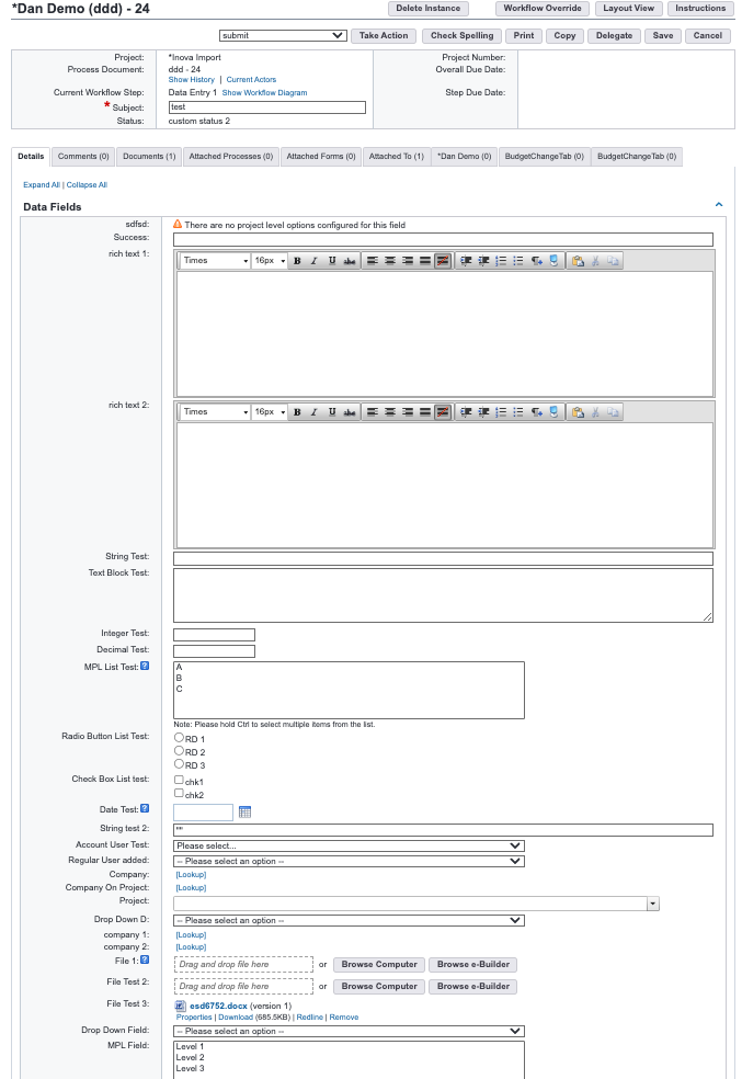
After:
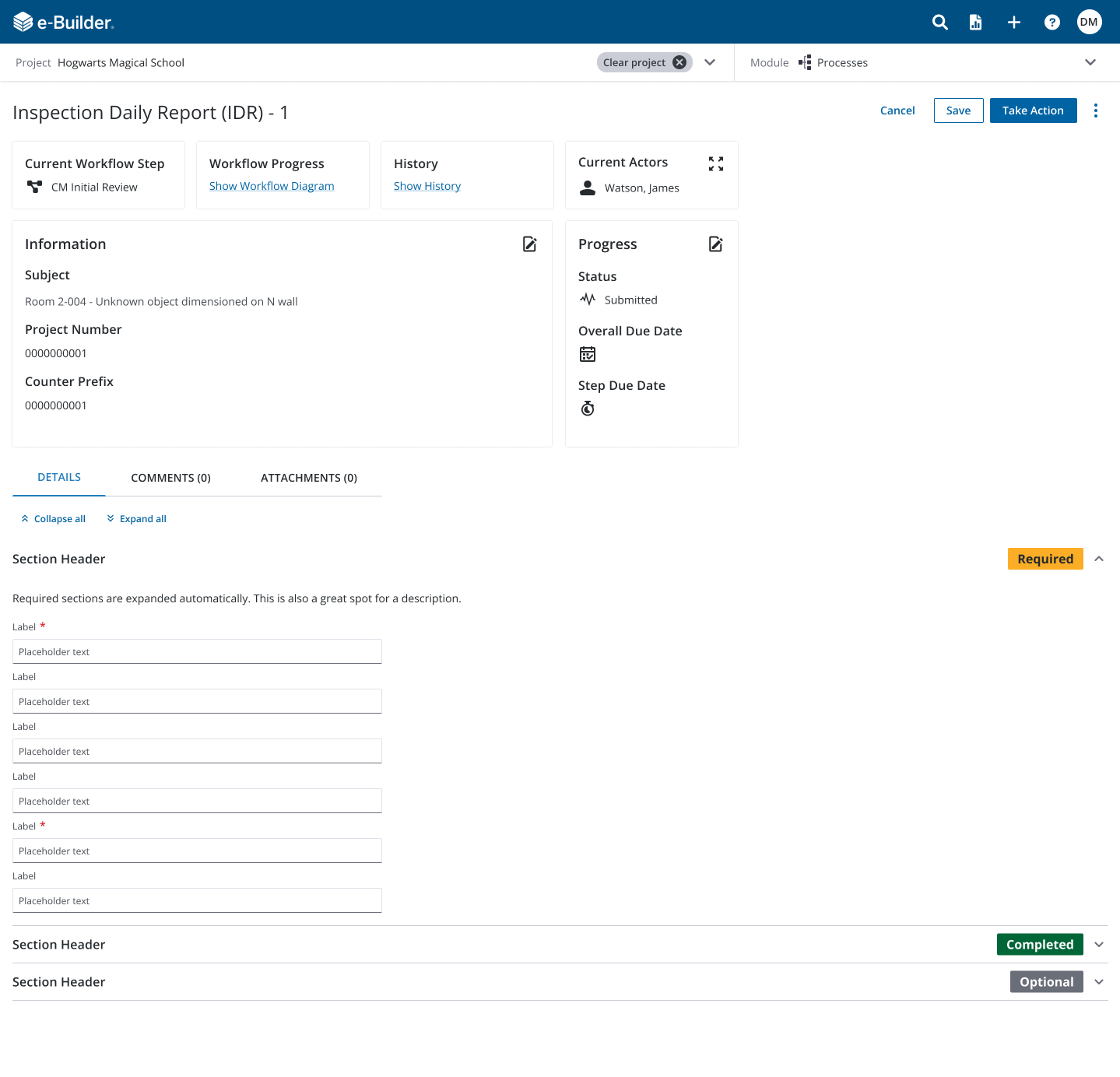
-
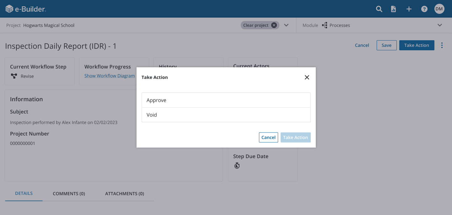
A structured workflow that guides users through completing a task from start to finish. For example, a field worker performing an inspection follows an inspection process created by an administrator, which lays out the steps required and the fields each role must complete.
Processes aren’t limited to inspections—there can be hundreds of different workflows, each varying in complexity. The more steps a process includes, the more fields must be completed, often by multiple people. Each actor may be responsible for entering new information or referencing fields completed by others, creating a chain of collaboration across roles. goes here
The Problem
Usability tests confirmed low confidence and frustration with excessive steps and scrolling (e.g., poor task fluency)
Legacy components clashed with Trimble’s design system, limiting consistency and scalability
The client initially requested accordion fixes—but deeper research revealed structural redesigns were required
Design Approach
Goals:
Reduce complexity and cognitive load for users
Align with Trimble’s design system to ensure consistency
Contribute reusable patterns to support future product work
Highlights:
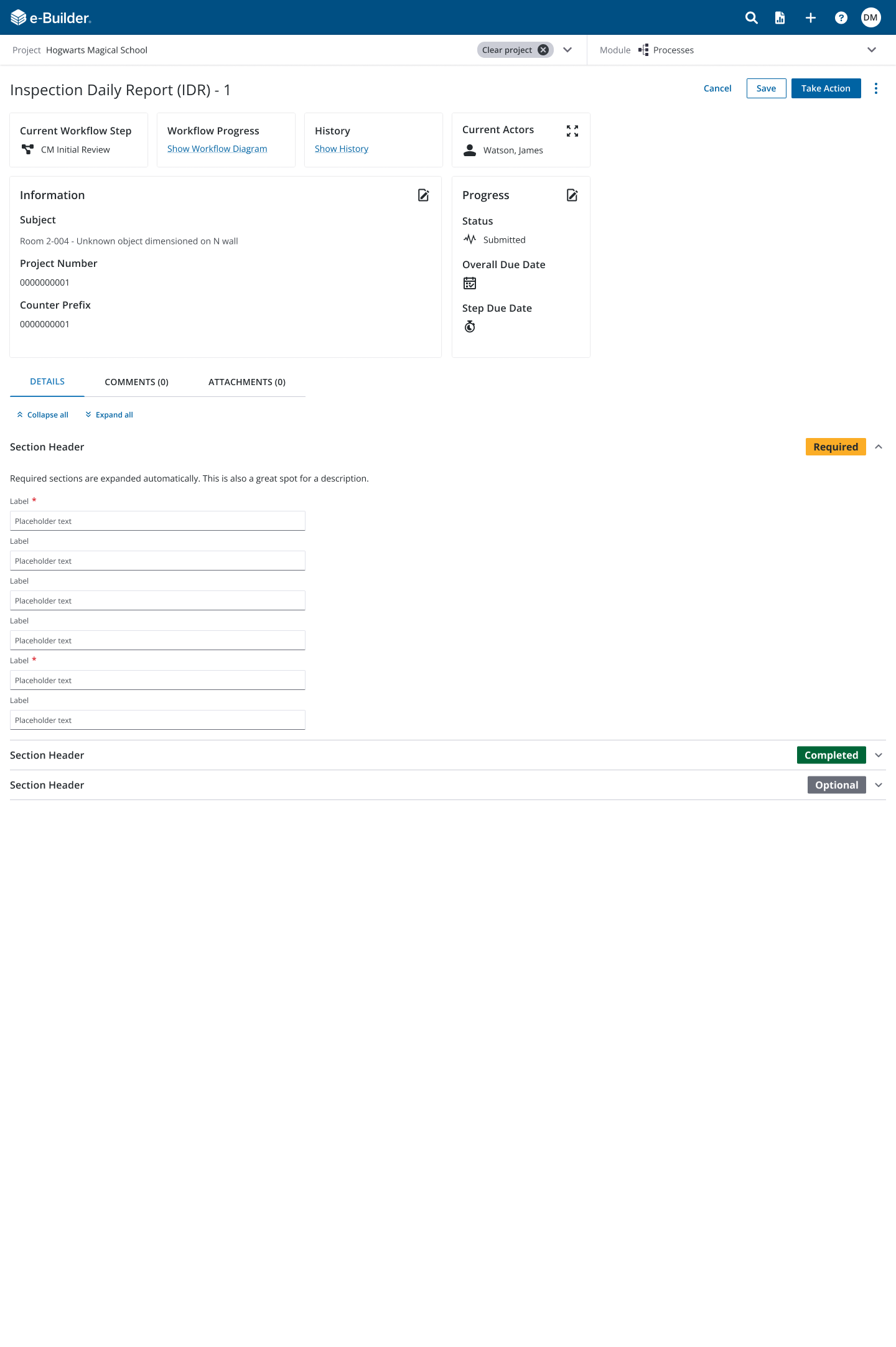
Reorganized content hierarchy and streamlined workflows to improve clarity and reduce setup steps.
Balanced client expectations with research-driven solutions, ensuring changes addressed root causes rather than surface issues.
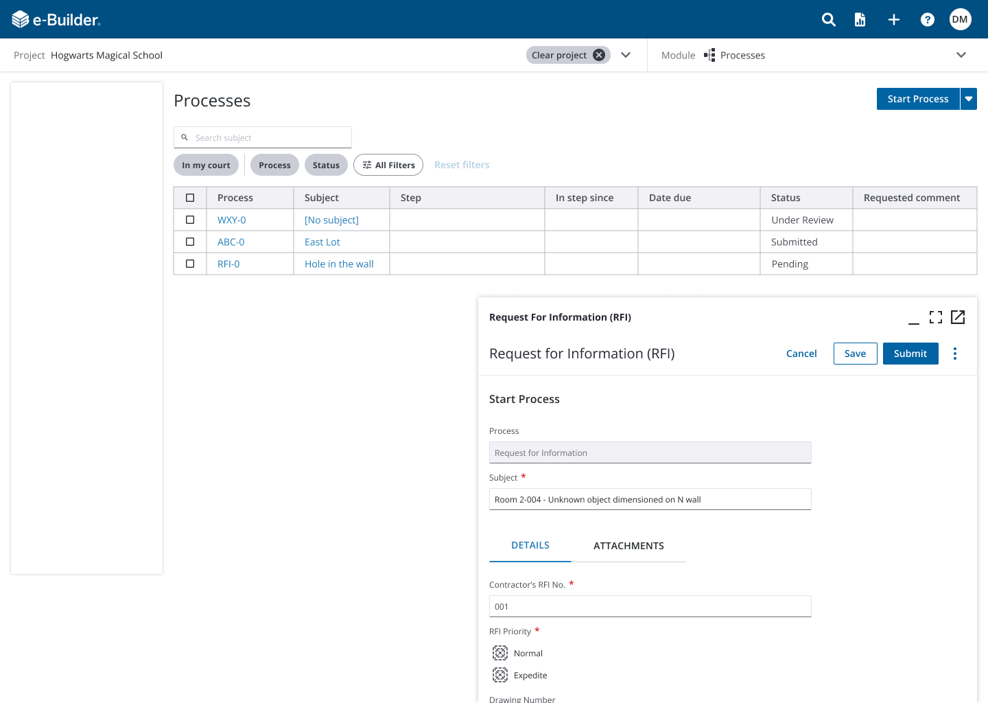
Designed and contributed reusable components, including advanced tables with filters and modernized form patterns, back into Trimble’s design system for long-term scalability.
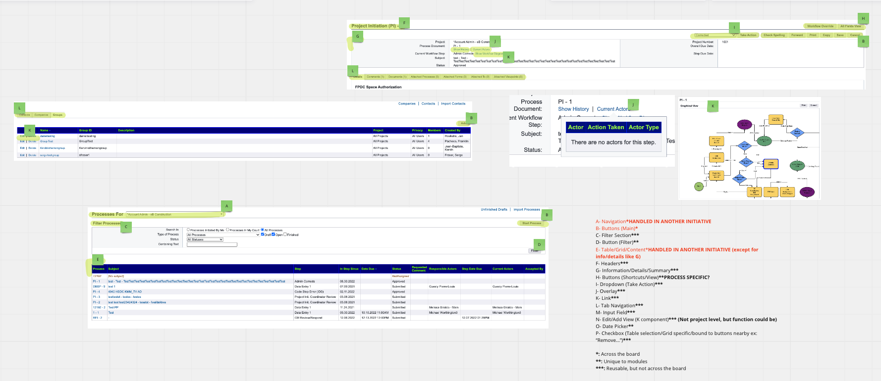
Legacy Processes Page - Audited for revamp
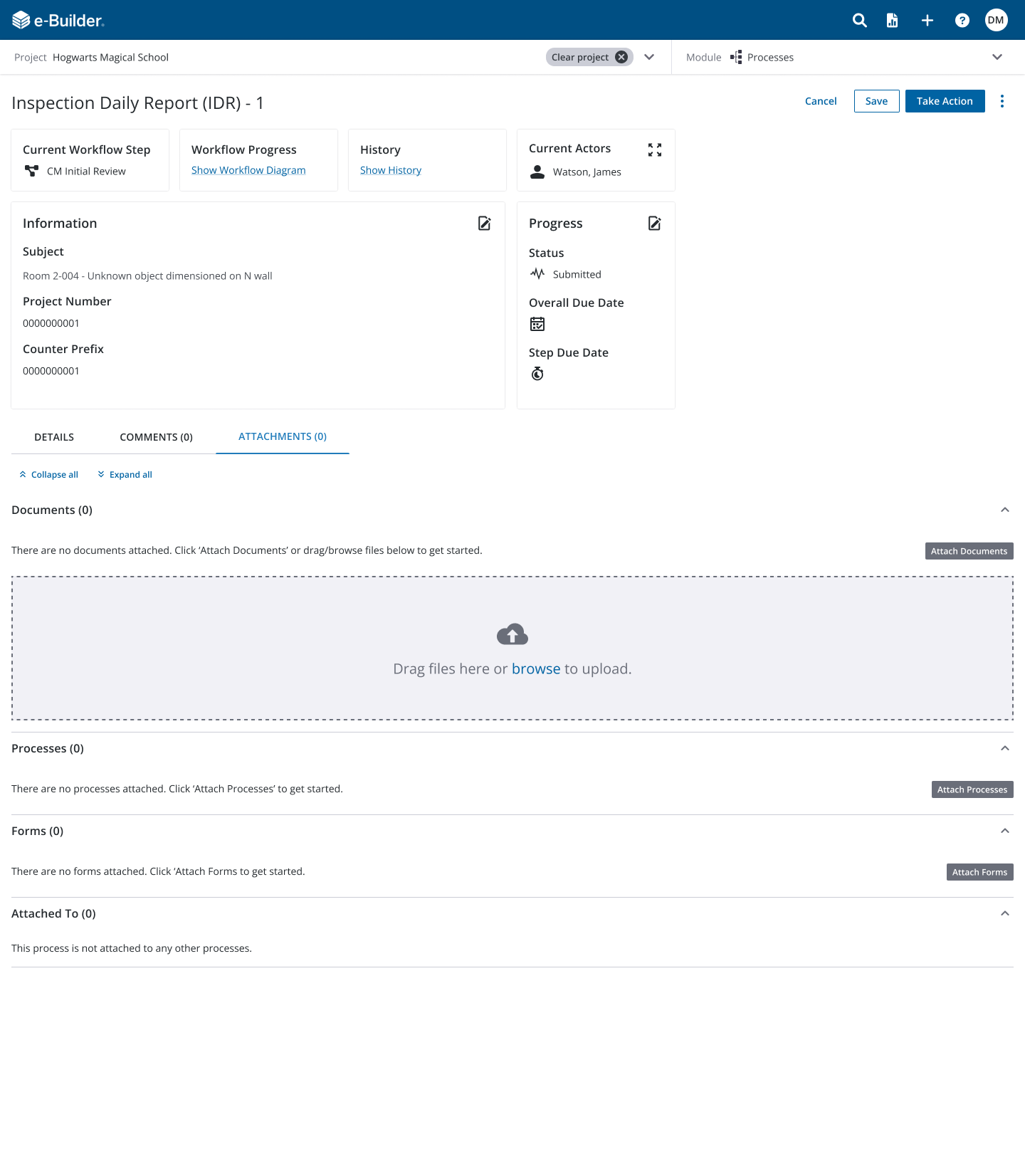
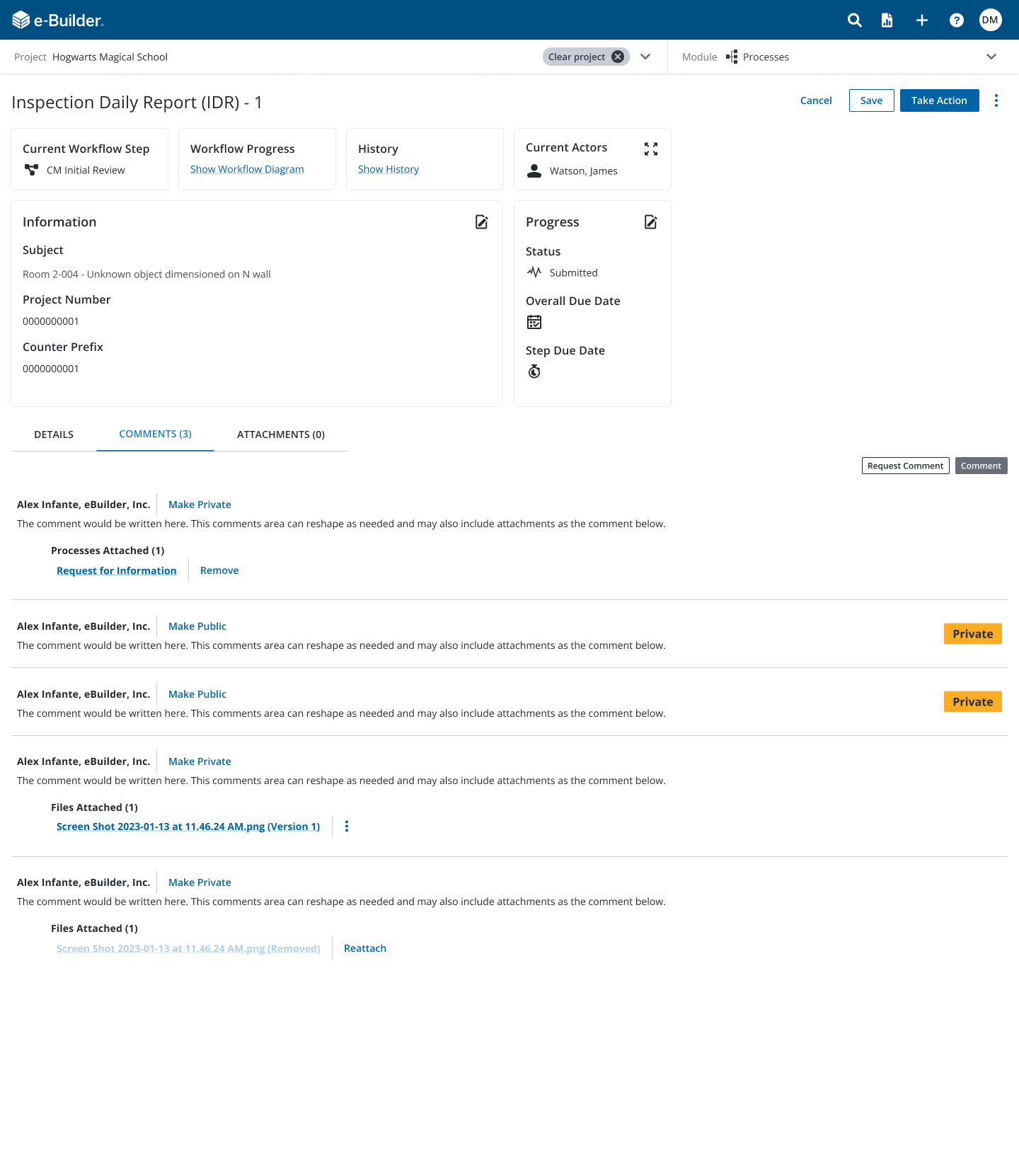
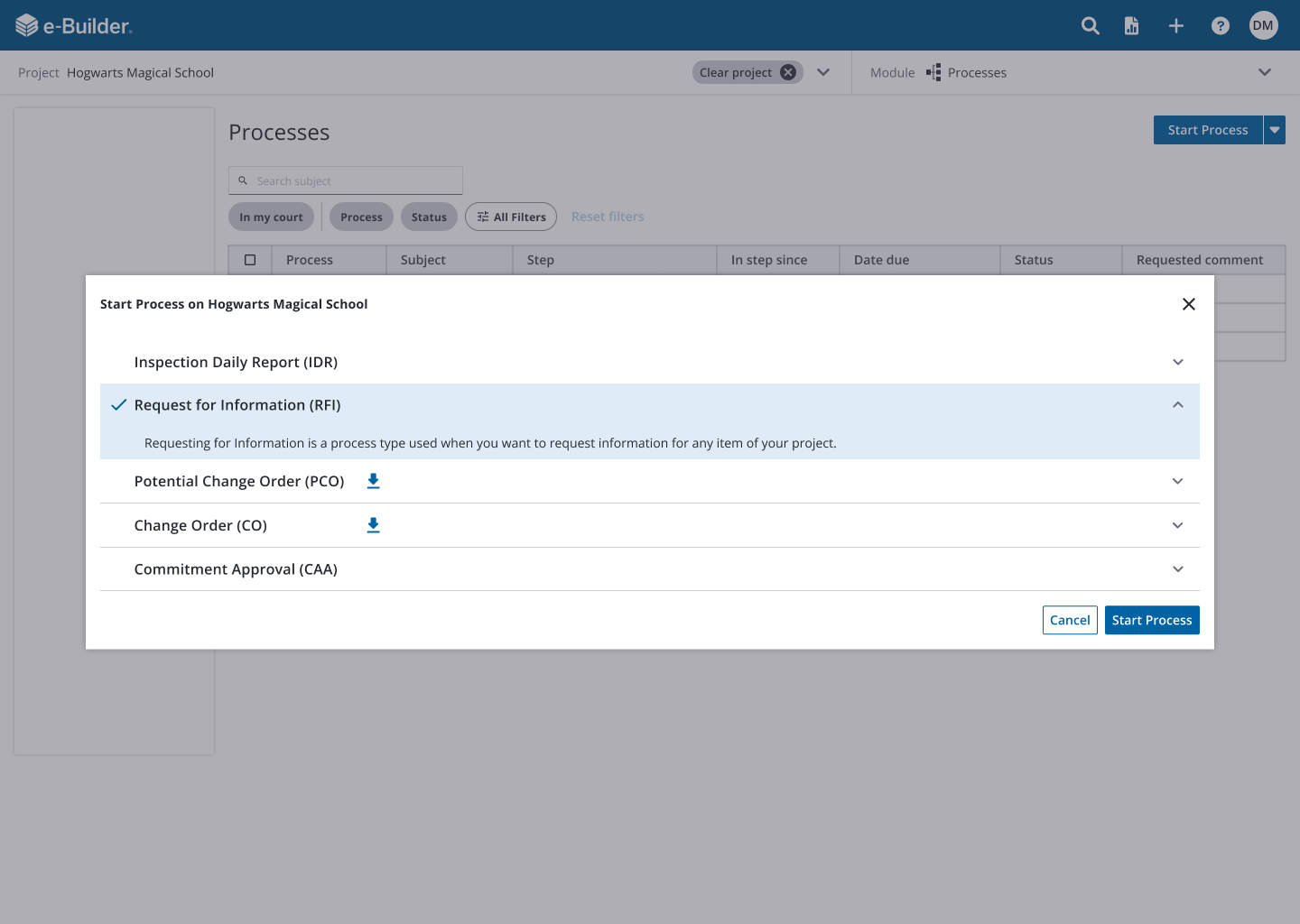
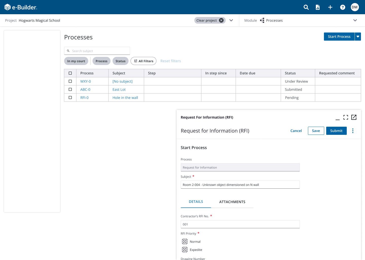
New Processes Page - Includes new feature for creating processes
Research & Insights
Methods: UX audit, JTBD canvases, empathy mapping, affinity diagram synthesis and usability studies
Key Findings:
Users felt overwhelmed by the layout → implied need for better content hierarchy
Complexity in workflows with many steps and actors → called for clearer organization
Users lacked confidence completing tasks in the current workflow → opportunity to simplify and validate design
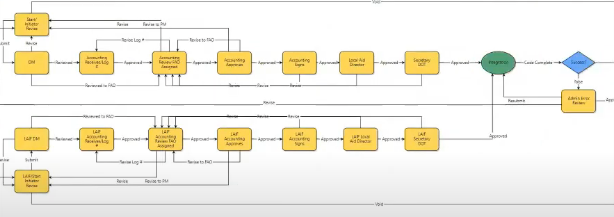
Example of a process workflow
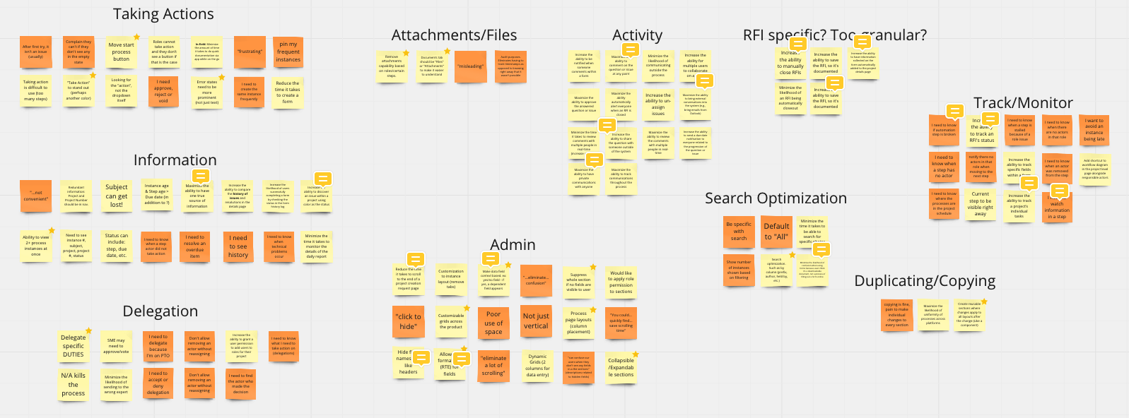
Affinity diagram
Based on the JTBD canvases and other findings gathered from related opportunity maps, I broke down the main categories of data and jobs that would need to need to be accounted for.
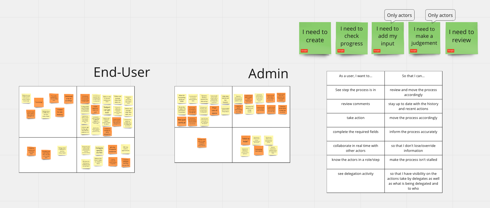
Empathy map, prioritization & user stories
I created empathy maps with the above information, prioritized the main jobs I was going to address (green cards) and wrote out some user stories to help guide my design paths.
Outcome & Impact
Usability testing metrics soared:
40 invitations sent to participants, I was able to complete a total of 16 studies
Of the 10 studies (5 being admin), the results were as follows:
Task confidence (completion of the task) 98%
Ease of use 96%
Usefulness 91%
Net Promoter Score - Ease 96%, T2B 100%, 70 NPS, 7 Promoters, 3 Passive, 0 Detractors
NPS Usefulness 100%, T2B 100%, 100 NPS, 10 Promoters, 0 Passive, 0 Detractors
The client responded with enthusiasm, highlighting user trust and excitement
Delivered a consistent, modern UI that serves as a template for future pages, enhancing design system scalability
Reflection & Next Steps
What worked: Starting from user needs, not just client suggestions, allowed us to truly solve the root pain of complexity
What I’d do differently/next: Incorporate deeper accessibility testing (screen readers, keyboard navigation) and validate performance on low-powered devices
What I learned: The value of designing at the system level, contributing reusable components strengthened the design ecosystem beyond this project, while navigating client pushback sharpened my stakeholder management skills.