Process Instance
Process instance redesign for e-Builder
Product
e-Builder is a construction program management solution that manages capital program cost, schedule, and documents through a world-class workflow and business intelligence. e-Builder is a complete solution designed at its core to deliver control and reduce surprises for owners of capital program.
Challenge
e-Builder has been around for years and while it solves several problems in the owner space, it can be challenging to navigate and control. The most important job of a user is being able to start a “process”, add the required data, and monitor the overall project's health. When our highest-profile client raised concerns that this function was behind, e-Builder decided to initiate a collaboration with them which would expedite the enhancements we were planning on making to the product. Our client put together a team of professionals in the construction industry as well as their own group of user experience designers and developers. They then provided a list of interface issues along with their suggested solutions. The challenge… all of the above.
Role
I was responsible for the end-to-end design of this initiative. While I collaborated with my UX team for feedback or to delegate some minor audit responsibilities of the existing product, I was in charge of the research, high-fidelity designs, usability testing, delivery, and development support through analysis, refinement, and release.
Part One
Understanding the problem (really)
UX for the win!
It’s important to note that our client is well-known for their user-friendly products and arguably dominates the user experience space in general. With that said, they’re still only one of the many clients that we serve and while we were extremely excited to get the chance to collaborate with them, we still wanted to start from scratch and really understand the problems we were solving.
Pause
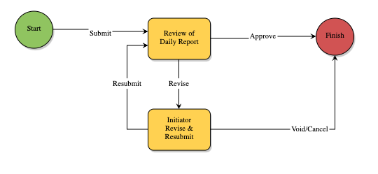
Before we continue… Let me define what a “process” is in our product.
Our users’ day-to-day varies based on the type of work they’re assigned to or need to assign. One example would be a field worker performing an inspection. Their administrator would have created an inspection workflow that lays out steps A to B for how that inspection is started and finished and each step is likely to contain a set of input fields specific to a role.
In this example, the first step is to start the inspection and the field worker would fill out the form to then submit to their project manager. The second step is for that manager to review the inspection and assuming there are no revisions needed, they complete whatever required fields they may have and they push it through as finished. That is a business “process”.
Pause continued…
Our users don’t only perform inspections, though. There can be hundreds of processes that range in complexity and that just means more steps in those workflows can exist.
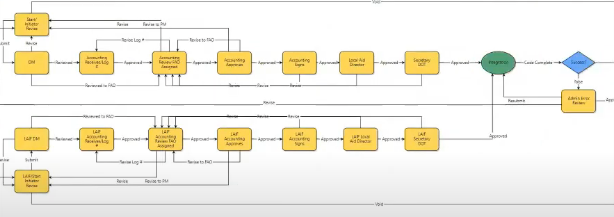
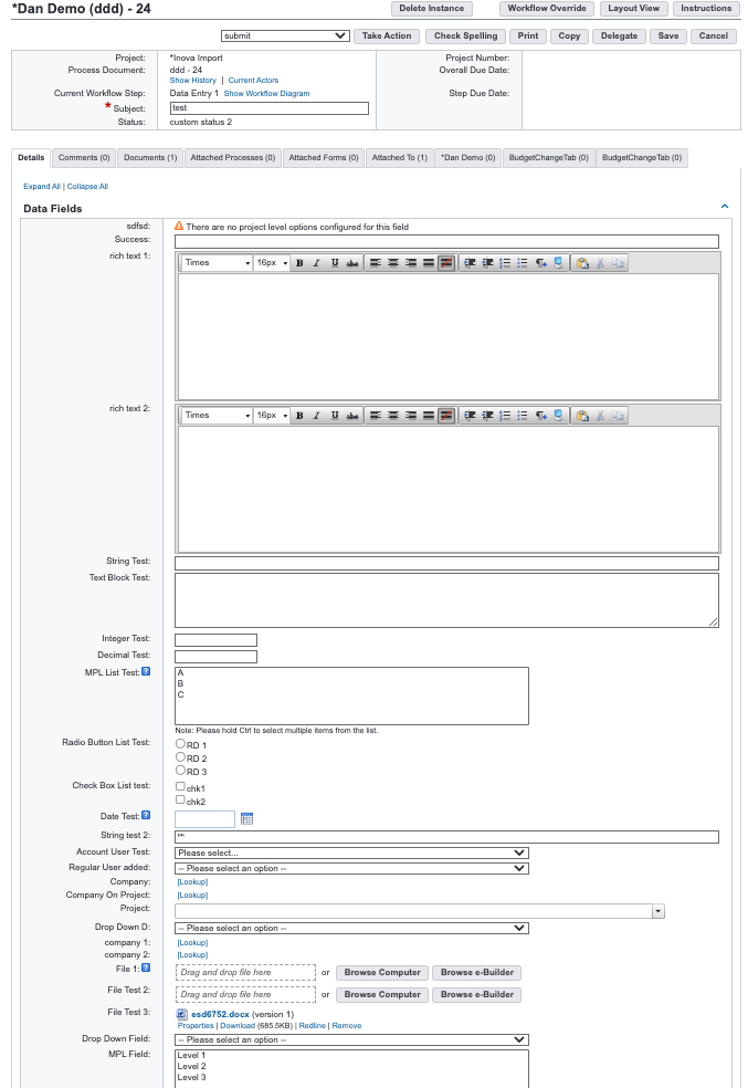
Process instance
The more steps a process has, the more fields there are to be completed. It also means more people (actors) will be involved in completing those fields in addition to referencing fields completed by prior actors.
“Too much scrolling”
Once our product managers gathered all of the issues and suggestions from our client, they immediately requested to implement collapsible sections to address the major concern being that the page was "overwhelming” and had “too much scrolling” in addition to other suggestions such as changing the layout and updating to our new design system and meet corporate standards.
The concern was understandable and of course, modernizing the design was a given, however, the UX team felt that we didn’t have enough information to support the accordion implementation.
We needed more information and didn’t have the time or support to perform user research to validate the concern.
The decision to implement collapsible accordion sections was out of our hands in UX.
Compromises
This project had a lot of obstacles. Many came from product management, some came from our client, and several came from our development team.
There was a lot of independent interpretation when it came to understanding the collaboration with our client and what the contract really required. In the very beginning, both product and development wanted to take advantage of small wins as often as we could which meant taking their design suggestions and implementing them right away.
Being the sole designer on this initiative, I had to face most of these battles alone and if there’s one thing to know about me is that I’m very (productively) stubborn.
I pushed against the accordions because we didn’t know if it was a true need for all of our users. In fact, we barely understood the problem we were trying to solve. “Too much scrolling” could mean a lot of things and approaching how we display the input fields really opened the door to a variety of solutions. Jumping to accordions felt premature.
Unfortunately, I did not win the argument but I was okay with that because it allowed me the opportunity to test the solution in our legacy product while I worked on applying the new design system.
Initially, I recommended A/B beta testing all of the sections collapsed and all of the sections expanded. The goal was to test the adoption by seeing if our users would collapse sections if they found them automatically expanded and also learn if seeing less on the screen would address the scrolling concern (showing the sections automatically collapsed).
Development wasn’t keen on the idea and argued that if all sections were expanded that no one would adopt the accordions and that we should automatically have them collapsed at first. I advised that was the point of the test because if nobody adopted collapsible sections, we clearly didn’t need that particular enhancement. We moved forward with my intent to A/B test.
While building this internally (before releasing it to users) there was an uproar about all sections being collapsed and most believed that they had lost information or that there was a bug. This was great feedback so we decided to keep the sections expanded and I added “expand all/collapse all” buttons saving development from having to set up A/B testing. I was then able to set up product mapping using Gainsight analytical to continue tracking adoption.
Research begins
Now that all of that was settled, I could continue understanding the problem further. We didn’t have enough information and I needed all I could get before hopping into figma.
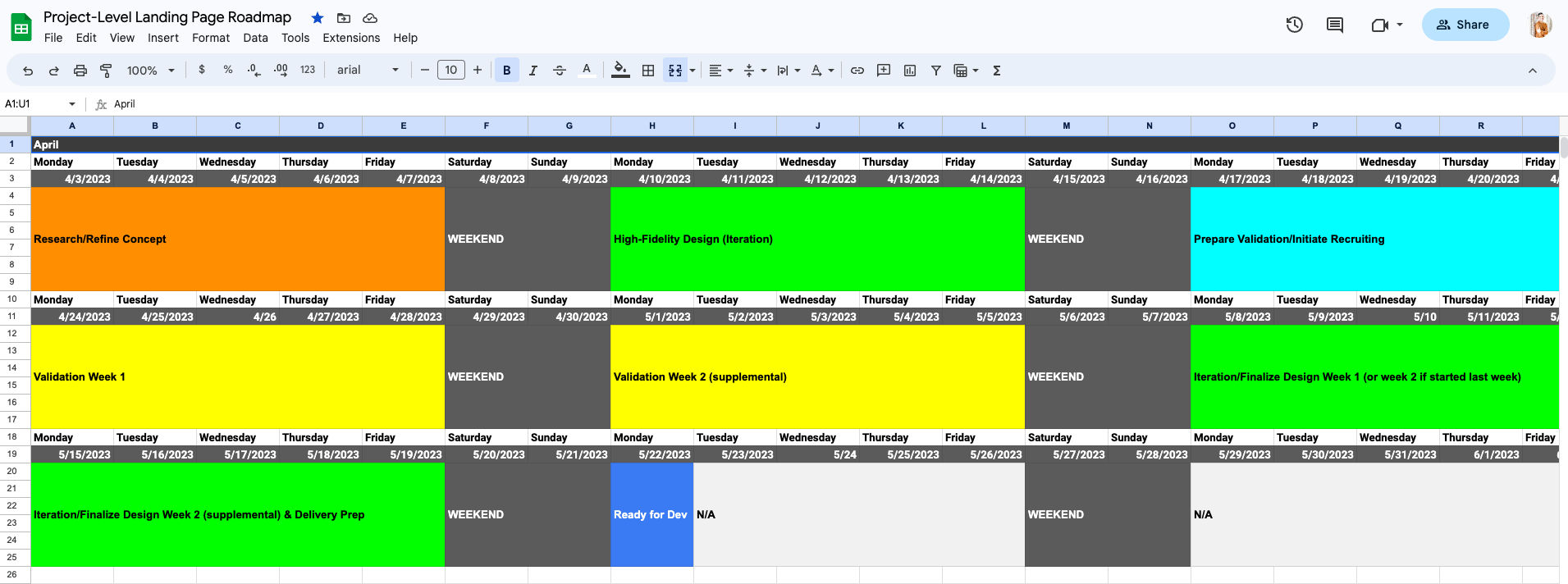
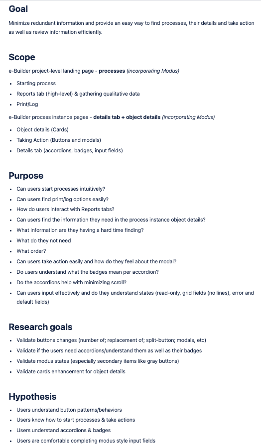
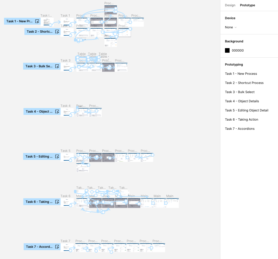
I created two research plans, one specific to the process instance (the long form page) and the project landing page (this is where users search existing processes and start new ones).
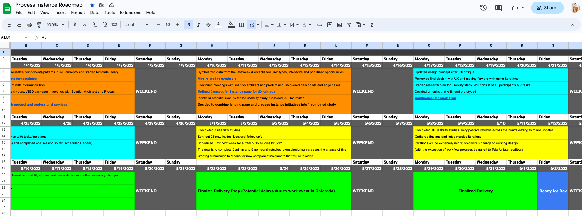
There was a lot of pressure when it came to timing, so I also created a roadmap to help communicate to our client what to expect and when. As weeks went by, I would complete each phase and link any deliverables I was allowed to share with them.
Transparency was the biggest ask from our client and their involvement with the actual design was minimal. Not that it wouldn’t have been welcome, but I was happy to say there were few design obstacles and it would later be very well received.
Missing information
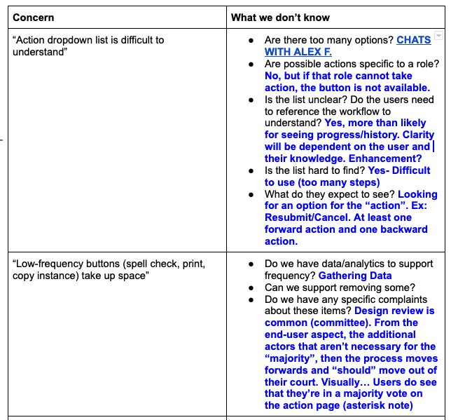
I reviewed old and new user feedback in A-ha, jobs-to-be-done canvases, and met with several internal SME’s including our Solutions Architect who provided a lot of insight on the workflow configuration itself.
This affected our admin users more than anything but they were still core users for the pages we were enhancing.
A lot was learned in this process and ultimately influenced how users took major actions in the process which is arguably as important as how they read/fill out the input fields.
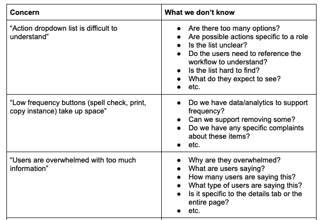
I wanted to understand the concerns our client had and what made this function so “overwhelming”. I took exact phrases from the feature memo (a document that specifies product requirements) such as “Action dropdown list is difficult to understand” and “Low-frequency buttons (spell check, print, copy instance) take up space” and added questions that I needed answered.
Synthesis
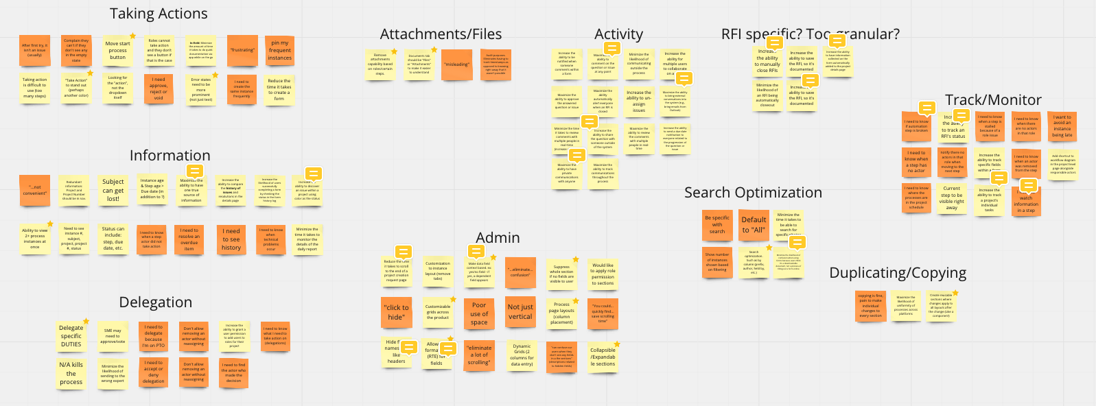
Affinity diagram
Based on the JTBD canvases and other findings gathered from related opportunity maps, I broke down the main categories of data and jobs that would need to need to be accounted for.
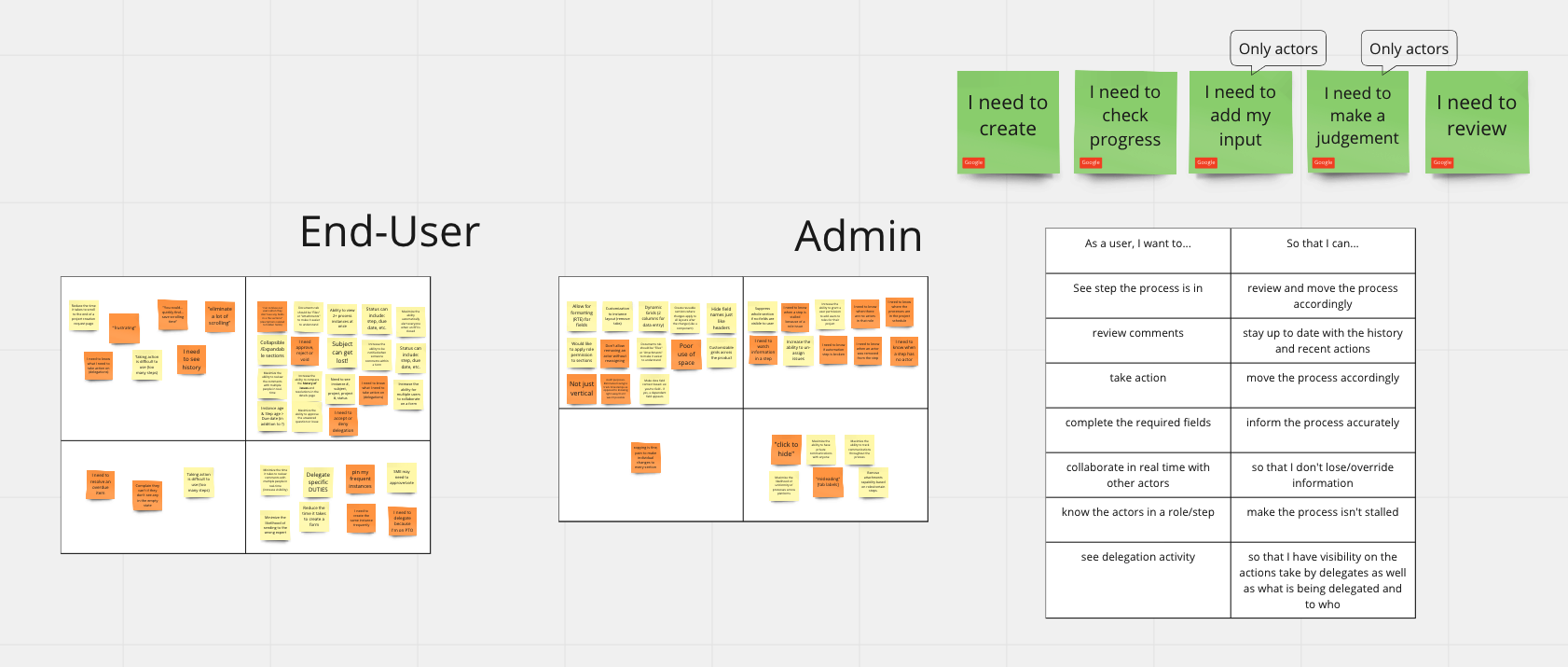
Empathy map, prioritization & user stories
I created empathy maps with the above information, prioritized the main jobs I was going to address (green cards) and wrote out some user stories to help guide my design paths.
Modernizing the look
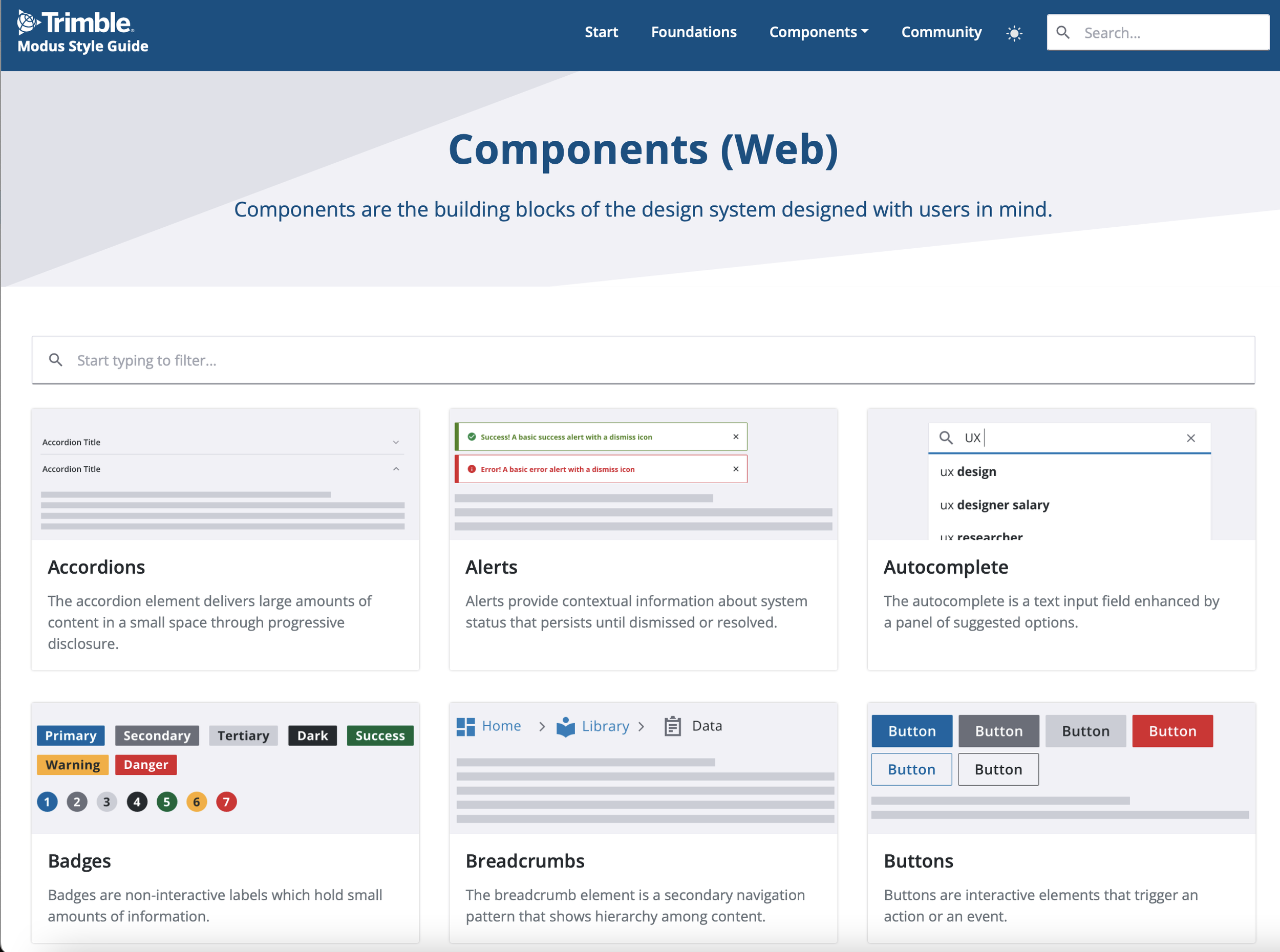
e-Builder was acquired by our parent company Trimble Inc. in 2018 and Trimble had their own style guide that we were asked to slowly implement.
One thing I had in the back of my mind at all times was that the new layout and the updated look of the input fields would likely solve a lot of the issues for how the form was digested by our users and while I was going to continue exploring the collapsible sections, there were a lot of elements that would do nothing but enhance the usability of the page.
I felt that I had a lot of information to support the design decisions I was about to apply but it was really important that whatever I did to this page would serve as a “template” for other pages that would later be enhanced with the new design system.
Using miro, my UX team and I conducted an audit of the legacy product and established what that consistency would look like across the board including main action buttons, form fields, data visualization, etc.
This also meant submitting a handful of components to the design system team and even spawned a dedicated tiger team I would later be a part of to design advanced tables (grids) with filter and view capabilities.
Part Two
Usability study research plan
Research and recruiting
I started working on the redesigns while simultaneously establishing a research plan. I knew I wanted to meet with more users than usual since this was the most frequented page in e-Builder. I also decided I needed to talk to both admins and end-users. Admins are the users who ultimately set up these pages in terms of fields, layout, and even roles specific to each step of the workflow, and while I wasn’t changing how they set up the processes themselves, I was changing how they would be displayed. Their feedback was crucial. End-users needed to navigate the page efficiently. The goal was 10 total participants (5 of each type) performing 7 total tasks.
I sent out a total of 40 invitations to confirm a surplus of participants and guarantee five admin and five non-admin users.
Part Three
High-fidelity designs & findings
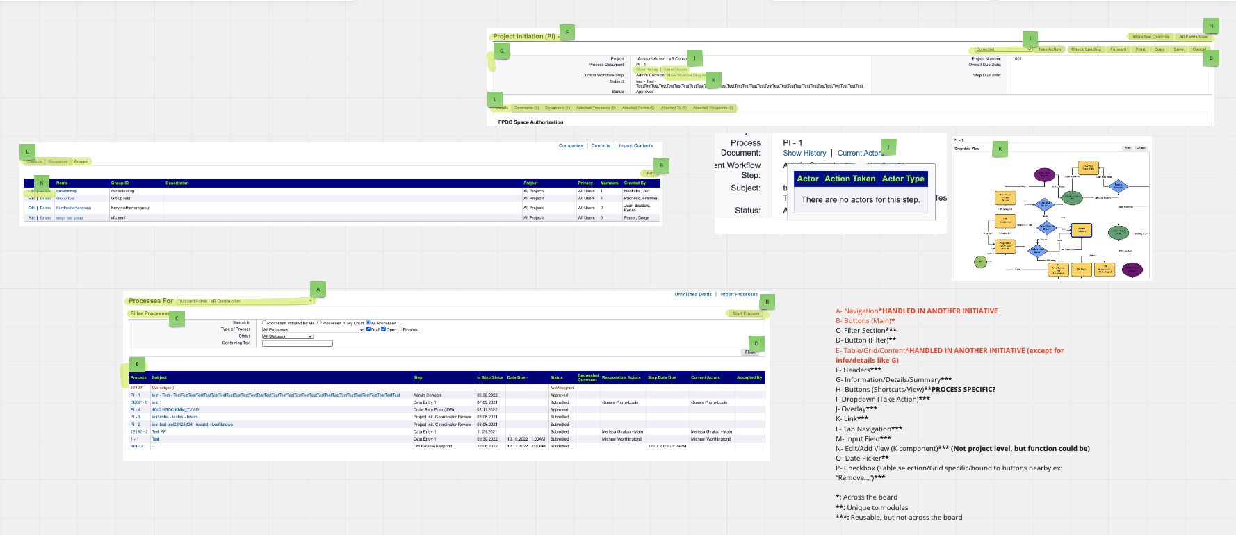
Major design changes
There were several changes across the processes module so I’ll stick to the main ones, starting with the collapsible sections.
At this point, the accordions were a requirement so I implemented them in my designs. With that said, the feedback we were getting from the legacy integration and assumptions from the research phase was that there would be a concern (mainly from admins) that users would skip fields/sections would it be accidentally or intentionally. This would cause an issue with required fields being missed entirely.
To combat this, I added badges inside the accordion headers that would advise if a section contained required fields or if they were optional. This badge would also be dynamic in that as soon as the required fields were completed, it would change to a “completed” state. Testing was positive with this feature, even from admins that were concerned that users would skip non-required fields as it really just meant configuring them to be required if they were important to the process.
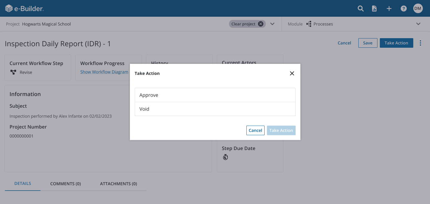
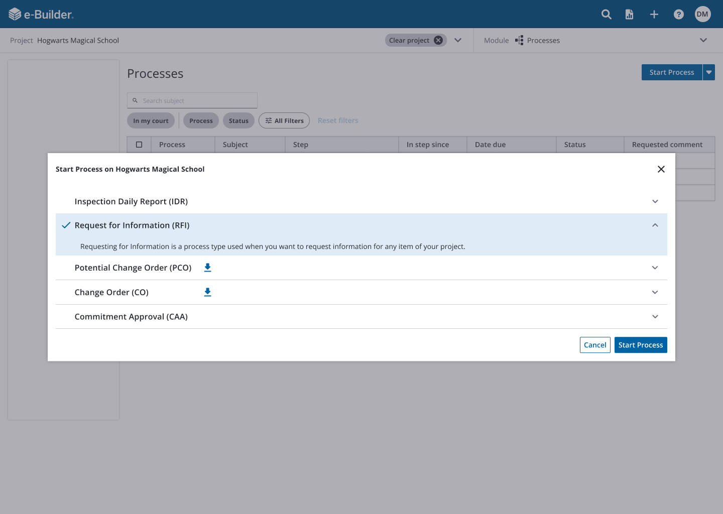
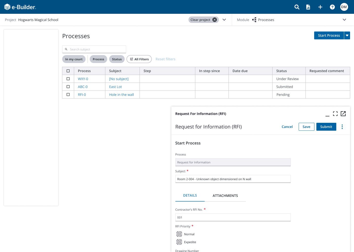
Other changes included modals to replace what currently existed as pop-up windows. The idea was to keep the user in that process instance rather than “overwhelm” them with endless pop-up windows.
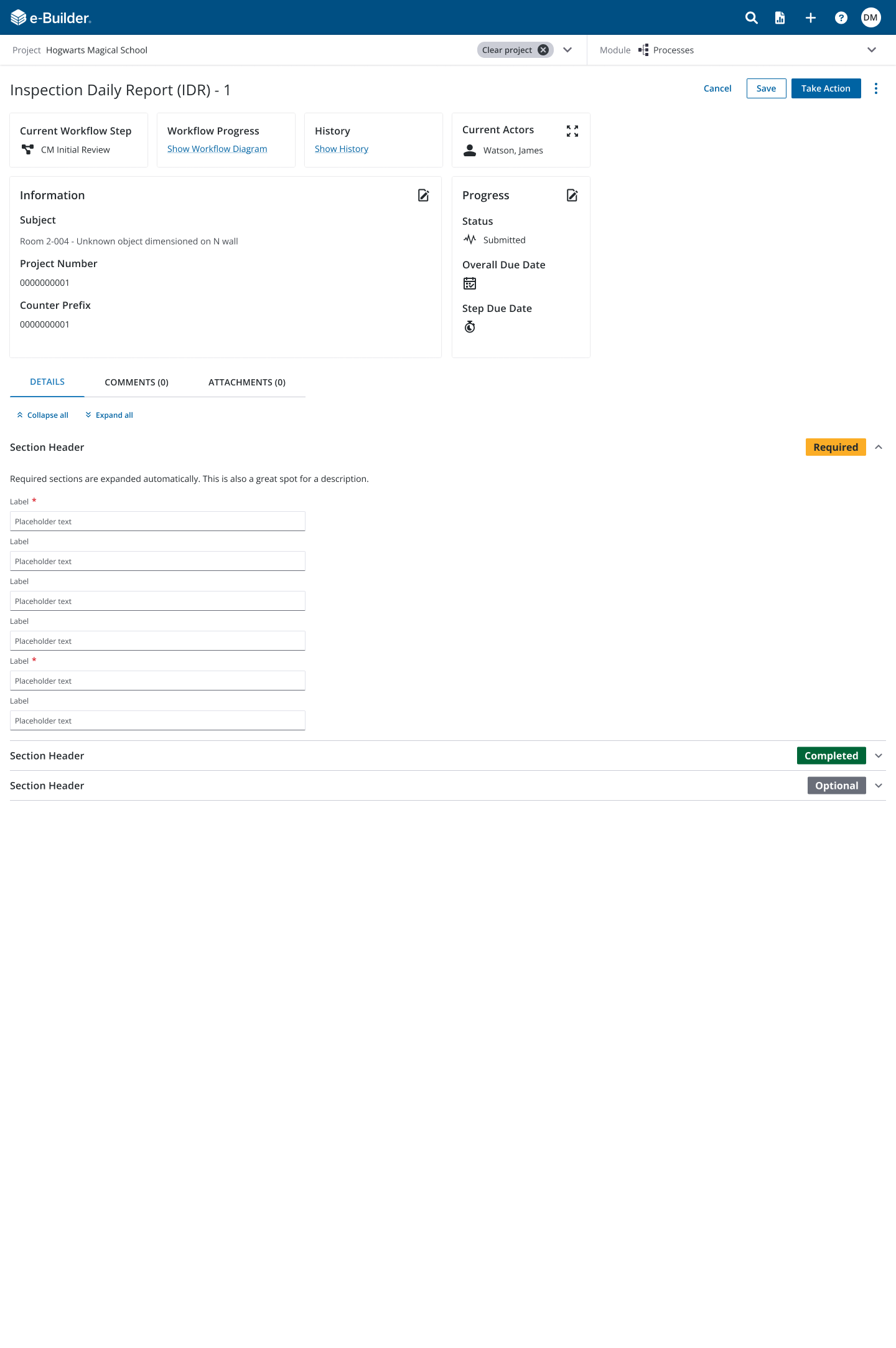
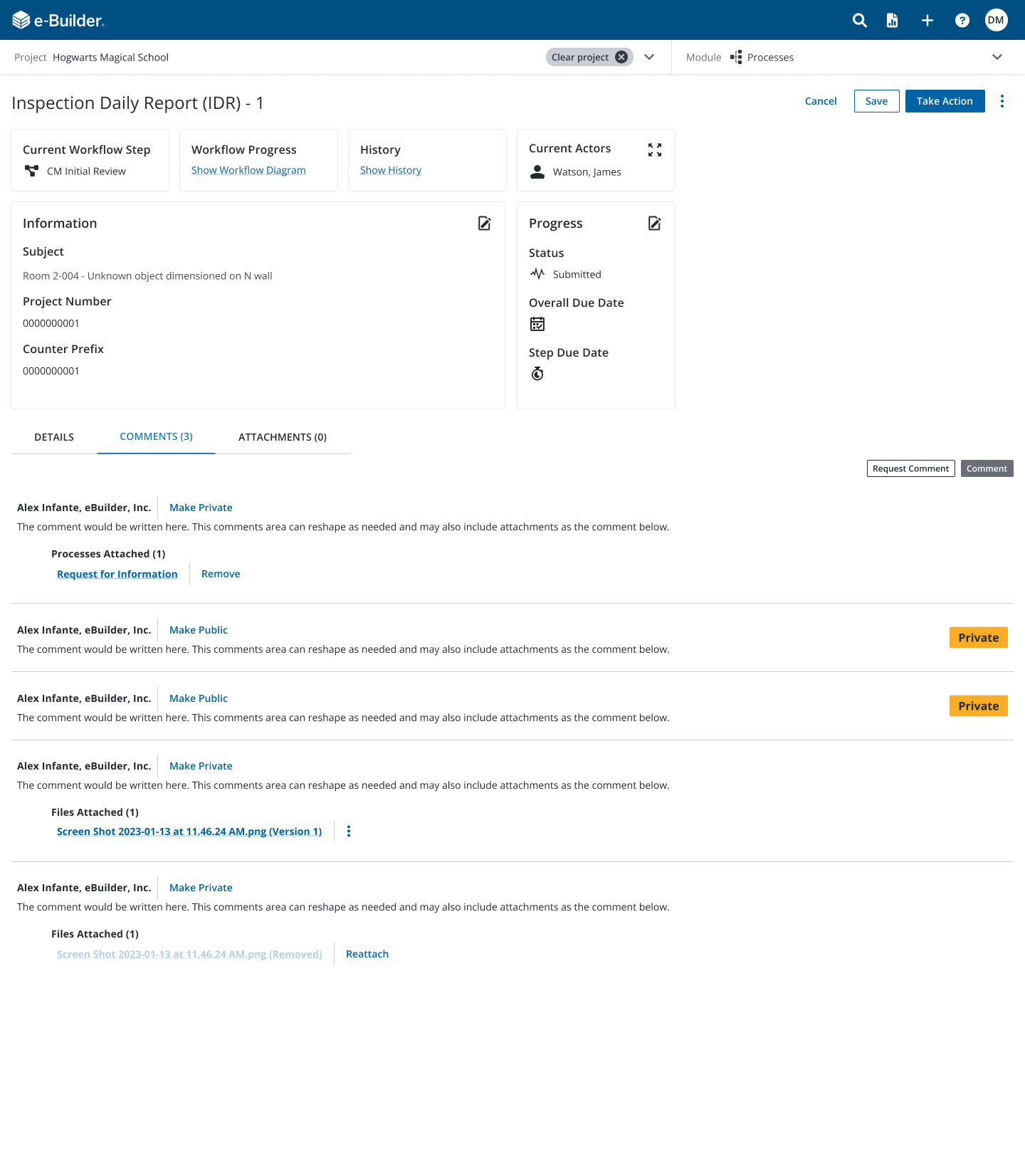
Another major change was taking the main object details (subject, due dates, assigned actor(s), status, etc.) and presenting them as digestible cards that would be ordered in a way that made sense to the user. The idea was to see “what” they’re looking at, “where” it is in the process life cycle, and “who” is assigned to it or taking action.
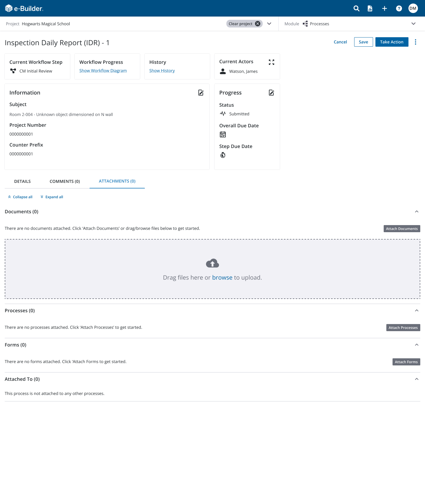
Lastly, our instance pages contained more tabs and buttons than necessary. When it came to tabs, there was essentially one per attachment type (attached documents, attached processes, attached forms, etc.) and then there was a tab for comments as well. Depending on the role of the user, they would see five or more main buttons and admins would see a few more above the user actions. My redesign consolidated the attachments into one tab leaving a total of three vs. the five or more tabs they see today and I also limited the main action buttons to three with a “more” menu should they need the other low-frequency items. The admin options would be housed there as well. This was very well received as it de-cluttered the page and using Gainsight analytics, we were able to remove some buttons that were rarely, if ever used.
Study results
Of the 40 invitations sent to participants, I was able to complete a total of 16 studies.
I gathered both qualitative data and quantitative feedback considering the following (on a 1-7 scale):
Task confidence (completion of the task)
Ease of use
Usefulness
NPS (Net Promoter Score) Ease
NPS Usefulness
Of the 10 studies (5 non-admin and 5 admin), the results were as follows:
Task confidence (98%)
Ease of use (96%)
Usefulness (91%)
NPS Ease (96%, T2B 100%, 70 NPS, 7 Promoters, 3 Passive, 0 Detractors)
NPS Usefulness (100%, T2B 100%, 100 NPS, 10 Promoters, 0 Passive, 0 Detractors)
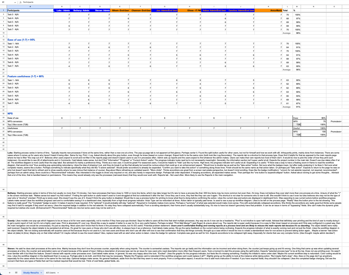
Of the 16 total studies, the results were as follows:
Task confidence (97%)
Ease of use (95%)
Usefulness (92%)
NPS Ease (96%, T2B 100%, 75 NPS, 12 Promoters, 4 Passive, 0 Detractors)
NPS Usefulness (96%, T2B 94%, 81 NPS, 13 Promoters, 3 Passive, 0 Detractors)
Part Four
Looking back
This project was so much fun. Our client responded with overwhelming positivity with one member saying, “I want it now”. While the update is still being refined especially as we continue to learn more about our users in other initiatives such as the workflow configuration and main navigation, this was still an exciting opportunity to work with a major client and heavily lean on UX principles to influence the best solution.
Many obstacles presented themselves along the way, mostly when it came to cross-functional communications but we all eventually saw the bigger picture and found that slowing it down and taking it back to the basics was the right approach.
The project also really challenged the existing design system and opened the door to contribute enhancements supported by usability testing.
I look forward to refining this further and the overall future of e-Builder.