Product Consistency at Scale
A Handbook for Component Patterns and Consistent Product Behavior
Overview & Challenge
As Judi’s product ecosystem scaled, design decisions were becoming increasingly inconsistent across teams.
Teams were making design decisions based on individual interpretation instead of shared standards, leading to repeated debates, inconsistent experiences, and unnecessary custom solutions across the platform.
The existing handbook had become difficult to trust, difficult to scale, and too dependent on tribal knowledge to support efficient product decisions.
What looked like a documentation problem was really an operational one: the team didn’t need better pages, they needed a clearer system for how product decisions were made.
Role
I owned the initiative strategy, framework definition, and adoption plan alongside one peer designer, with leadership oversight.
This included defining the decision framework, establishing governance across patterns and components, aligning with engineering and design systems on implementation feasibility, and creating contributor standards to support long-term scale.
Part One
Discovery
Understanding the problem
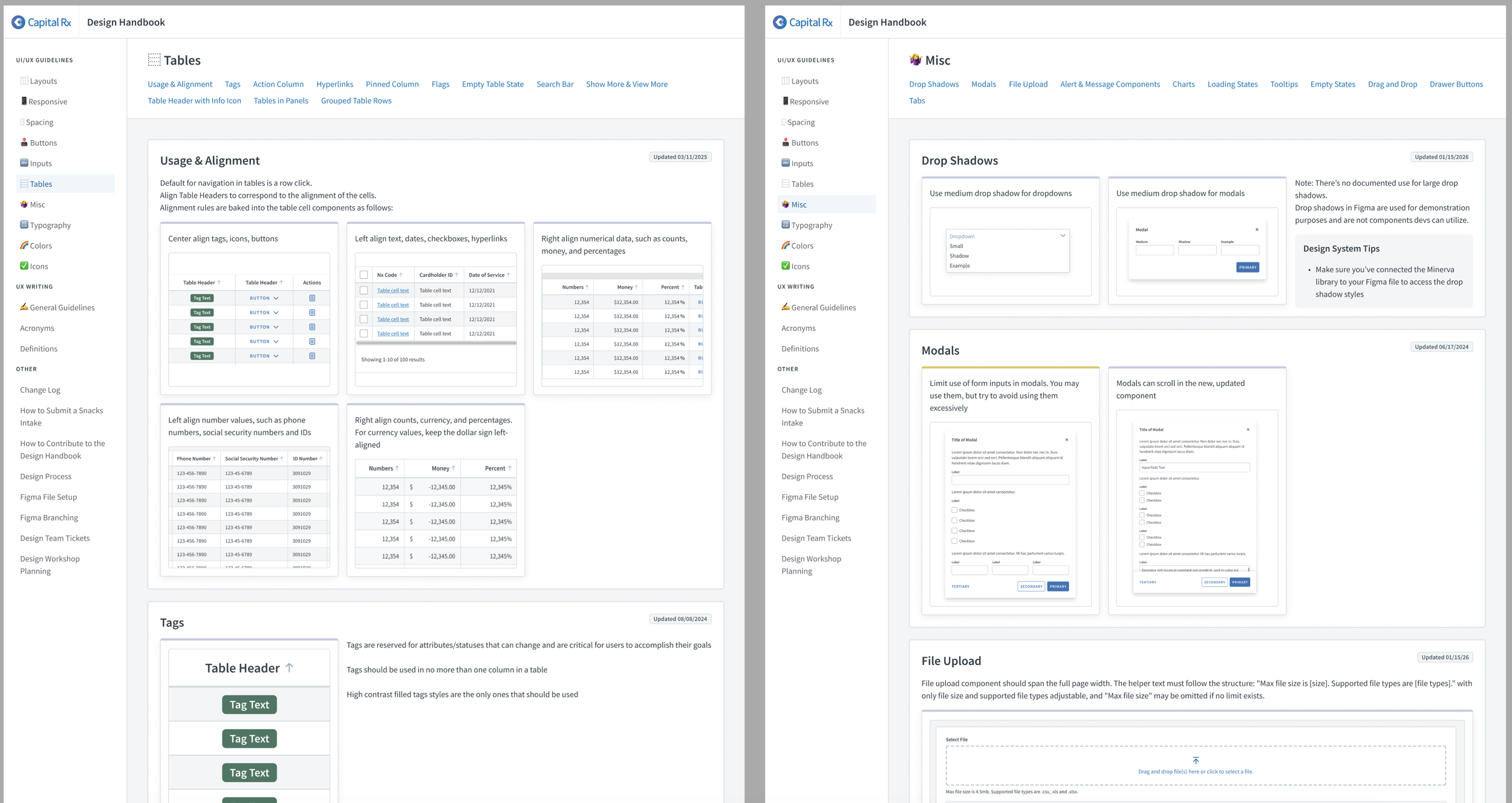
The original initiative started as a redesign of our existing design handbook, but after months of iteration it had stalled.
The team was stuck in a loop:
Reworking pages, debating structure, and revisiting the same decisions without a clear framework for how the handbook should actually function.
Documentation existed, but it wasn’t trusted as a source of truth.
Designers relied heavily on tribal knowledge, Slack messages, and direct conversations with engineers to answer basic questions like:
when should this component be used?
what pattern is considered standard?
is this behavior intentional or just legacy?
Developers often skipped design guidance entirely and went straight to component code because documentation was either incomplete, difficult to navigate, or too disconnected from implementation.
The issue wasn’t missing information, it was missing structure.
What I needed to learn first
Before proposing solutions, we audited:
where documentation currently lived
what content types were actually useful
where people got stuck
what patterns were repeatedly debated
how both designers and engineers referenced documentation in real work
This included reviewing:
the existing handbook
developer documentation modules
design system references
recurring design review friction points
feedback from design leads and engineers
The same issues kept surfacing:
Unclear component usage and decision-making around actions and controls
Inconsistent interaction patterns across shared product behaviors
Documentation discoverability and navigation challenges
Gaps in writing standards and content guidance
Inconsistent accessibility expectations across teams
Lack of clear ownership and standards for recurring design patterns
The problem became:
How do we create a shared decision-making system people will actually use?
Part Two
Templatizing the system
Creating a scalable framework
The first major decision was to stop thinking about the handbook as a collection of pages and start treating it like a product system.
Instead of documenting individual components one by one, we focused on building a repeatable structure that could scale across teams and future contributors.
I reorganized the handbook into two core categories:
Patterns:
Shared product behaviors like adding & removing behaviors, loading states, show more/less, etc.
Components
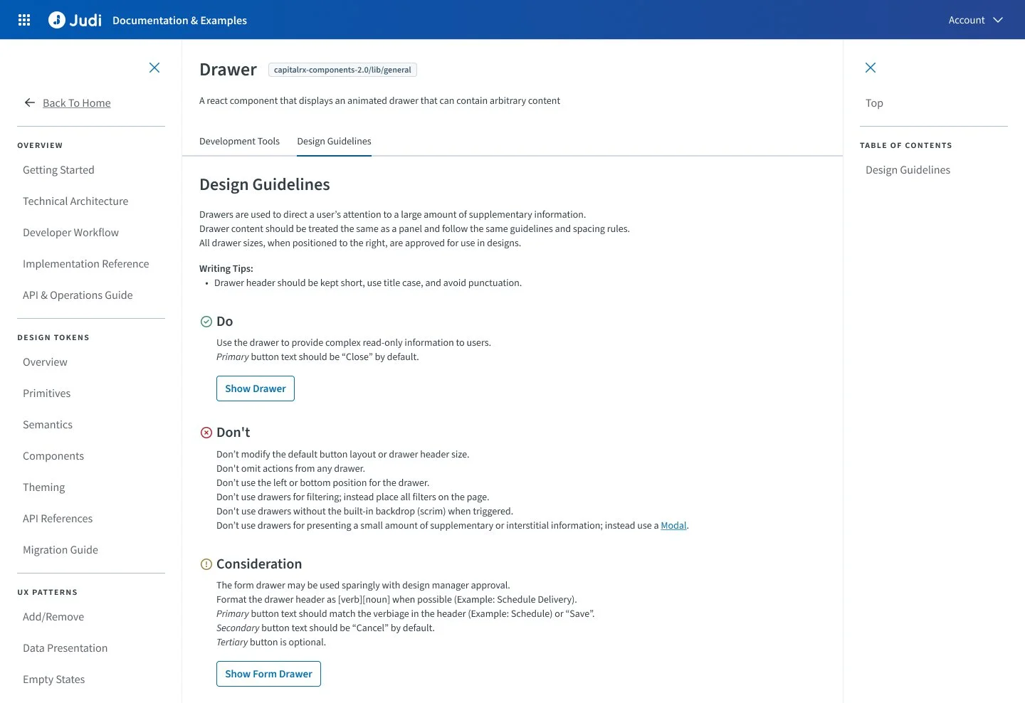
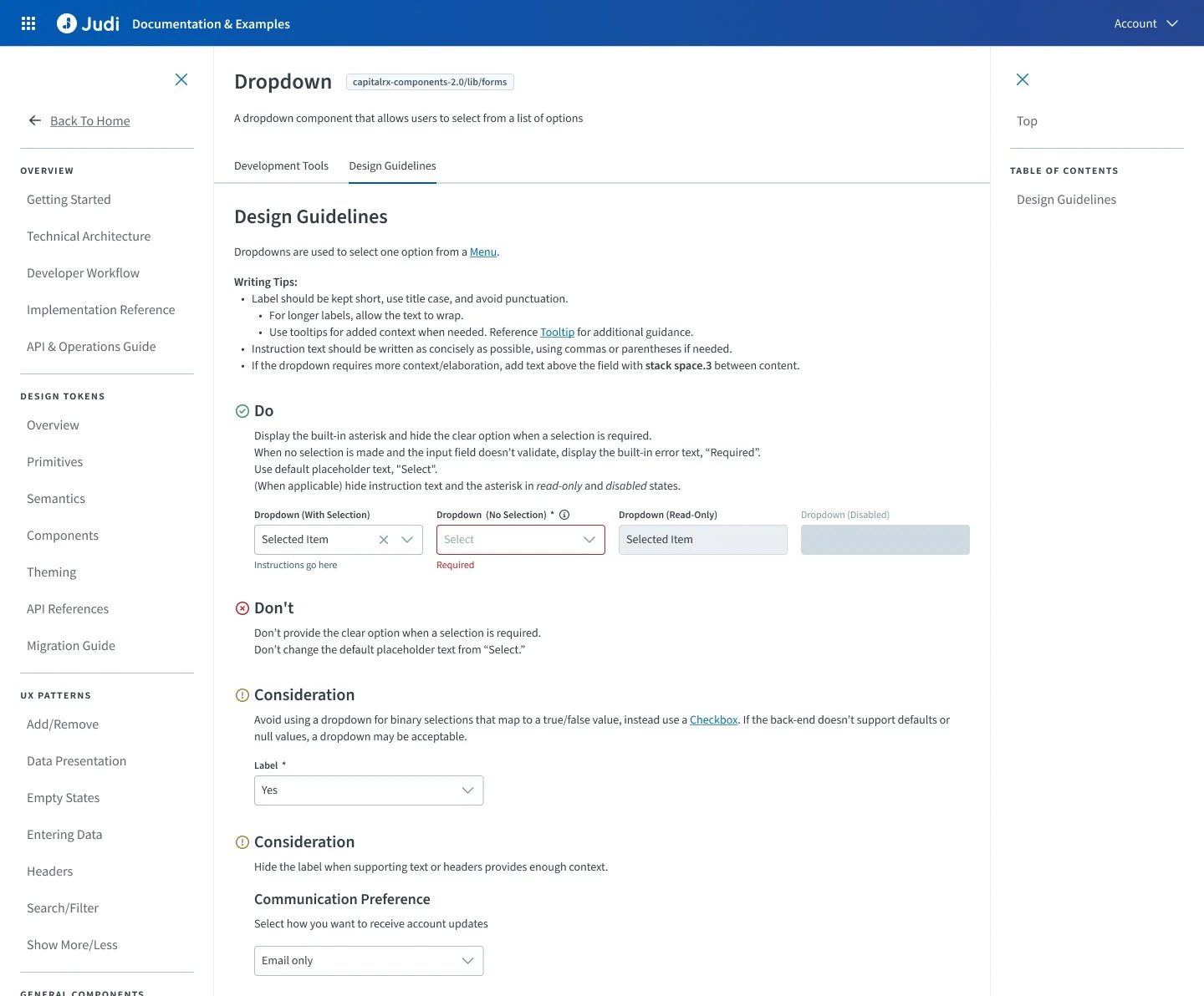
Specific usage rules, do/don’t guidance, and implementation considerations
This would give teams a predictable mental model for where decisions lived.
The breakthrough was realizing the handbook shouldn’t just document decisions—it should standardize how decisions get made across teams.
Defining Templates
We intentionally limited interactivity for MVP and prioritized clarity over complexity.
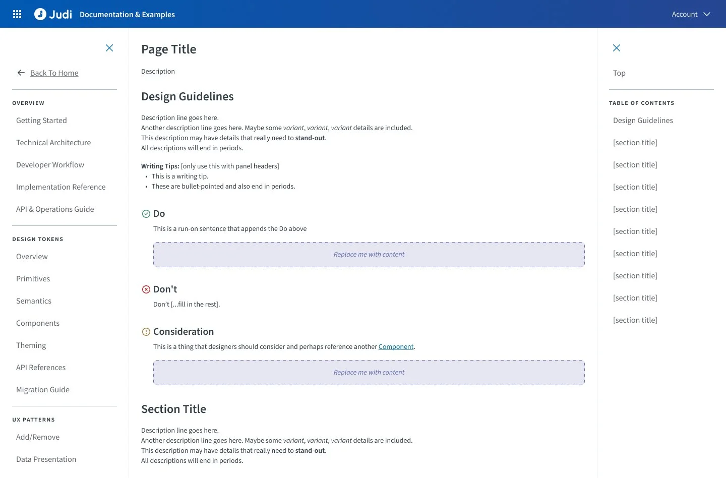
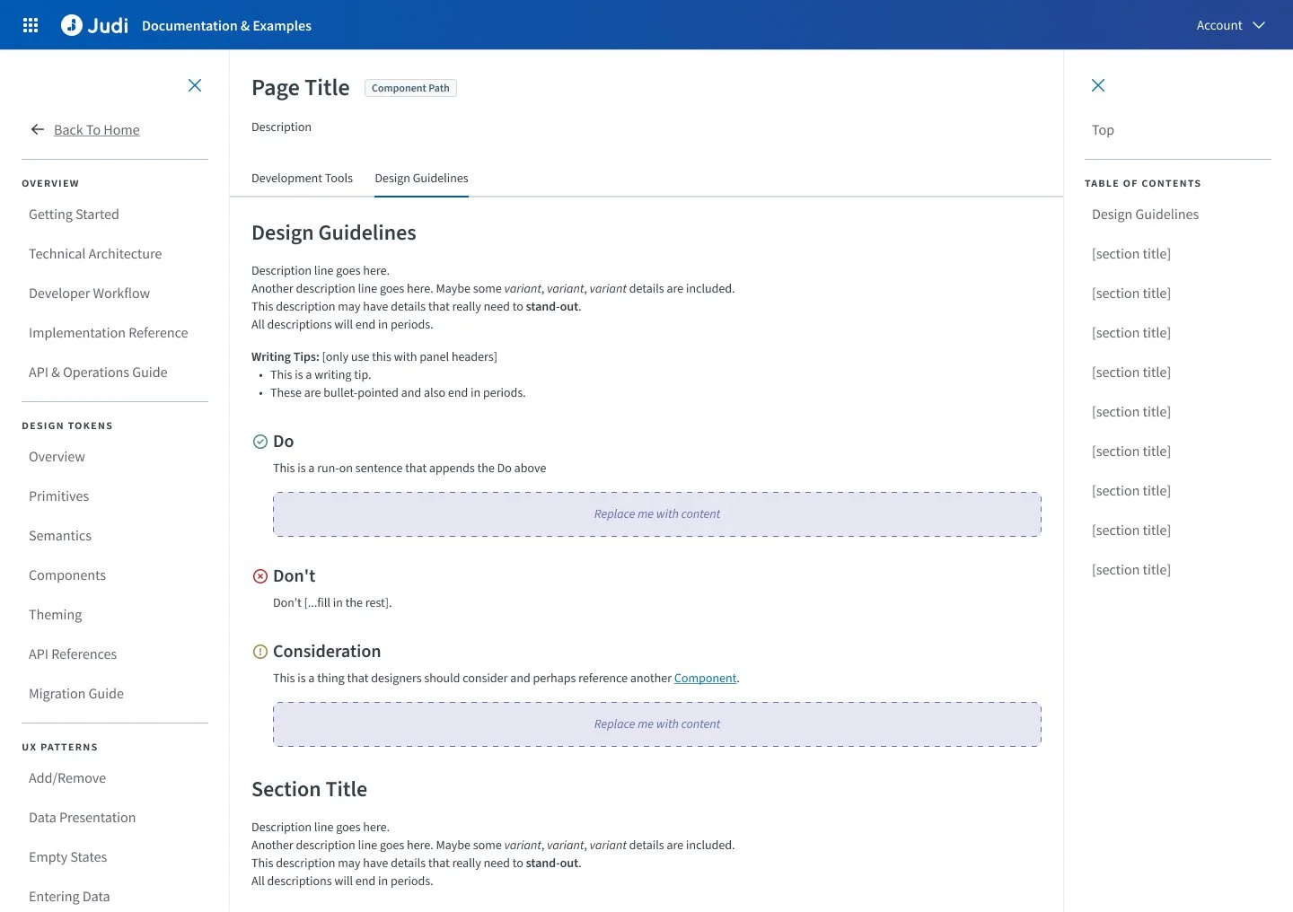
Rather than building highly custom documentation pages, we focused on reusable templates for:
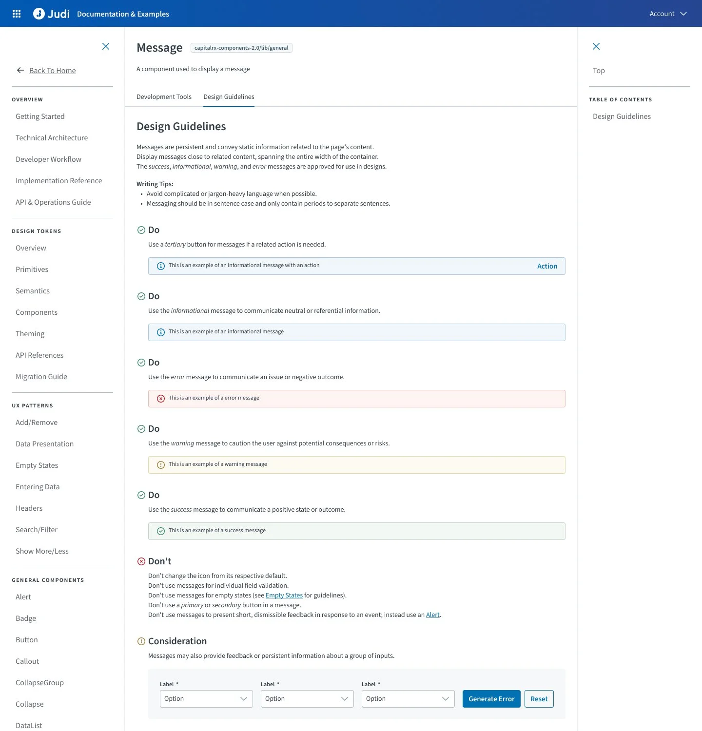
component usage rules
do / don’t callouts
considerations and exceptions
codified examples paired with explanatory guidance that would encourage designers to inspect the page thus bridging the gap in developer-designer communication
We also made a deliberate decision to avoid creating new documentation components where existing ones could be adapted.
The goal was consistency, not more maintenance.
This meant:
modifying existing components instead of inventing new ones
reducing duplicate patterns
making documentation easier to scale over time
The system needed to be lightweight enough to adopt and strong enough to govern decisions.
We divided ownership across patterns and components, working page by page to define:
approved usage and variants
do’s and don’ts
considerations and exceptions
implementation notes
writing standards
related component relationships
Part Three
Execution, Challenges & Rollout
Doing the work
Once the framework and templates were established, the real work began: auditing components, defining rules, and translating design decisions into scalable guidance.
Each page had to answer a simple question:
Can a designer make the right decision using this alone?
If the answer was no, the guidance wasn’t done.
The goal was not completeness for the sake of documentation—it was clarity for real product decisions.
This required constant review of:
existing component behavior
legacy patterns already in production
known exceptions and edge cases
engineering constraints
future scalability across teams
That meant challenging unnecessary customization, identifying patterns that needed to be standardized, and recommending updates where the current system created avoidable friction.
In several cases, the work required requesting component changes rather than simply documenting current behavior, because documenting bad patterns would only scale the problem.
This shifted the work from documentation into product standardization.
Keeping up with change
The hardest part of the project was that the design system itself was still evolving while we were documenting it.
Design language, palettes, tokens, and component standards were actively changing, which created constant back-and-forth with the design system team.
Originally, we approached documentation using highly technical language:
exact property names
token references
developer terminology
It was precise, but difficult for designers to use consistently and too fragile for a system still evolving. Additionally, it would have been redundant and slightly veered out of our lane. The main audience was the designer. We didn’t need to tell developers how to code, we just needed to ensure the development was consistent with our guidelines.
We shifted toward:
plain language
behavior-based guidance
directive writing
clear do / don’t decision frameworks
Instead of:
“Use the actionContent property with tertiary.large.unpadded”
We documented:
“Use a tertiary button when a related action is needed.”
This made the guidance significantly easier to adopt while keeping it flexible enough to scale as technical specifications evolved.
Some patterns also had to be created from scratch, requiring design lead alignment and design system collaboration before documentation could even begin.
This created delays, but it also made the work more valuable:
we weren’t just documenting decisions—we were helping define them.
Testing
At around 50% completion, we shared the handbook with design leads and used it during active design validation to test whether it could function as a real decision-making tool.
The goal was simple:
Could leads effectively use this to review work?
They could.
Feedback was minimal and iteration needs were low, which validated that the structure was working.
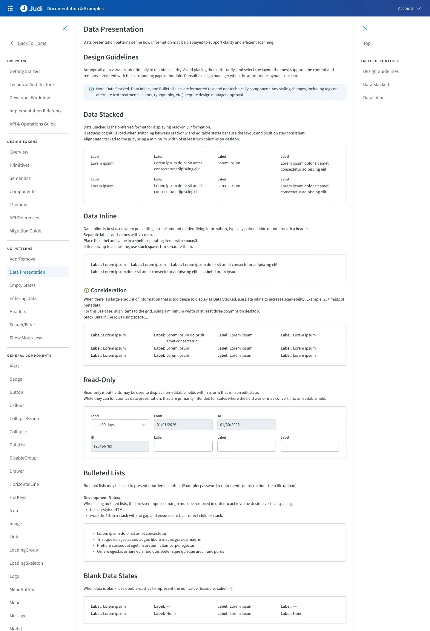
At around 80% completion, we released the Figma file to the full design team and asked designers to begin using the updated standards in live product work.
Again, adoption was strong and revisions were minimal because the guidance was already solving real friction points.
Long-Term Scale
To ensure the handbook could grow beyond the initial project, I also created a dedicated Confluence contribution framework for future contributors.
This established standards for:
writing structure
do / don’t formatting
linking related patterns
plain-language documentation rules
examples and implementation guidance
contributor expectations
The goal was consistency not only across product decisions, but within the handbook itself.
As adoption grew, we added another designer to help maintain and expand the work.
At that point, it stopped being a project and became an operating system.
Part Four
Reflection
The biggest success of this project wasn’t the handbook itself—it was creating a shared system for how product decisions were made. We established a clear reference point for component usage, interaction patterns, and product behavior across teams, which improved consistency, reduced unnecessary customization, and made design reviews faster and more predictable. Designers were able to use the handbook as a standard before lead validation, helping improve review quality and reduce repeated revision cycles across our Gold / Silver / None validation process.
The strongest sign of success was adoption—the handbook became part of the team’s daily workflow and continues to grow today.
Looking back
I would involve engineering and design leads earlier in the initial framework decisions to reduce rework and speed up alignment as the design system evolved. I underestimated how important that alignment was before documentation could scale—the hardest part wasn’t writing guidance, it was getting agreement on what the standard should be. I’d also formalize contributor guidelines sooner, since maintaining consistency within the handbook became just as important as the content itself.
The biggest takeaway was simple: if something is meant to scale, you have to design how it will be maintained—not just how it will be built.