jurni
Travel planning app
Planning a trip. Simply.
We've all been there... Excited to go on that vacation but when the planning starts, we freeze. When to go? Where to stay? What to do? It's a lot.
The jurni app looks to break down the milestones of the travel planning experience in a way that’s simple to understand and exciting to put together.
Challenge
Whether you're the type of traveler who likes to play it by ear, or who simply can't function without an itinerary (or somewhere in the middle) we'll agree there isn't a one-size-fits-all approach to planning a trip, and that wasn't the objective.
Role
From Research to Prototype, I spent eight weeks determined to eliminate as many possible obstacles and lay a foundation for travelers to plan their adventures in a relaxed, efficient and effortless way.
Part One
Research & ideation
Uncovering the truth
Specifically, my goal was not to tell travelers how to plan a trip but rather lend a helping hand or even give that push for those who have no idea where to start. With this in mind, the more obvious research I needed to gather were the existing difficulties of travel planning and the varying opinions of how to do it.
Secondary research
Before diving into my own research, it was important to dig deeper into the topic. Perspective was very important to me at this point and would later influence the direction of my project.
Blogs galore
In general, travel and leisure is easy to read and write about. Blogs were a great place to start and see what others thought about when making plans. Not surprisingly, there are people significantly more organized than I am when it comes to it. I'm talking excel/google sheets and more.
Overall, the blogs were mostly opinion pieces, which was perfect from a research perspective. The tone read like an interview and it was all subjective. I just needed to look for insights.
They included links to sites/apps they enjoyed and explained why.
Additionally, they would touch on their order of operations when it came to the planning stages. This was really eye opening reflecting back on my own trips and knowing that I could have planned some things better.
Mental health impact
I really wanted to explore the positives and non-stressful aspects of travel planning. As mentioned, my goal was to lay a foundation to the planning experience, this meant considering the users that enjoy travel planning even when they don't ultimately go on a trip.
This was extremely important to explore especially living during the COVID-19 pandemic.
I found a National Geographic article that explains travel planning and its correlation to mental health.
A 2014 Cornell University study delved into how the anticipation of an experience (like a trip) can increase a person’s happiness substantially—much more so than the anticipation of buying material goods.
[Travelers] “end up talking to people more about their experiences than they talk about material purchases... compared to possessions, experiences make for better story material.”
Amit Kumar, Assistant Professor of Marketing and Psychology at the University of Texas at Austin
Reading between the lines
Overall, the secondary research gave me an idea of where the limitations can be in every aspect of travel planning.
The most important insight I gathered was how people like to organize their planning from start to finish. Not only did it support that there is no one-size-fits-all approach but it ultimately inspired the milestones component of my final product design.
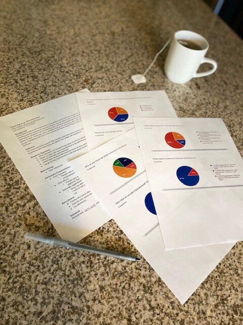
Research plan & screener survey
I'd gained perspective into the space of travel planning. I was ready to dig further and conduct user interviews.
I put together a Research Plan and Screener Survey to recruit participants.
I was looking for participants who traveled often or at least often enough to truly speak on their planning experiences and touch on the obstacles faced and how they overcame them.
Primary research
I was very passionate about the research portion of the project and while the interviews themselves were quick to gather, the insights were, well, insightful.
We'll save that for later. Right now I was really focused on the data.
Just getting started
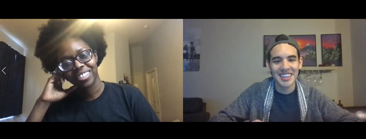
Screenshot of User Interview
Interviews
I sent out 10 screener surveys and of those 10, 8 responded of which I conducted 5 interviews.
Three of my participants traveled very often, whether it was with family or friends. One participant traveled often mainly solo and my last participant traveled both in groups and solo. This provided a great variety of experiences as well as a deeper look into group travel which was definitely something I was interested in learning more about.
I really just wanted to hear stories. So I led with that and their stories provided a lot of the information I would have gathered in follow up questions.
Some of the questions I asked were:
Where would they start when planning a trip?
How did they feel during the process?
If they accomplished their planned activities and if not, why not?
If they had any go-to sites/apps and what they liked about them
Where would they find the inspiration/ideas for travel?
How did they plan budgets, logistics, etc.?
Seeing the trends
There was a lot of information gathered in each interview session and most people had different preferences as well as styles of planning. Some loved planning and some really didn't. Whatever the case, they all looked forward to being done planning, and starting their trip.
Commitment issues
We've all been there... Dreaming about that weekend getaway or long vacation to another country, but when it comes to booking a flight, we hesitate.
This isn't to say that everyone hesitates. At the end of day, a lot of factors go into this such as budget, time off work, pandemics... You get the idea.
From my interviews, I gathered two types of individuals. Those who book the flight from the start, committing to the trip and those who plan the trip and book a flight later.
Again, there are a variety of factors that impact when that flight/car rental is booked but ultimately, the most successful plans came from the commitment upfront.
From just the general excitement of knowing there is "no going back" to possibly saving some money because it was purchased in advance.
This was another pain point for group travel. Unless everyone purchased a flight right away, there was always a question of whether or not some travelers would make it.
Blogs. We love blogs
Like I said, people love to read and write about travel. It's incredible how much of a resource blogs are.
Of my interviews, most users enjoyed reading blogs to some degree. From just putting them in the mood to travel to planning activities around what they read.
Some blogs aren't limited to just destination details, others provide tips and tricks into the logistics around planning, packing, etc.
Figuring out what to do can be rough
Most of my participants have different ways around planning their activities.
The most successful vacations came from an initial list of general interests but nothing concrete. These users would map out the locations of their interests, figure out accommodation, then create some sort of "itinerary" thereafter.
This was interesting, because even though that seems logical enough to stay around the activities that you want to do, most travel sites will lead you to purchase a flight and accommodation at the same time.
This ultimately helped with the order of planning phases in my design.
Users also agreed that group travel is not easy to plan. In every aspect, the biggest pain points are communication and participation. In general, activities are hard to plan when everyone's priorities differ.
The other stuff
A common theme I gathered from the participants was that packing came last and almost all of them forgot items until they were on the trip.
Granted, some items aren't difficult to purchase on location, but it's definitely not ideal.
Another common trend was not minimizing risks or planning logistics in time, if at all. I didn't know myself what that even entailed until I conducted my secondary research. I asked participants about them as well to gauge their knowledge and most blanked.
Risk Management refers to a variety of things such as:
Travel Insurance
Important Documents (Passports, ID's, Visa's, etc.)
Vaccinations/Medicine
Etc.
Logistics refer to the nitty gritty details around a plan.
For example: The logistics around visiting a museum are knowing the museum hours, entrance fee, travel time from hotel, etc.
Many participants don't think to plan for this or think about them last minute (on the trip). One of the participants even had a hard time getting into a country once without the proper visa.
The discovery
Solidifying my goals of the project which was to find a way to facilitate the planning process rather just make the plan, the interviews also presented a lot of other obstacles I hadn't previously considered.
There is just so much that goes into travel planning, and every person is different in how they do it. Ultimately, this defined the scope of my project. I realized that while I wasn't going make all of these problems disappear in 8 weeks, I had a huge opportunity to get creative and at least guide users through the key and familiar processes without making them think too much.
Digging deeper
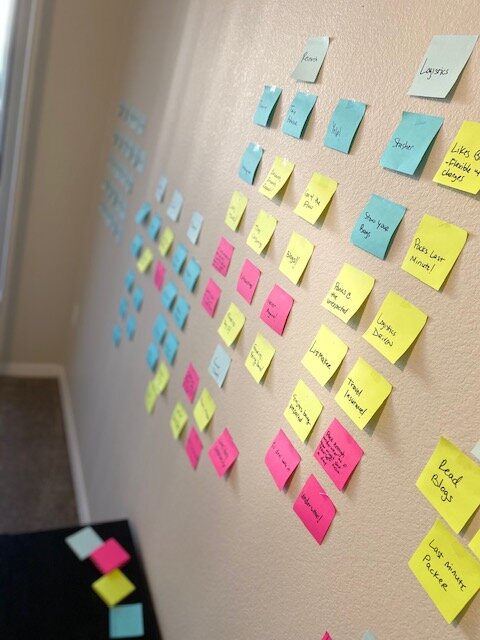
Writings on the wall
I had a lot of data now, more than I imagined. The next step was to synthesize and prioritize the information with an affinity map.
Synthesis & mapping
This stage was very exciting for me. I re-watched, read and listened to my interviews and identified all of the trends that I could. The above image is a much (much) more condensed image of the initial insights gathered.
A lot of them were very similar. Most people struggled with the same things and those who didn't struggle too much had simply developed greater skills from past obstacles. They had created solutions that I was able to learn and ideate from.
Start to finish
Every user had a slightly different approach to their order of operations.
If they didn't start with a "Destination", they would start with a "Budget".
If they didn't end with "Accommodation" they would end with "Activities".
Those two actually would mainly come one before the other. As I had mentioned from my trends, the most successful vacations came from "Activities" then "Accommodation".
All the apps
Some users had their own "Travel" folder on their phones. Each site/app had their purpose of course, but most fit a "Budget" objective.
From tracking flight prices with "Hopper", to multiple search engines for hotels/rentals including, but limited to "Orbit", "Hotels.com", "Kayak", or even just "Google".
From an Inspiration standpoint, users loved "Pinterest", "Instagram", "Airbnb", and of course, Blogs.
One user even had "Stasher" to place their luggage in a secure location while they waited to check-in to their accommodation.
General thoughts
"I love to plan as long as I have time!", "I have a love/hate relationship [with travel planning]", "Exhausting", "Too complicated", were some of many thoughts that came to mind when it comes to travel planning.
These ultimately helped shape my user "types" but also many quotes were problems that I wanted to solve.
Who was I designing for?
The easy answer to this was "Everyone", but realistically not everyone needs a guide to travel planning. A couple of my users could easily continue planning like they do and would be just fine, but I definitely aspired for at least an "all-in-one" platform for them because while their structure was highly effective, they still had a lot of information floating around on different sites, notes on their phone, one of them even had a physical binder.
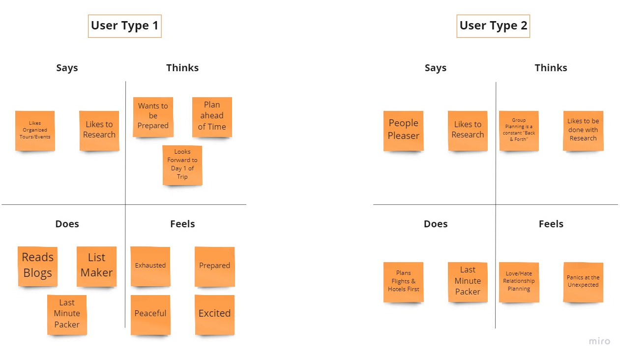
So, with that in mind, I had two users I would ultimately design my product for.
User One (1) would be the type that enjoys the research, they love to make lists and feel the most excited when planning. This same user is also highly organized and likes to plan ahead. They aspire to the first day of their trip, because they get to put their plan into action. They just need somewhere to store their information, and they need to track their progress.
User Two (2) would be the type that says they enjoy what User 1 does, but they really aspire to being done with the planning rather than the planning itself and also panics at the unexpected. This suggests they have experienced the "unexpected" more than once. They just need structure and they need to enjoy it.
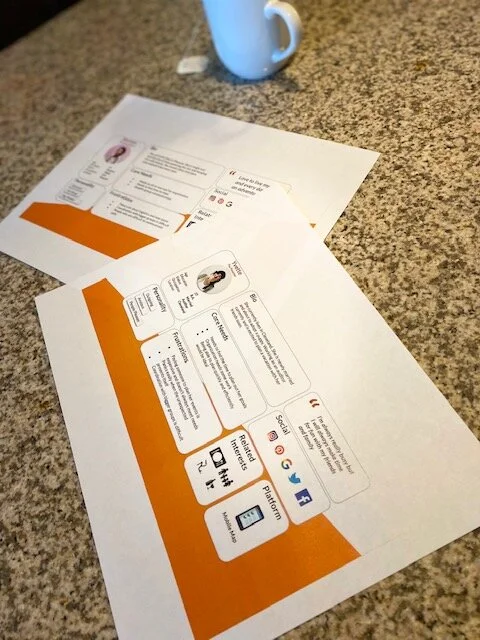
Personas
User 1 and 2 needed names!
Shereen, the "Overachiever" and Yvette, the "Panicker".
It was important to have these personas now before moving forward because I was designing for these specific people. I wanted them in the back of my mind at all times, I wanted their needs to be met and I wanted to help ease their frustrations as much as possible.
Shereen was all about the adventure but needed some simplicity in her thought process. An "all-in-one" platform would be ideal for her.
Yvette was very busy so planning a trip needed to have structure, efficiency and she needed to enjoy it. A platform that could "track" her progress while breaking the process into phases/milestones would be ideal for her so she wouldn't feel overwhelmed.
How Might We…
It was time to narrow down the problem statements I was looking to solve.
A couple of the statements included were:
How might we... (HMW)
… create a fun and interactive way to help organize the planning process?
… drive a living and active “list” of needs/wants throughout the entire planning experience?
I started thought jogging some possible solutions. They were more so "feature oriented" so I didn't immediately design for most of them but a couple would meet initial sketches as well as evolve over time.
Creating a vision
User stories saved my life
Focusing on my HMW statements, I started sketching some possible solutions.
I got a little ahead of myself here and looking back, I would have liked to slow down in my thought process.
I was too excited to "design an app" and while it didn't set me back too much, I ultimately didn't bring all of this to life right away so focusing on just the bare bones of the solutions would have been better.
The details in my sketches were so specific that they later translated too identically in my initial wireframe draft so this phase of my project wasn't the best.
My User Stories, however, really helped shape my intentions and was truly what saved me from moving too quickly.
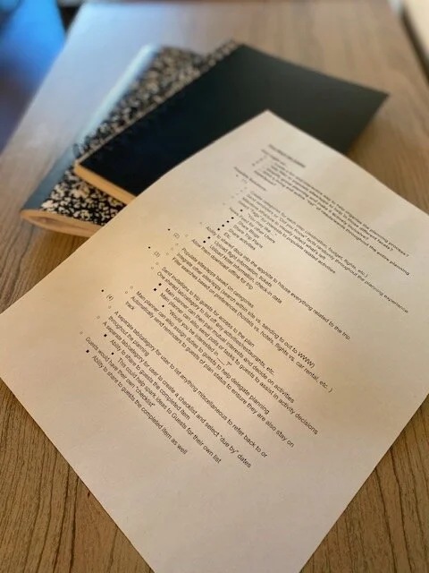
Prioritizing them was extremely helpful because I would only focus on the high priority functions in my initial MVPs (minimum viable product).
User Stories (High Priority)
As an... Amateur Traveler, I want to... guide my planning experience, So that I can... ensure I don’t miss anything before my trip(s)
As a... Savvy Traveler, I want to... track my planning stages in milestones, So that I can... monitor what all is left before my trip(s)
As a... Savvy Traveler, I want to... store all of my information, So that I can... effectively monitor and locate important details
Part Two
Red routes, wireframes, branding/Hi-Fi design, usability tests & redesign
Calm before the storm
Having a much more concrete idea of what I was designing and who I was designing for, I was ready set a foundation.
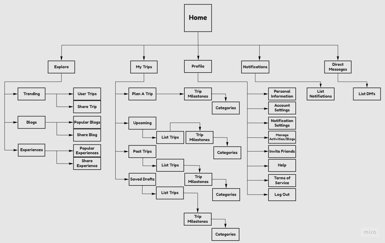
Inspired by the sites that my users were comfortable with such as, "Pinterest", "Instagram", and "Airbnb", I took the simplicity of their navigation and worked from there in my site map.
I specifically wanted a few key functions that they would use to navigate the app. These were Explore, My Trips and Profile.
I worked from there to figure what all would fit within those categories and was sure to include Direct Messages and Notifications. These functions would be ideal to house travel specific conversations and reminders rather than texts, emails or group chats.
The essentials
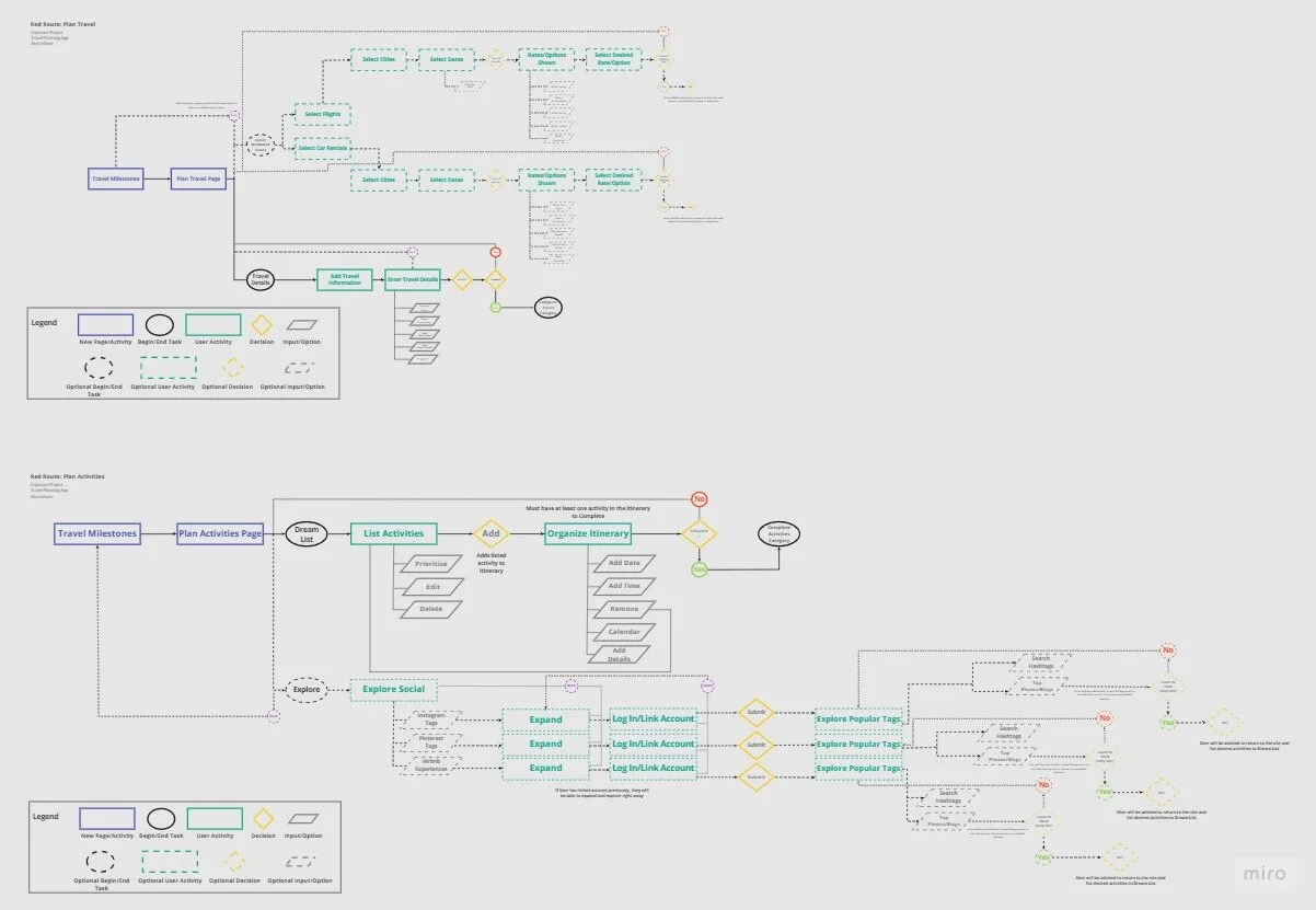
Considering the scope and time constraint of my project, I wanted to start with two user flows that would be practical, essential and that I could use as a base throughout the continuous design of the app.
At first, I considered one complete user flow for the entirety of the planning process. However, this would take much longer and definitely would have required additional research and possibly more user interviews to develop effectively.
So I focused on one flow that most users would already be familiar with, which was the process of searching for flights/car rentals to their desired destination and housing those finalized details in the app.
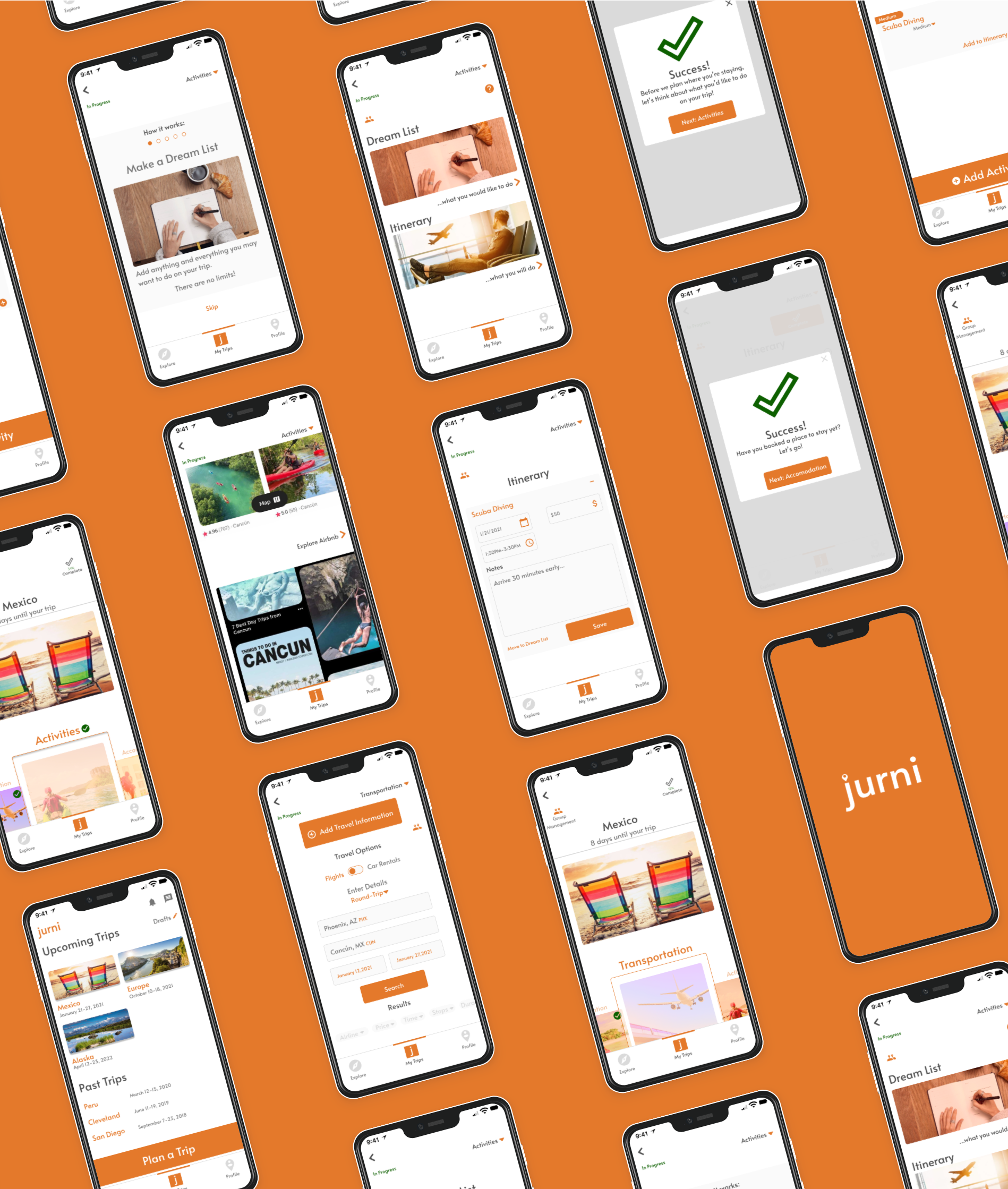
The second flow was more creative and most important in solving a problem. This was the process of creating a list of desired activities called the "Dream List" and later creating the final Itinerary for the users trip.
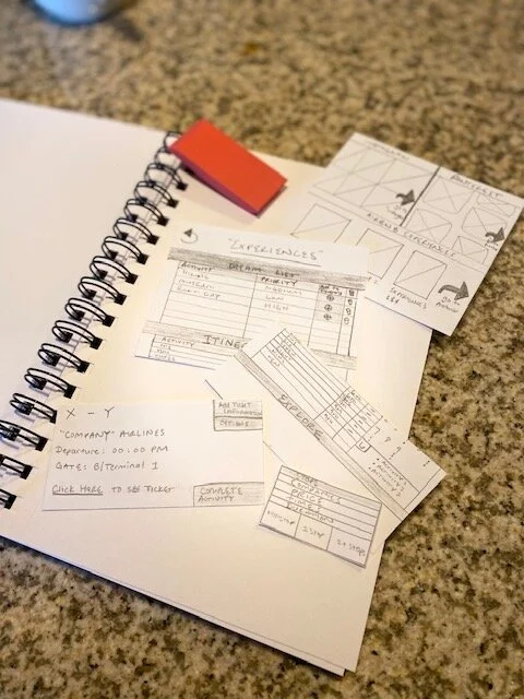
Sketches
I had worked ahead of myself on my ideation sketches, however, they had enough detail that I could use them as a "template" so I got a little creative with the visual flow.
I created mini sketches and literally cut them out of my journal and placed them on my existing "templates" reflecting the user flows page-by-page or feature-by-feature.
This only worked because I had spent the time on my sketches before I needed to (during ideation) and needed to save time so I may not use this method again for future projects.
Key features
It was important to address some of the problems I gathered in my primary and secondary research. The user flows I was addressing were "Transportation" and "Activities".
Aside from those, I incorporated the milestones/phases of the planning. This would include (in this order):
Destination > Transportation > Activities > Accommodation > Logistics > Risk Management > Budget > Packing > "My List"
The users wouldn't have to follow that exact order, but the design would ultimately guide them in that order.
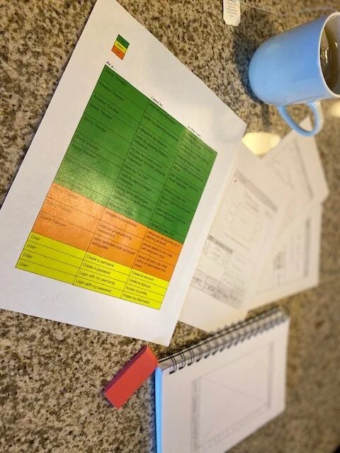
Completion status
The first component I wanted was some sort of label to identify their completion status. Essentially for every individual phase of the plan, upon completion, the milestone would reflect that it's done with a green check mark and there would be a completed percentage that would update as they work through the plan.
Prioritizing dream list
For the "Activities", the users would have the ability to prioritize their "Dream List" from Low to High which would assist in finalizing the Itinerary. This would also help with Group Travel.
There will be a Group Management feature at a later time, but for now the priority feature would help gauge importance and ideally meet the groups desires and expectations.
Explore
As I mentioned, users enjoy blogs and use several social media platforms to inspire and plan their trips.
I would include an "Explore" page that would allow users to see other existing trip plans for inspiration, read blogs and even find experiences (activities, tours, etc.).
There would also be the ability to link social media and explore "Pinterest", "Instagram", and "Airbnb" directly on the platform.
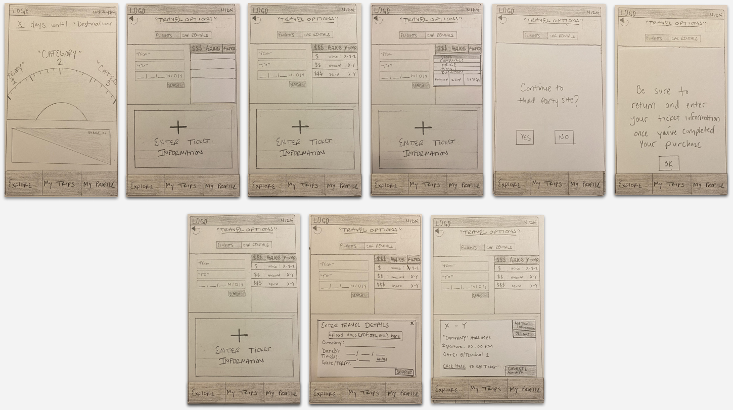
From paper to screen
Wireframing
I was very excited to transfer my sketches to screen. Using figma, I began designing my layout. I really focused on size and spacing and without changing any of my user flows, my sketches evolved immensely.
Bringing vision to life
Naming a masterpiece
Branding the design wasn't easy. I spent more time than I needed to come up with a name and quite honestly will go back and change it in the future.
I had considered many names just to have one and came upon something simple: Journey.
It was in line with the tone of my project while staying true to the concept of enjoying the process.
I had more fun with it and gave it non-traditional spelling: jurni.
This was unique enough, as well as inviting because it was all lowercase.
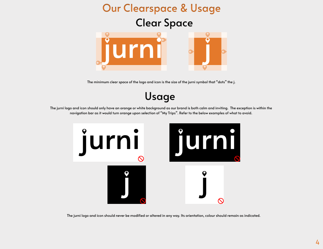
Creating a logo was a whole other ball game though. I had a lot in mind and eventually set on the idea of using the popular location icon to dot the "j".
Later, after finishing the project, I came upon a travel agency that used the same logo concept and is named “journy” and even used the location icon to dot the "j".
This reinforces that I will very likely rename the product but given the style differences and service provided, "jurni" serves its purpose at this moment.
The vision and personality
jurni looks to break down the milestones of the travel planning experience in a way that’s simple to understand and exciting to put together.
Rationale
The purpose of this vision is to tell our users that we understand what normal travel planning may look like and that it may be stressful or difficult. I created a product that will simplify the process and has an efficient personality that is also passionate and eager to help our users.
Attributes
Relaxed, Efficient, Effortless and Determined
Our products' relaxed nature is contagious to our users. It's efficient in its experience while effortless in its use, all while being determined to deliver a great outcome.
Setting the mood
I was determined on an inviting color from the start. I knew a warm color was great for this. So while searching several sites like dribble, I found several inspiring color palettes in addition to great imagery such as the one of the person sprinting in front of a sunset.
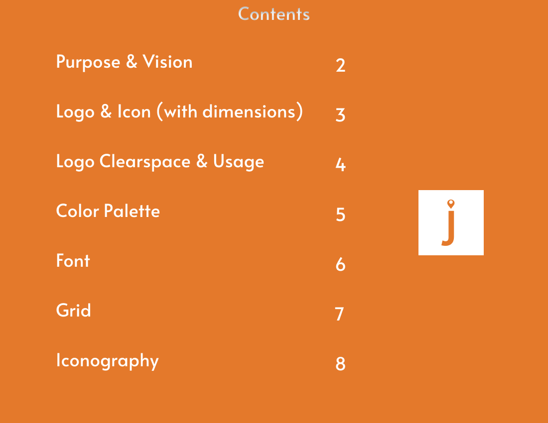
The style guide
I struggled with the style guide for several days. Primarily because it was so outside of my comfort zone and knowledge. UI is absolutely a skill that would take much more time to develop so while working on this, I had opened many style guide examples to help guide me.
I realized that many companies incorporated their vision into their style guides so I needed to start there to really kick my mind into gear with the specifics (size, fonts, grids, etc.)
Creating a Cover Page and Table of Contents were the first thing I did and once I finished the "Purpose" page which included my brand vision, everything else came much more naturally.


Giving it style
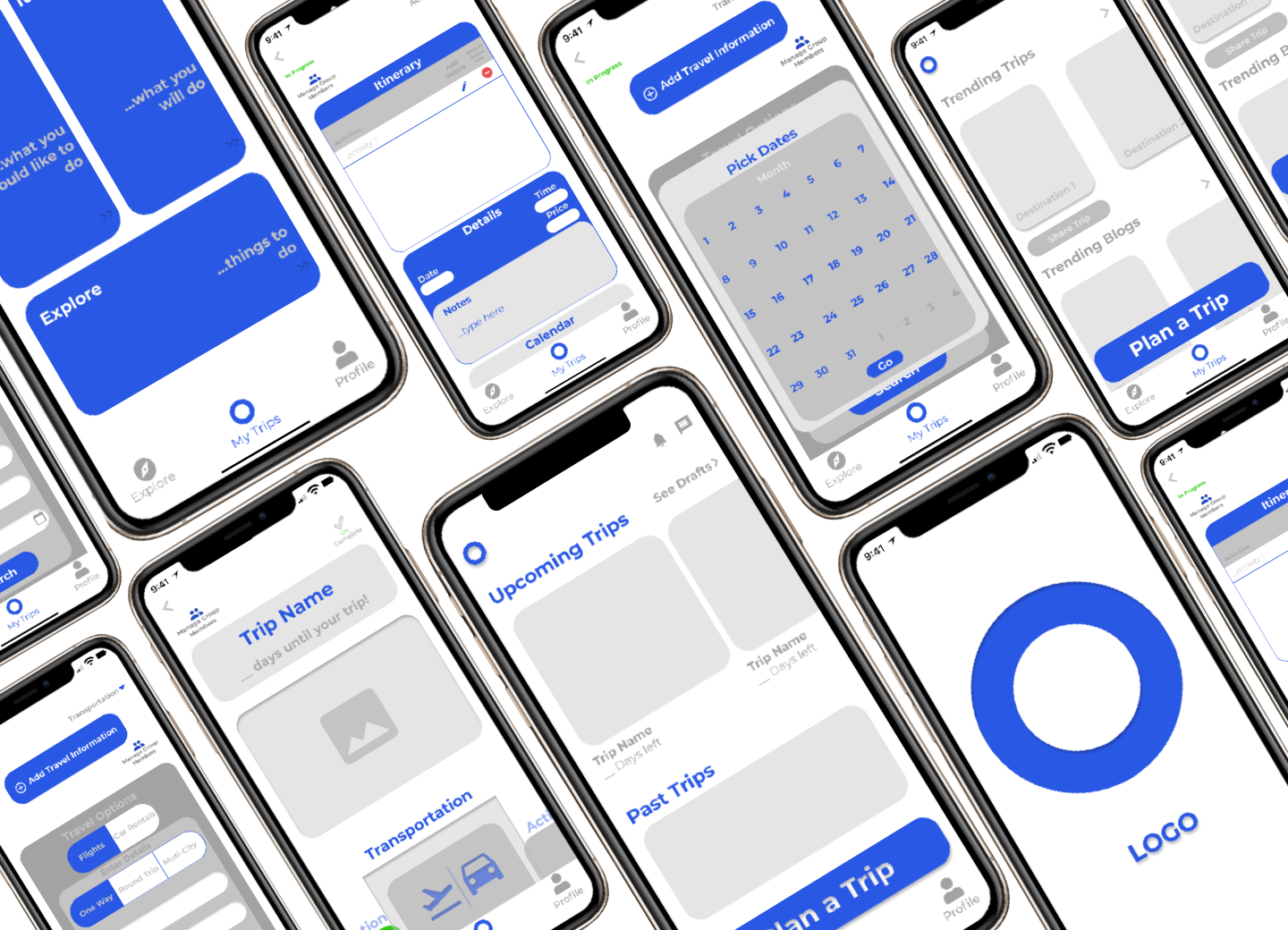
High-fidelity designs
jurni looks to break down the milestones of the travel planning experience in a way that’s simple to understand and exciting to put together.
Keeping it simple
While implementing the style changes, especially when it came the colors, my initial wireframes leaned heavily on overlapping boxes and pages. This would have required a few more shades of colors but was also just very busy.
I simplified this by giving certain sections their own screens.
For example: In the Activity phase, I had originally placed the "Dream List" and Itinerary on the same page. I even included a Calendar to help visualize the activities per day. This was a lot to look at so I later designed a page dedicated to each function and scratched the Calendar completely.
This was cleaner, more interactive and led me to create an instructions flow to help guide the user through the process before diving in.
Even simpler
My wireframes also included very heavy curves for each box or input field.
I made these more subtle as I worked through applying the style changes.
Additionally, my wireframes had considered little to no imagery.
I incorporated a lot of imagery inspired by my mood board especially to identify the Planning Milestones and on my Explore Page.


Prototype
The next step was to build the prototype and test the design. The main user flows were the phases for "Transportation" and "Activities", and I was ready to test them out an gather feedback.
figma Prototype Flows
Planning to test
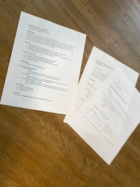
Before interviewing began, not only did I test my prototype several times, I also put together a Testing Plan just as I did with my Research Plan for primary research.
This time I wanted to answer specific questions:
Can users navigate through the milestones intuitively?
Is creating an itinerary/planning activities simple?
Is the familiar process of purchasing flights/car rentals clear?
Is the style inviting?
These weren't questions I would ask them directly. I put together tasks for them in hopes of answering these question myself from their navigation.
I had four specific tasks for them that I would word in several parts for clarity. These tasks included:
Search flights to a destination
Add purchase information to the app
Plan something to do on the trip
Link social media to look for things to do
Moment of truth
I used the same pool of participants from my screener surveys to test the prototype but swapped out the two I didn't initially interview.
I was more specific with the tasks to provide realism. Such as choosing "Mexico" as the destination they would work with and "Scuba Diving" as the activity they would add to their trip.
I gained great feedback overall and almost all of my answers were what I was hoping for.
However, there were definitely minor changes I needed to make as there was slight confusion with planning activities and linking social media.
Testing Plan and Usability Issues
Synthesis & redesign
Improving the activities milestone
Overall this section was easy to complete and very clear once the users dove into the sections.
However, all of the users needed additional direction to review the instructions because it wasn't organic in the design.
Previously, I had a question mark icon to guide them, but it wasn't obvious and they weren't inclined to tap it.
Without losing the button, I just added a flow for the instructions to come up immediately at first-time entry with the ability to skip it if they so choose. After the initial entry, the instructions would only be accessed by the question mark icon.
Self-navigation
Now it was important to consider the users who would navigate without instructions.
In my initial design, the users would need to add to their "Dream List" in order to add to their "Itinerary". The itinerary would simply remain blank with no possible actions.
So what would happen if they tried to add to their "Itinerary" first?
I added a simple "Add Activity" button just as the "Dream List" had and if they didn't have enough detail (date, time, etc.), jurni would add the item to the "Dream List" until they had more detail to efficiently place it on the itinerary.
Linking social media
When I provided the task to link social media to search things to do on their trip, the natural reaction was to either navigate the "Explore" page or "Profile".
This was previously part of the Activities page also titled "Explore". I ended up removing the section from the "Activities" page all together and will incorporate to the "Explore" page at a later time.
I also will incorporate linking their social media to an account creation flow when initially downloading the app with the ability to skip and add to the "Profile" page at their leisure.
Too simple
An unexpected result was that it was too simple to complete the planning phases. This is positive problem, but it needed addressed.
For example: The user would add "Scuba Diving" to their itinerary and would complete the Activities phase right away.
More than likely, Scuba Diving may not be the only activity they'll participate in, so I added a pop-up screen to confirm before officially completing the phase allowing them stay and keep working.
“This is so cool! I always have the issue of wasting time. This is amazing!”
— Real User Feedback
Part Three
Looking back
Considering the complexity of the project, I was really happy with all that was accomplished and proud of the reception from my usability testing.
I really wanted everything to be clean and efficient. As I mentioned throughout the process, there were a few hurdles that I eventually overcame.
The style guide for example was difficult to start, but by reframing my thinking and buying into the product when revisiting the brand vision, I was ready to move forward.
Overall, the experience was great and I plan to continue developing this product further and I truly look forward to that jurni.