e-Builder Mobile
Mobile app redesign
Product
e-Builder is a construction program management solution that manages capital program cost, schedule, and documents through a world-class workflow and business intelligence. e-Builder is a complete solution designed at its core to deliver control and reduce surprises for owners of capital program.
Challenge
The e-builder mobile app is geared towards field construction users. In its current state, the app is built on top of a web development environment. This is an older way of creating mobile apps, and we wanted to get away from that and build the app “mobile-first” without depending on web software architecture. The goal was to design a fresh look with modern UI elements while also improving the UX throughout.
Role
I was responsible for the end-to-end design of this initiative. While I collaborated with my UX team for feedback, I was in charge of the research, high-fidelity designs, usability testing, delivery, and development support through analysis, refinement, and release.
Part One
e-Builder app critique
Initial review
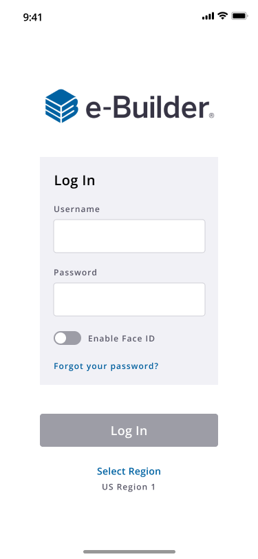
Before redesigning the interface, it was important to review the current app’s functionality, visual design, interaction design, and usability.
When it came to the UI, I analyzed the patterns, inconsistencies, usage of color, typography/iconography, and affordances.
There were several things that would change in terms of the visual interface once I started to apply the newest components from our parent company’s style guide.
From a hierarchy standpoint, I reviewed the layout, information architecture, and grouping/order.
The app wasn’t difficult to navigate per se, but because of the outdated look, there were several assumptions a user would have to make in order to accomplish certain tasks.


Part Two
Breaking down phases
Phases of the redesign
I was excited to get to work. The goal was to spend the next year swapping out the new components and improving the user experience along the way. In order to do this effectively, I broke the app down into several testable phases based on the modules and this would also help track the progress more efficiently on our UX Kanban board.
Phases:
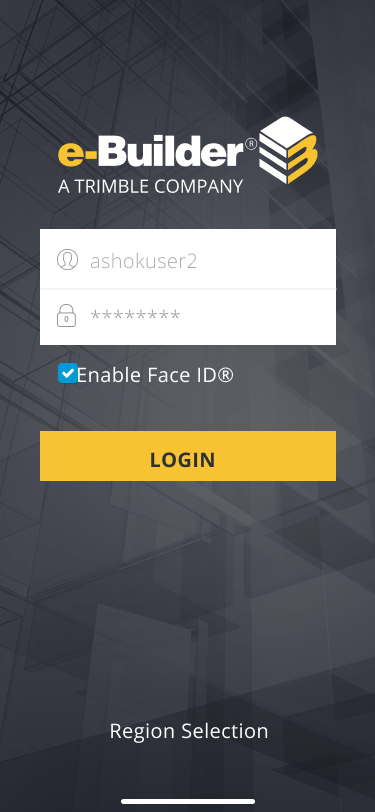
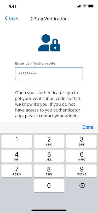
Login
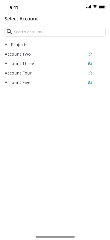
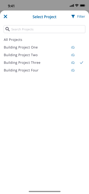
Account/Project Selection
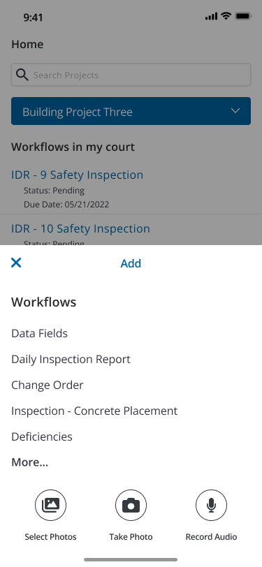
Quick Start/Add Menu
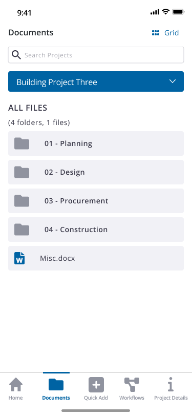
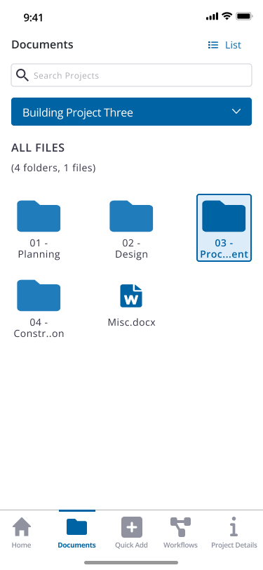
Documents Module
More Menu
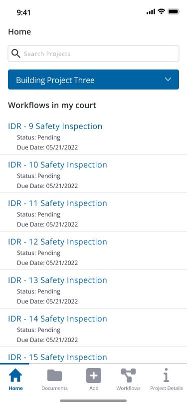
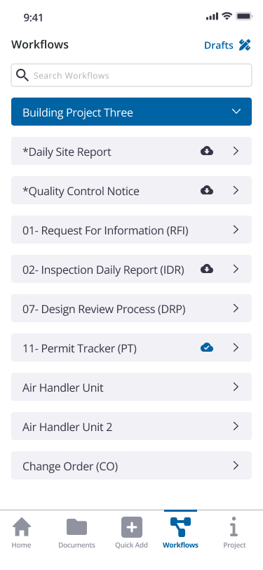
Workflows
Unexpected organizational changes
Soon after establishing a plan for the app redesign, I was ready to dive into the first phase (login).
There were changes in the organization that meant breaking up our sector separating the owner side which was where our app belonged. This change impacted my team directly as our Product Manager had to shift to another product.
This meant that our traditional process was tweaked quite a bit. Typically, we would have the opportunity to gather designs and then establish user stories/BDD’s (Behavior Driven Development) for our developers.
Since we would lose that PM, the next few quarters were very autonomous on our end so we worked in reverse establishing “preliminary” BDD’s before the designs were even started. These requirements would help establish parameters in the design so while we knew we would eventually have to come and change them/split the epics up further, this helped shape the scope right away.


Usability studies & iteration
Once the design was complete, I conducted five user studies with clients to gather insights for iteration.
For the login experience, there were minor changes made primarily to the error messages and other body text but the biggest win was validating the importance of a password reset link. Several users would simply login through a web browser most of the time or reset it there. Adding that streamlined approach in the app was deemed extremely useful.
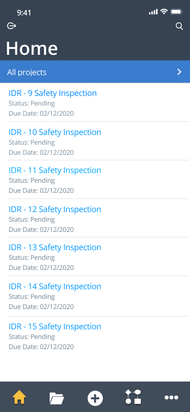
For the account/project selection experience, the open search bar was validated and users took advantage of it quite a bit. A lot of feedback was gathered for future enhancements such as sorting, etc. One additional change was made and that was to swap the page header that originally read “Home” to the actual account title and this was to further confirm the user’s account selection on the prior page.
I added labels as well to the original stand-alone icons such as filter and log out and replaced a chevron with a more appropriate close (X) icon now that the project selection was shown as a modal. I also added labels to the main navigation menu which previously were stand-alone icons.
For the add menu/navigation bar, the changes made were mainly stylistic. The few iterations made were label changes and adding industry terms that needed to be more universal.
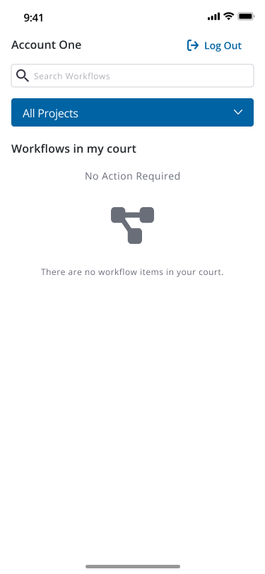
The main navigation and logging out process were items I was interested in gathering more information on. The last tab was originally titled “More” and the log-out button would live on that page alongside the details (location, important contacts, etc.) The details were on its own sub-page as well and the “More” was really very purposeless.
For the documents page, the changes were also stylistic, but I did take it upon myself to introduce toasts as a new component to the mobile design system. Toasts weren’t even remotely under consideration and I had to establish a case against generic iOS notifications being the only form of messaging in the app. This wasn’t difficult by any means, as once the scenarios were drawn up and accessibility came into the conversation, it was a no-brainer to customize these elements, and since messages were already designed in the style guide, referencing a library wasn’t too much of an effort. We established success, error, warning and information toasts.
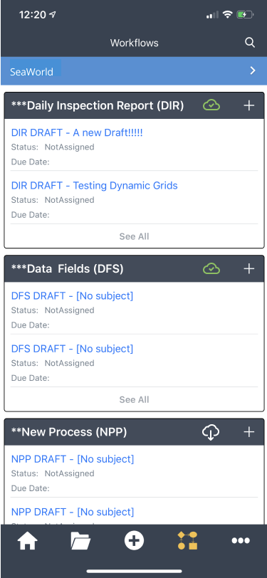
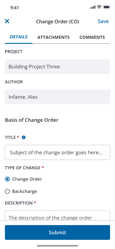
For the workflows page, there were several enhancements to the module from a design system implementation aspect and only a handful of flow changes.
Though there were several enhancements to the module from a design system implementation aspect, there were only a handful of flow changes. To my surprise, there was very little iteration after testing. The fact of the matter is that the current app itself wasn’t favored to accomplish work and very commonly the users would be surprised that certain features existed that weren’t new at all. This was great to hear in the sense that any changes made were low risk and could guarantee an increase in adoption.
Part Three
Looking back
This was a long year of research and design to bring the current app to date. There were several challenges along the way that required a certain level of creativity on my part. Not having a PM for most of it meant a lot of self-prioritization and agreeing on certain business requirements collaboratively with developers.
Additionally, having a beta mobile design system came with its own struggles. There wasn’t and to this point, still isn’t a lot of standardization for mobile components so this meant being very flexible with certain changes along the way and meeting in the middle with the team.
Lastly, this project was heavy on UI and limited me in terms of new research so I had to take advantage of the usability studies to really inform the following phases. This turned out to be okay given the low risk of redesigning the new app, but all in all, the challenges were there.
I look forward to continuing enhancements and establishing success metrics to truly track performance from an analytics standpoint.