Bulk Response
WorldShare® (an OCLC product) modernization enhancement
Product
OCLC is a cloud-based program that offers an integrated management of library workflows. It’s product, WorldShare Management Services (WMS), allows library staff to draw on OCLC's shared data network and technology for more efficient workflows.
WMS also enables staff to better manage resources in all formats and to provide their users with improved access to the library's collections and the world's knowledge. The Interlibrary loan (ILL) module of the platform automates borrowing and lending processes through OCLC’s resource sharing network of 10,000+ libraries, the largest in the world.
Challenge
Currently, there is an initiative to introduce an updated look and feel to WorldShare ILL’s most action heavy features while maintaining as much of the existing workflows in order to accomplish tasks seamlessly in the transition.
When tackling the “batch response” feature of the module, we discovered a lot of the existing functionality needed enhancement from both a usability perspective as well as overall accessibility.
Role
I was responsible for the end-to-end design of this initiative. While I collaborated with my UX team for feedback, I was in charge of the research, high-fidelity designs, usability studies, delivery, and development support through analysis, refinement, and release.
Part One
Exploring existing functionality
Batch actions explained
In a nutshell, WorldShare ILL is handling library requests from either/or both the borrowing & lending side. This means that a library institution is either providing the requested item(s) to a patron or they’re asking for it (on behalf of the patron) from another institution.
Depending on the size of the library, it’s not uncommon they receive a plethora of requests and in some cases, they can take bulk action on those requests at certain stages of the workflow.
Stage may include:
Marking requests as “Reviewed”, “Returned”, “Lost”, “Canceled”, etc.
Advise borrowing libraries if requested items can be supplied (i.e. that the items are available to lend)
Etc.
Existing issues
No logical tab order and not keyboard accessible at all (Failed most recent VPAT)
Ignores buttons, links, etc.
No labeling or unclear labeling for screen readers
Behavior isn’t clear as there is no intuitive or explicit direction
Preliminary research indicated that most users don’t use the function as they don’t know what it does or it fails to accomplish their needs
Easy to hit dead-ends where the user would need to start over or be forced into taking undesirable action
Example: If the user selects multiple items and decides to change the “response”, all items are deselected automatically
Defining success
How might we...
... maintain the ease of taking bulk action on their requests while mitigating the risk currently involved?
... enhance the functionality of taking bulk action without users having to “re-learn” the product?
Desired state:
More user control (increase batch limits, allow for “response” changes)
Ease of use (Maintain behavior but remove “noise”)
No dead-ends & add emergency exit (Progressive disclosure and finding a way “back” to where they came from)
Product considerations:
Maintain current functionality but explore expanding the code where possible
Modernizing the look
How do we…
... allow users to see all of their selections in one area, while still allowing them the freedom of navigating the data grid that may contain hundreds of requests?
... promote focus on the job they’re performing?
The first step was to swap YUI (Yahoo user interface) for Material UI (React) components.
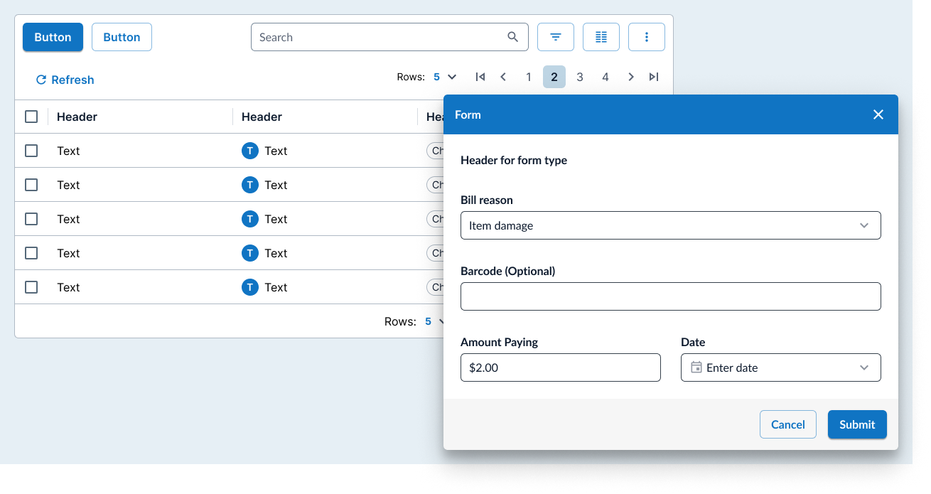
Generally speaking, we wanted to create a “workflow” pattern so the main components were a data grid and a dialog form.
This page is technically a “queue” so the data grid behavior was appropriate to keep as-is, however, the bulk actions of the items isn’t as straight forward in the traditional sense. In other words, we couldn’t just add check boxes and treat it like an email inbox.
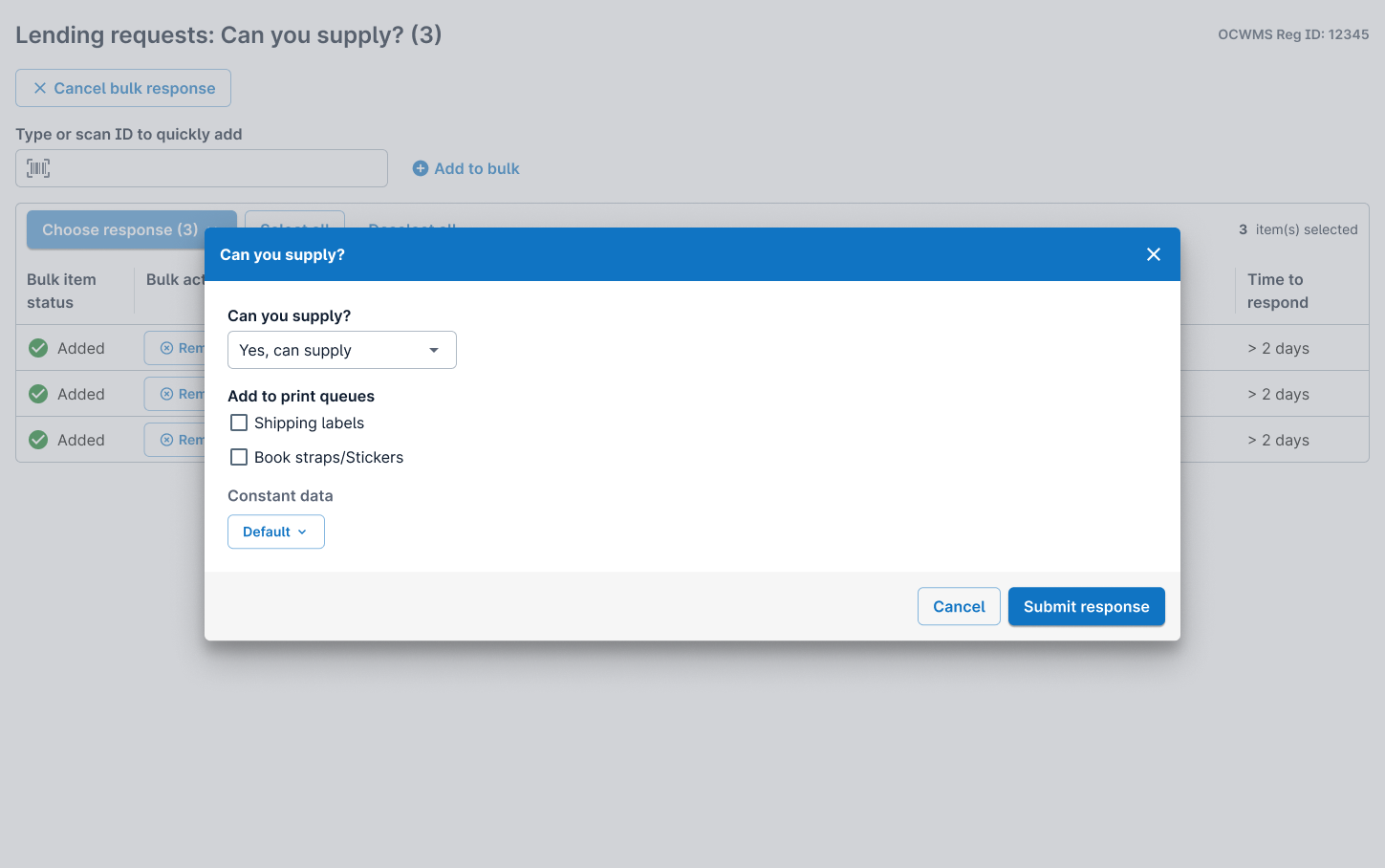
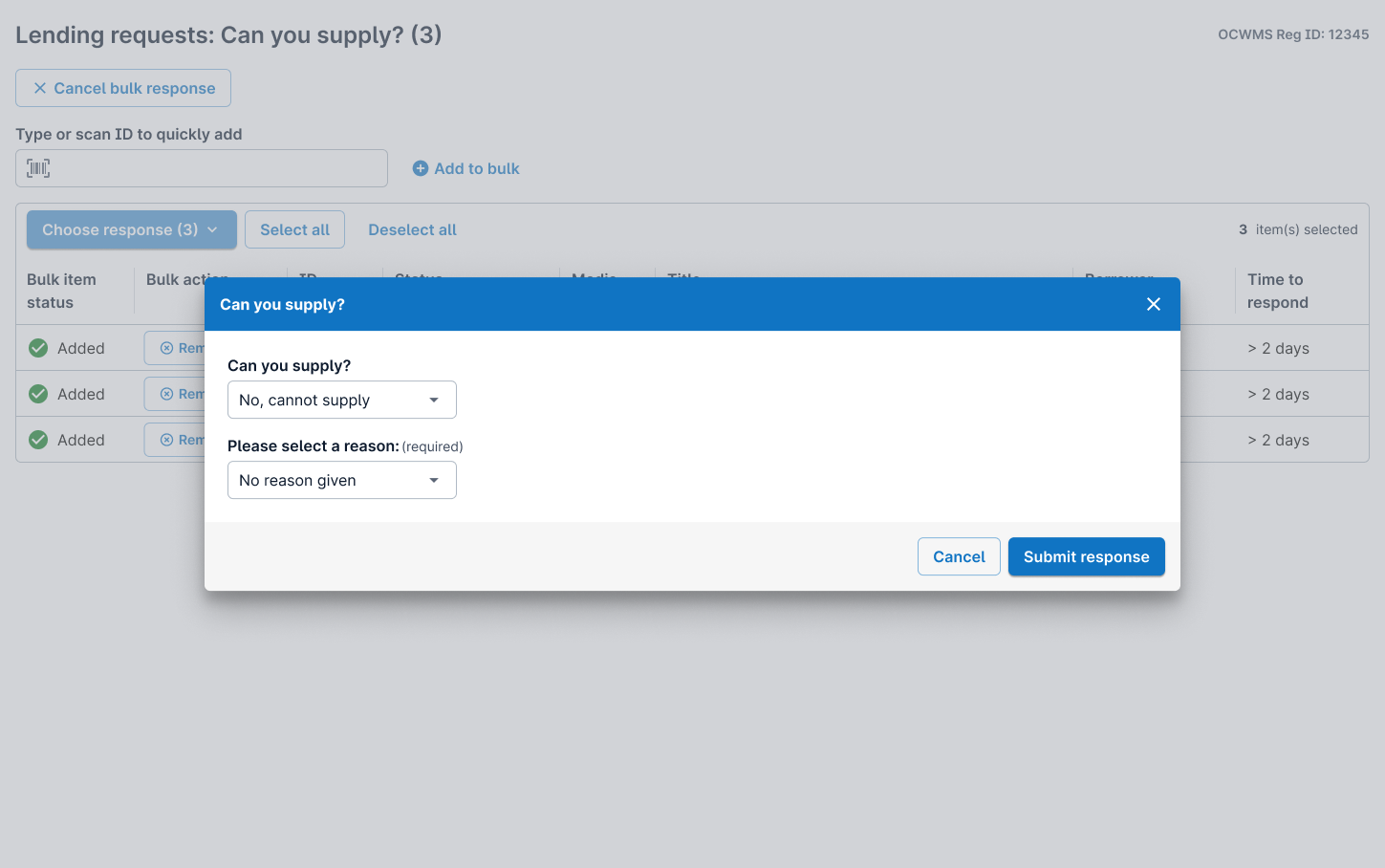
While checkboxes were an easy solution for developers, when it came to bulk selecting, there needed to be clear grouping of what requests were about to be pushed forward in their workflow and depending on certain statuses, secondary options needed to be considered (such as sending items to a print queue or “pre-fill” some of the request details).
Part Two
High-fidelity designs
Testing & Analysis
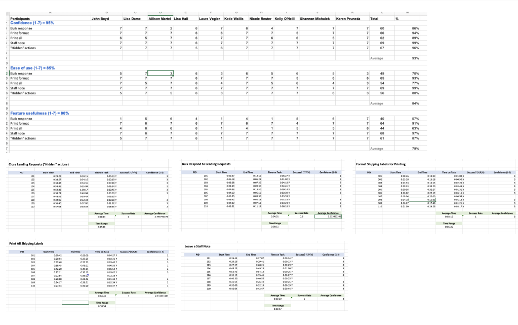
Created a detailed research plan
5 total tasks (including other ILL features as well) and outlined hypotheses & assumptions.
Determined success metrics:
Confidence of completion (95%)
Ease of use (85%)
Feature usefulness (80%)
Execution:
Of 15 users invited to participate, 6 accepted and scheduled sessions. Also recruited 4 additional users during a call with several library institutions and scheduled/completed all 10 studies.
Data analysis:
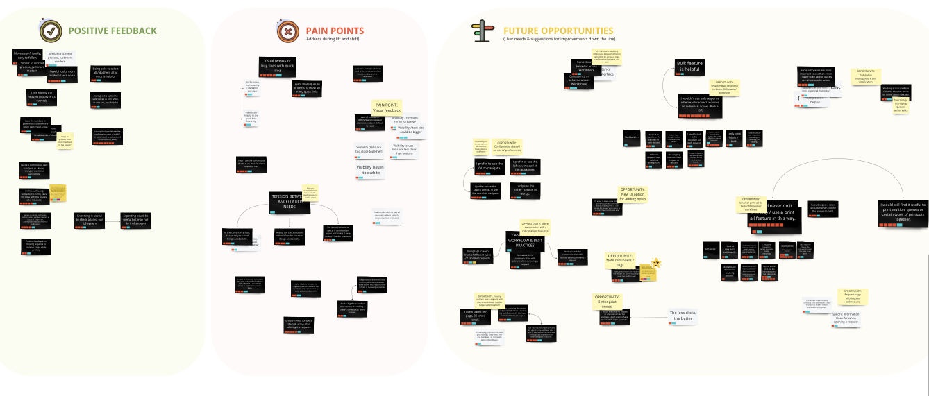
Testing included several features and wasn’t specific to batch (bulk response). The portion specific to that feature was very well received but mostly opened the door for future opportunities as this iteration was only within the scope of “modernizing” existing functionality.
Iteration and final design
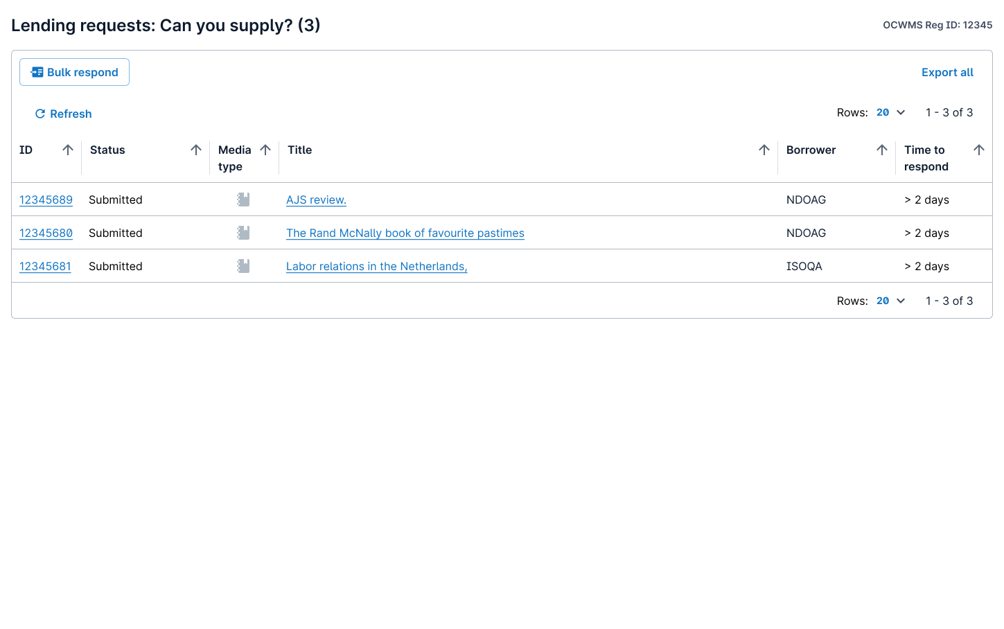
Only minor button placement changes were made after testing, but overall the final design included the following enhancements:
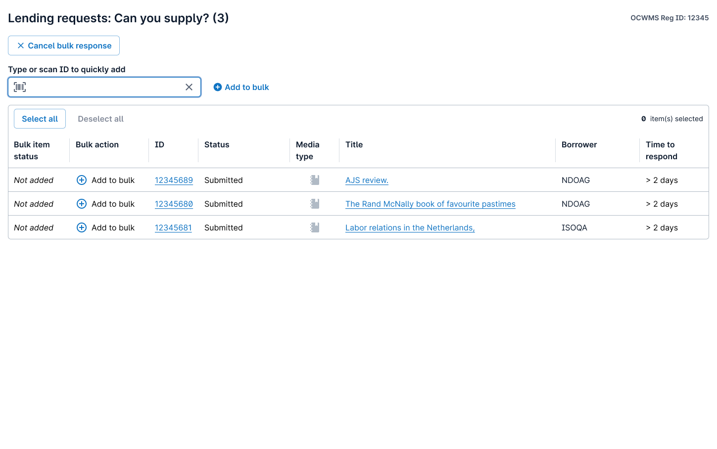
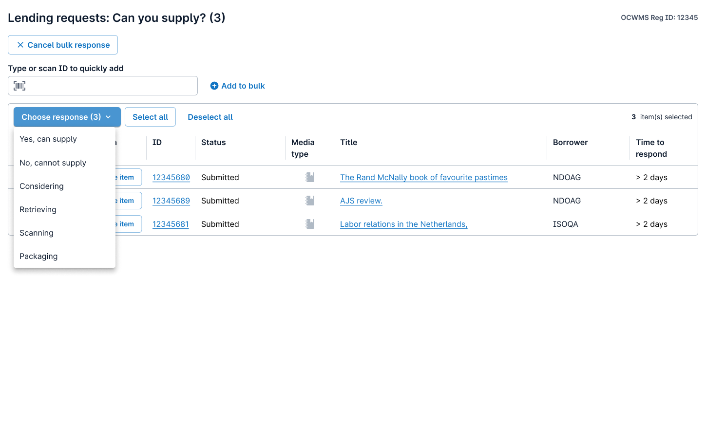
Created a “Bulk mode”. This would remove certain page options so the user could focus on taking bulk actions and remove the “noise” of the prior state.
In bulk mode, we removed:
Option to “Export” the data grid content
Pagination and added an infinite scroll behavior
Page “Refresh”
Column sorting
In bulk mode, we added:
Search functionality (including item barcode scanning)
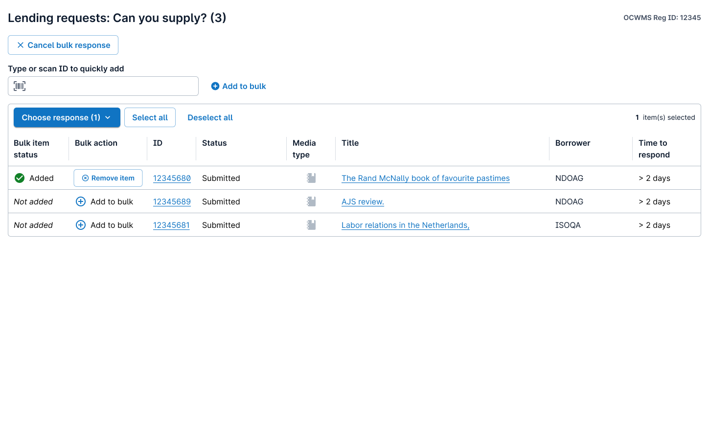
Bulk status column (to indicate what items are added to bulk) and Action column (to add item to bulk)
Main Call to Action (Bulk action - varies by request status)
Bulk count (how many requests are selected in the grid)
Option to “select all” or “deselect all”
Allowed for response change without removing their selections
Part Three
Looking back
This project was a lot of hard work and the biggest obstacle faced was navigating what was attainable in the code from the existing page and what would inevitably increase scope.
Certain compromises were made along the way, for example, I originally wanted the “selected” items in the data grid to automatically bunch up at the top of the grid, however, auto-sorting while navigating the grid was not possible at this stage. For this reason, we removed pagination so that at least the user would be able to scan for their selected items easier.
Additionally, the original behavior only allowed up to 100 requests for bulk action and while we couldn’t remove the limit, we were at least able to increase it to 500. This meant that when putting the page in “bulk mode” and removing pagination, we would only show the 500 maximum on the screen, therefore eliminating the need to design an “error” path or disable functionality at any point.
Looking back, I would have rather known these limitations prior to testing and would have wanted to touch on those items in the studies. Communication, although very high as it was, should have been better targeted from my end to make sure I captured all possible obstacles.
Overall though, I consider the enhancement a success and users responded well but there is a lot to explore in the future and that is the most exciting part.