Betancourt Media
Website Design
Quality over quantity
It's easy to focus on the cost of any kind of production especially if you're a business owner and you have to consider a return on investment in everything you do. We get it. Money matters.
Betancourt Media gets it too. They also get that when it comes to your video production needs, good things don't come cheap and cheap things simply aren't good.
The Challenge
Betancourt Media is a video production company based out of Miami, FL and they needed a website that showcased their work and was also an easy to use platform for potential clients to contact and/or request quotes for their service.
Over the course of three weeks, my team and I were determined to create a simple and classic website for our clients needs while really focusing on both their short and long term goals.
My Role
As a team of three, we divided our roles into the following: Research, Wireframing and UI.
As the project researcher, I focused on the user experience aspect in terms of content and general site architecture. This included secondary research of the industry and card sorting tests for the site map.
While that was my main focus, I still collaborated with the team throughout the life of the project thereafter.
Part One
Research & ideation
Understanding the industry
While our client provided a couple of websites for inspiration it was important to understand video production as an industry before diving in.
Initially, I studied the content on those websites and primarily researched the services those companies provided.
It hit me quick that pricing wasn't a category anywhere, at least not obviously. Each site had a button that either said "Get a quote" or "Contact Us".
This prompted me to search video production costs and from there I dove into the overall power of quality video production.
Cheap ≠ Good
There were a lot of great statistics out there to keep in mind. The cost of video production equipment is dropping while the number of skilled professional video freelancers and production companies are rising.
From various surveys and sources the numbers that really stood out were:
79% of consumers prefer to learn about a product through video rather than text.
84% of consumers have been convinced to purchase a product after watching a video
62% of consumers have a negative perception of a brand after experiencing a poor-quality video
All the things
There are so many components that go into video production. A lot of factors that influence price. Pre-Production, Actors, Direction, Cameramen, Editor, Production, Time, Camera & Lenses, Post-Production, etc.
It was clear why pricing wasn't a selling point. It wasn't simply a tactic for sales, but because it depends on all of the above and more.
It’s worth it though
Most companies use Facebook for marketing their content, and have been on a decline as the social network algorithms have changed to favor people over branding.
As engagement worsens across the board, video engagement takes an increasing lead over engagement for images and linked posts.
This means that branded content needs to feature genuine, authentic stories that people connect with and want to share.
Meeting the client
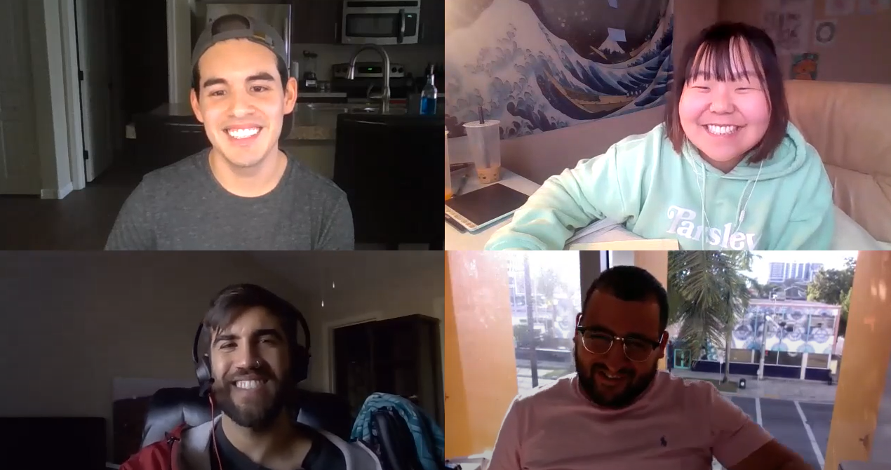
I had a really good idea of how the industry worked now, however, I didn't know enough about what our client specifically had to offer and was ultimately surprised to hear what his focuses were as this truly shaped our project and content.
Screenshot of Initial Meeting with our Client
Takeaways
It was clear what video production companies have to offer and from the websites our client sent us for inspiration, it was clear that each company provided a range of services.
Our client was very different from these companies. The most important takeaway was that he didn't have a lot of independent work to share on his site. He had worked on several productions but not much that specifically belonged to him.
This was extremely important for us to know as something that every established production company has in common is that they have libraries worth of content to share on their sites.
Our client also had big goals and was limiting his potential clientele to big budgets projects only with the aspiration of working on tv shows/short films. He also mentioned that Retainers would be great to have but they're hard to get.
Reshaping our goals
The website needed to serve two purposes: Showcase work and Promote contact for potential clients.
There was limited work and the potential clients he wanted needed to be able to spend some money. With that in mind, I conducted a little more research to really get an idea of how we could address the business needs.
Walk the talk
Going back to the benefits of high quality video, I had found that explainer videos were great for businesses to promote themselves. They helped increase conversion, engagement, customer acquisition, and brand awareness.
We just had to do that for Betancourt Media.
At the end of the day, nobody reads. They skim sites. If you need video production, you do the same but you watch a few videos.
Something about the websites our client sent us was that each of them had endless paragraphs explaining everything. A few had explainer videos but more so on blogs rather than main content.
If we could include short 30-90 second videos explaining different site content (alongside short text), that was made by our client, those videos alone could reflect their abilities while also getting to the point rather than scrolling too much as a user.
Retainers
The comment our client made about wanting retainers was quick and didn't seem to be something realistic for him to achieve.
I did some research on what they were and how sites go about advertising them.
One site I found had a tab dedicated to retainer information but didn't call them Retainers. They simply called it a Membership.
This made sense since retainers can be a little intimidating but given his goals, it made sense to include something similar. In addition to being a service he could offer, it gave that pocket of user types a place to look for. It was also a good area to include an explainer video while also establishing credibility.
Our client liked this idea after running it by him and it ultimately made the final design.
Contact fields
Having in mind how we would go about showcasing our clients work, the second step was making contact easy and seamless.
Each website had different ways to gather contact information. Some had long lists of fields, others not enough.
Our client just needed to know two things aside from the basic information: Approximate budget and a way for them to Upload media or share links to give him an idea of what kind of content was needed.
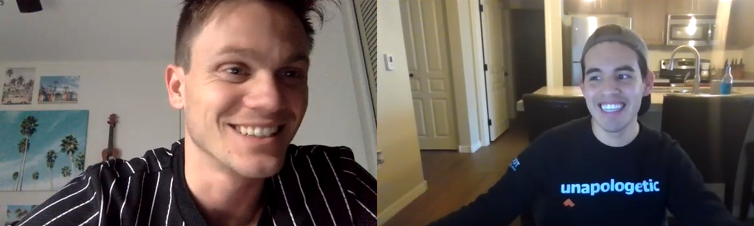
Screenshot of Card Sorting Interview
Card sorting
I had narrowed down the general content that needed to be on the site. There were a few I wasn't sure about or maybe had a name that was better than another.
Ultimately, I knew that really any kind of person would navigate this site. So when conducting the tests I wasn't too picky at all in terms of participants but out of my own network I found a couple of people that were familiar with the industry. One of which was a videographer himself, another that helped a previous employer with searches like these for marketing needs.
I completed a total of 5 remote moderated card sorting tests using Optimal Workshop. Each sort took around 30 minutes for 20 cards.
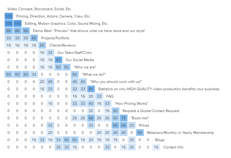
Trending insights
The card sorting went really well overall. Many agreed to certain groups. For example, everyone seemed group the services provided with the work/portfolio. These two categories I would tend too see on their own so that was interesting.
Most users didn't include "Pricing" or "Book Me" options on the site because they were already in the understanding that pricing varied and nobody felt like they would simply book right away without being able to go over their video production needs first. On the flip side, they did keep "How pricing works" and "Contact Me/Request a Quote"
Everyone worked hard to keep the number of groups at a minimum which was interesting because it told me that they simply didn't want that many options to put together, much less navigate. On average, there were six (6) groups.
Similarity matrix from Optimal Workshop
Demo reel on the home page
Everyone wanted to see the Demo Reel right away. This was the plan anyway given the research I conducted advised that conversion rates increased by 80% when there was a video on a landing page.
Nobody likes to read
I had simplified the overall services provided to Pre-Production, Production and Post-Production. However, in the card sorts I didn't label them as such. I had three separate cards for each facet and just listed a few services within each group.
Everyone grouped the three together but in conversation that was enough information to get the idea of what they do.
Other sites had longer pages of explanation for each production stage but at the end of the day, the clients aren't too interested in learning that as they are getting the service booked and trusting that the company knows what they're doing.
Everybody likes videos
Interestingly enough, everyone wanted to see videos where they could. One participants gave me the idea of using videos for client testimonials and even to introduce the crew.
This was great given I was already interested in using explainer videos.
This would give the site a little bit more life as well as impress upon potential clients of the quality of work.
Discovery
If there was anything I learned from card sorting, it was that everyone looks at grouping differently and there were really very few cards that 100% of the participants grouped together. Where I really gained massive insight was from the actual follow up and having them explain their process as they worked.
Digging Deeper
Synthesis & mapping
I re-watched, read and listened to my interviews and identified all of the trends that I could.
I reviewed our initial meeting with the client as well to make sure we were still focusing on the business needs.
Affinity map
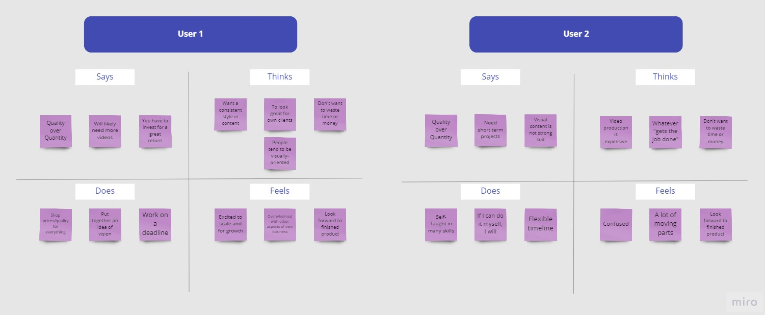
Empathy map
Who was I designing for?
From the beginning of the project I didn't think we'd have more than one user type given our client’s goals. However, especially after gathering the insights from different participants I realized there were different priorities given the situation.
One participants pointed out that his employer would rarely create video content as it was expensive but when they did, it was very high quality. The common themes were that they understood the concept of quality over quantity but constantly tried to do things in-house in order to get the job done. This delayed their timelines often and almost always, they had to resort to a professional.
That was the user I hadn't considered at all. The only user I had in mind was that studio that would constantly need videos and would likely be interested in a retainer deal.
With that in mind, I created two user types that were very similar in what they would say and think but one simply understood the benefits of using a video production company and another that needed to be sold and educated on those benefits as they would “shop”.
Naming the subjects
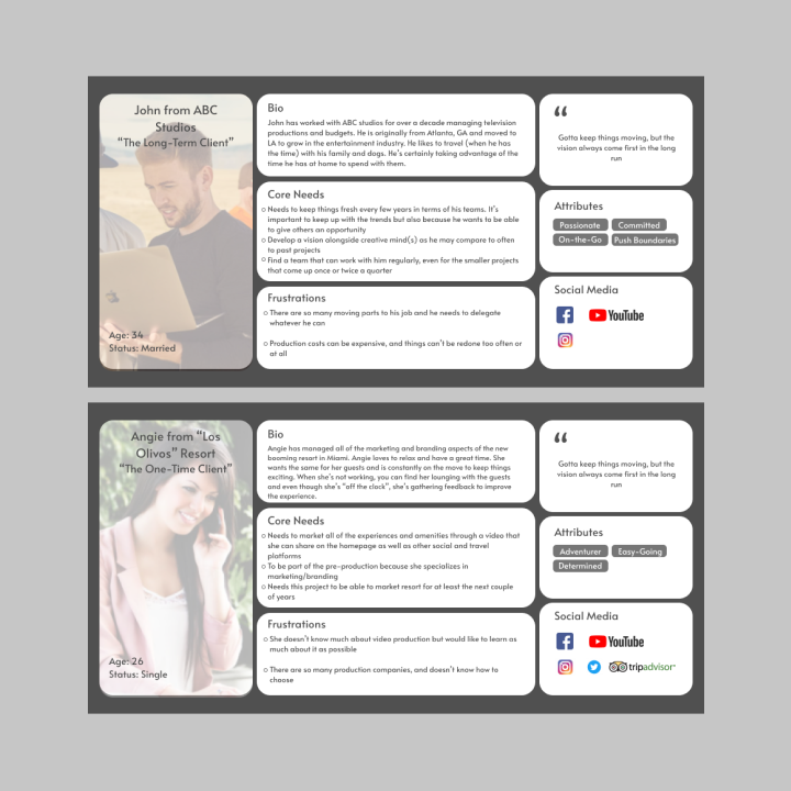
User 1 and User 2 would now be: John from ABC studios and Angie from "Los Olivos" Resort.
The Long-Term Client and The One-Time Client, respectively.
John was familiar with the industry. He just needed someone who could essentially take over the project. John would likely provide a mood board/style guide along with his vision and the rest was up to our client to bring to life.
Angie has never worked with a production company but she knows she needs a great quality video and ideally she can be a part of the process.
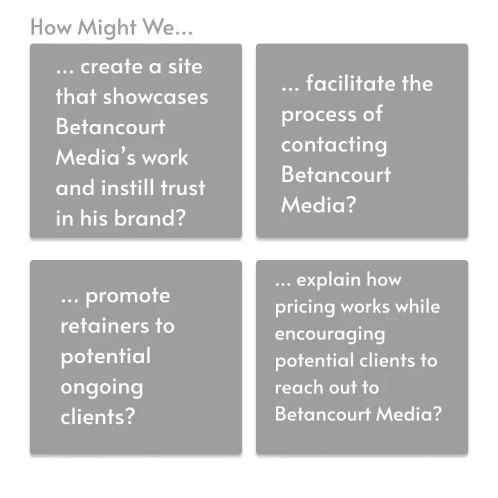
Problem statements (HMWs)
It was time to narrow down the specific problems I was looking to solve.
I started thought jogging some possible solutions soon thereafter. I was highly interested in keeping the site simple, classic and straight to the point. These were all the keywords our client would use or resonate with.
Can you see it?
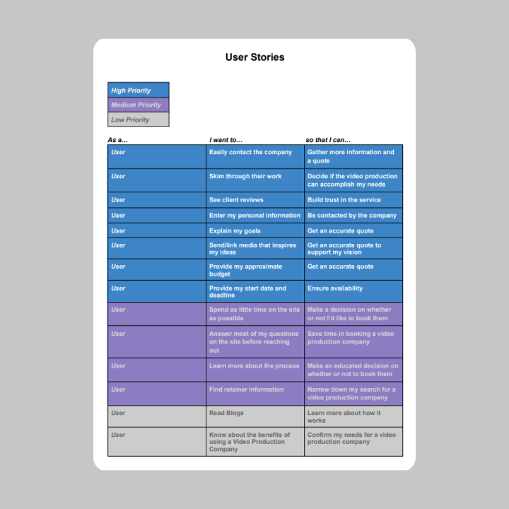
User stories
I knew visuals would be the main focus points on the site but I was still interested in the keeping some things familiar.
While I was drawing up some of my ideas, I kept my user stories in mind.
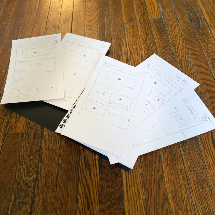
Ideation sketches
I really didn't want to add too much detail to the initial sketches but the navigation was important to me.
As mentioned earlier, the main focuses were to see Betancourt Media's work and also facilitate the process of contacting our client for a potential quote.
Two simple tabs I think would do the trick. Work and Contact.
We would later add Home to be safe.
Within the Home page, we would see our client's Demo Reel right away.
Below would be local navigation for the important yet not high priority information. This would include the "About" section under the title "Betancourt Media" which would also quickly touch on the the three production stages of our client's work.
The other tabs were Blog, Membership (Retainers), and FAQ.
Each were intentional in their content. The blogs are self-explanatory but placing the pricing and budget related ones up top would be key. Memberships would be a great focus for those potential ongoing clients like our John's but keeping it local rather than on the fixed navigation bar would help eliminate potential confusion for our Angie's. The FAQ would answer the nitty gritty questions like the pricing and establishing the minimum budget our client had in mind, as well as other possible questions like equipment/software used or insurance.
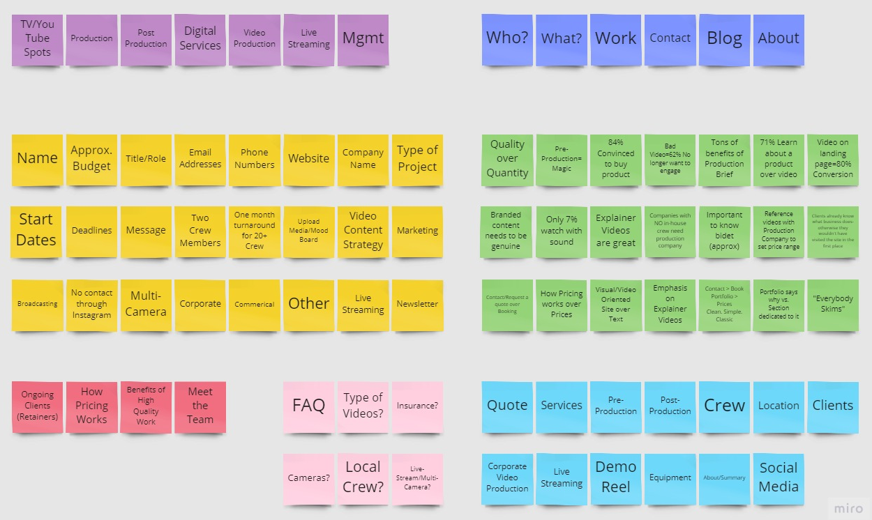
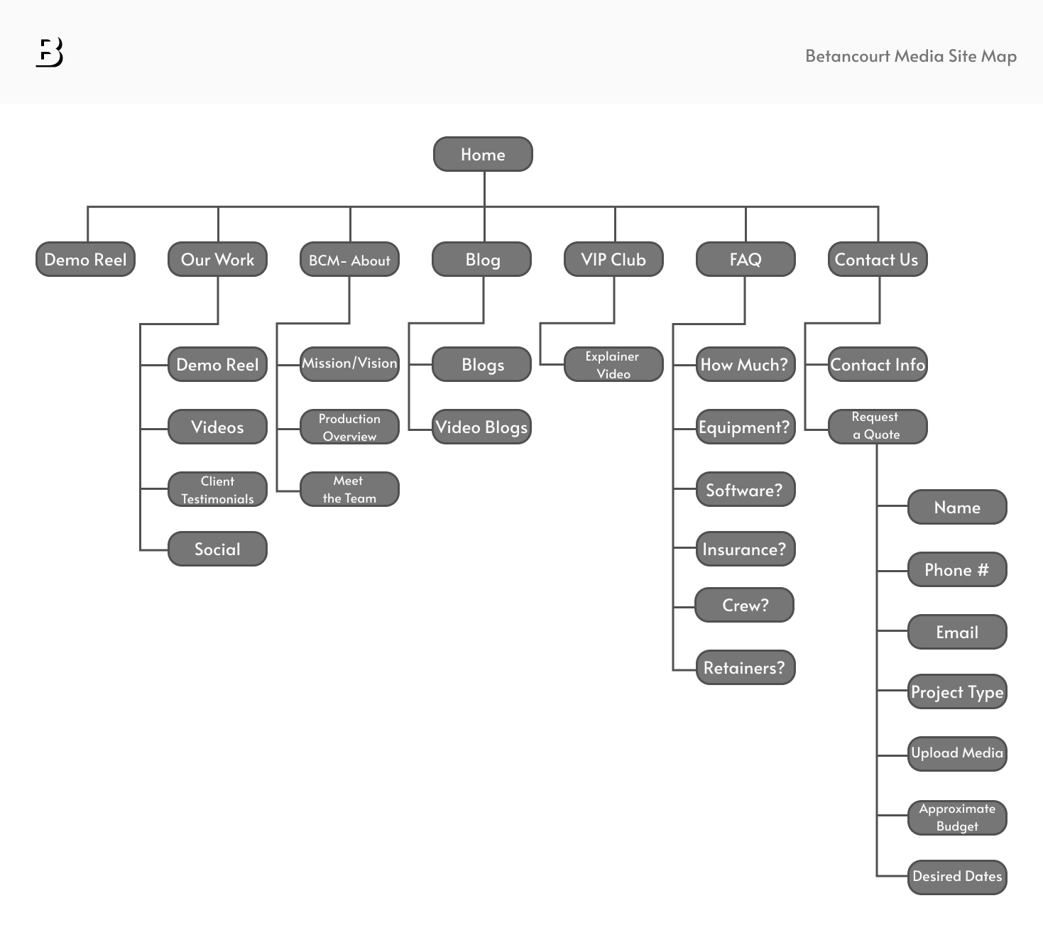
Site map
Having these ideas on paper helped put together a final site map. Based on card sorts, we kept it simple with a total of six (6) main groups aside from our Demo Reel that would live on the Home Page.
Contacting our client had to be specific and interactive as well.
I broke it down to 2 sub-categories: Contact Information and Request a Quote.
The ideal user would "Request a Quote" and provide their information naturally. This meant doing away with a list of fields and rather provide a step-by-step input: Name, Phone/Email, Project Type, Upload Media, Approximate Budget and Desired Dates.
Having this process be interactive could increase the rate of contact because it eliminated the potential overwhelm of seeing a list of fields and also was detailed enough to give our client some more specific information to customize a quote.
Part Two
Wireframes, style guide & Hi-Fi design
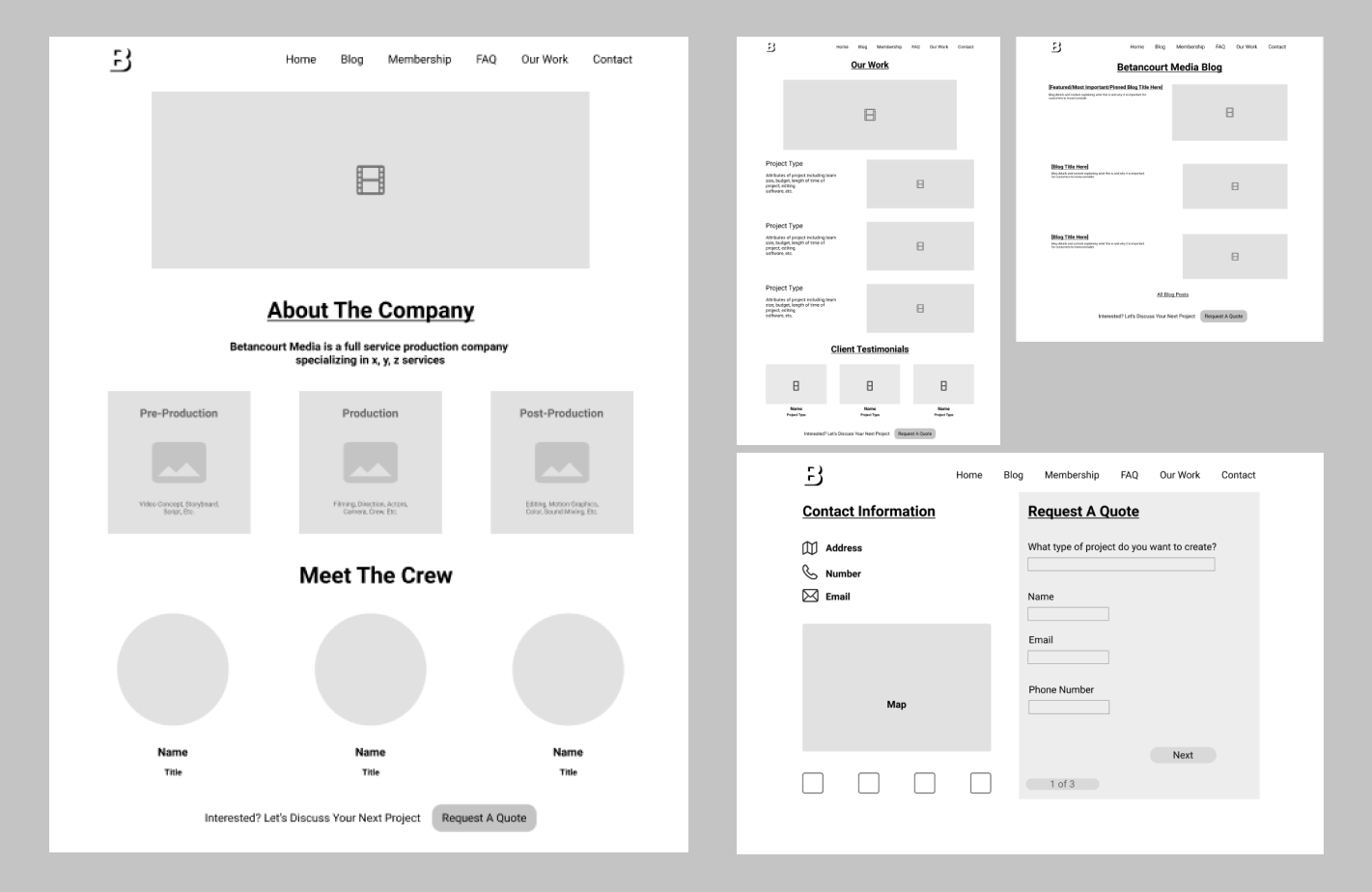
Wireframes
Marc Sessa, our other teammate, Hyelin Choi, and I really worked hard to establish wireframes. I assisted in staying true to the site map while also providing examples of space and content placement. Hyelin provided many examples of similar sites for inspiration.
After many drafts we had a general idea of how the site would be laid out. A majoy change was that creating local navigation for the home page would be slightly complex for our client to adopt when finally building the site. We kept it simple and added the sub pages to the main navigation.
Style guide & branding
Hyelin Choi communicated directly with our client to understand the company brand and vision and put together the style guide, brand platform and logo for the site.
Logo by Hyelin Choi
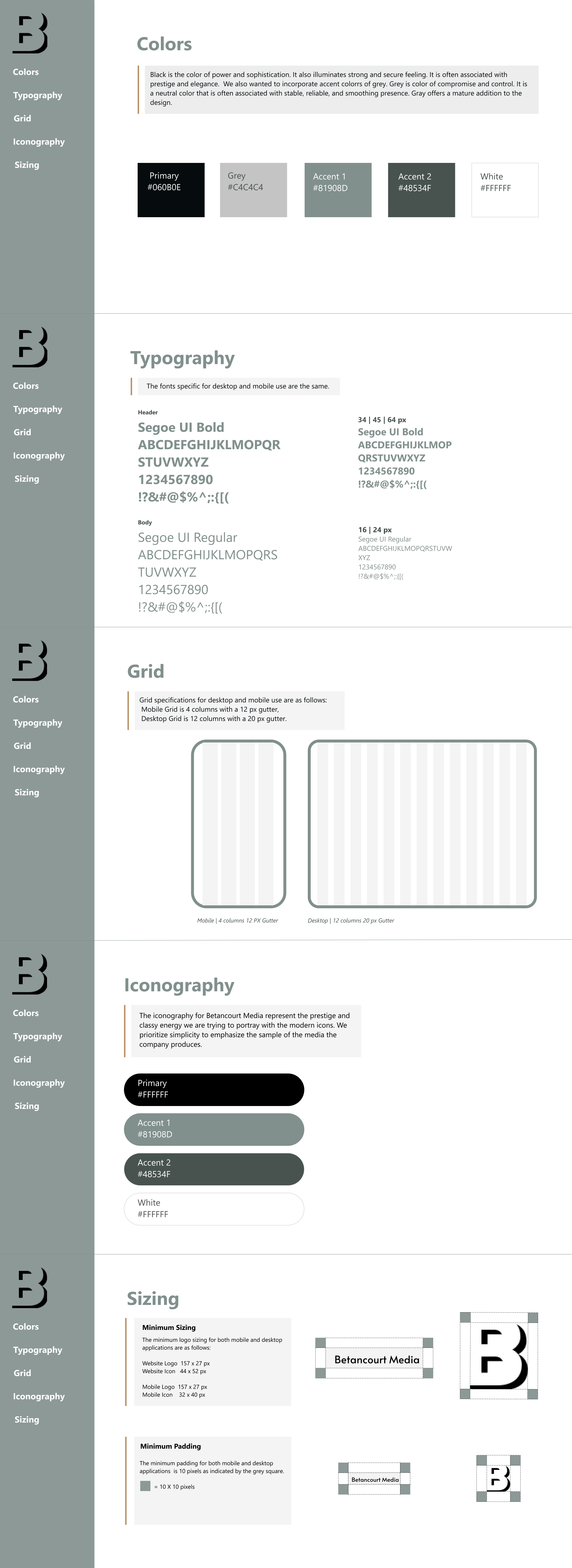
Style Guide by Hyelin Choi
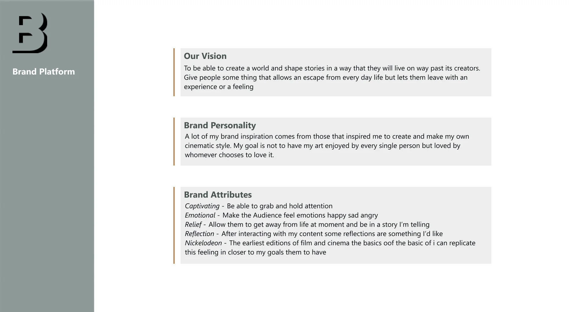
Brand Platform
Plug & play
We were ready to apply the style to our design. Our client provided the content to fill the space with real information and we went through several iterations before landing on a final design. Our goal was to keep the site modern and simple.
There were a few features we realized weren’t easy to build for our client so we had to strip back some creative decisions but fortunately the final design remained stylistically unaltered.
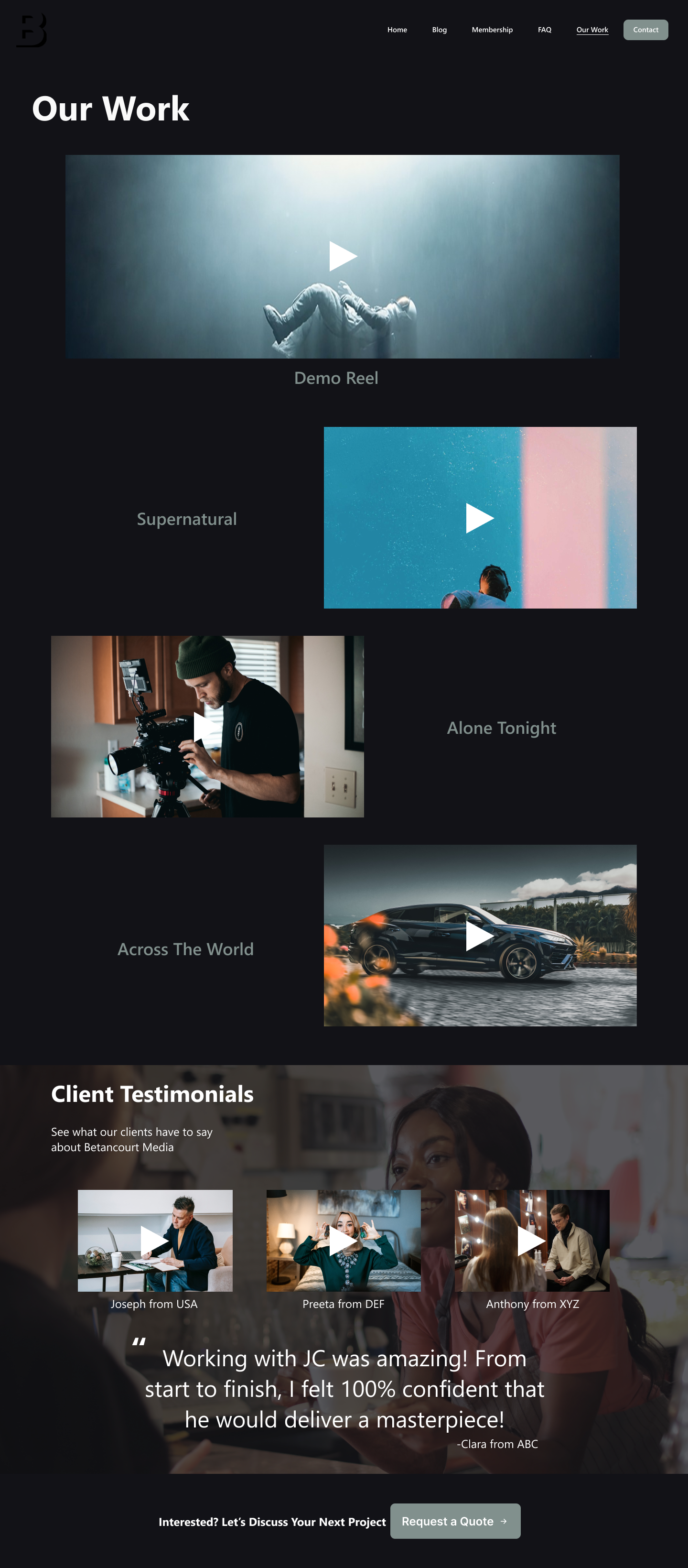
Work Page
Prototype
We prototyped the site when presenting to our client. Click here to take a look at the figma Prototype.
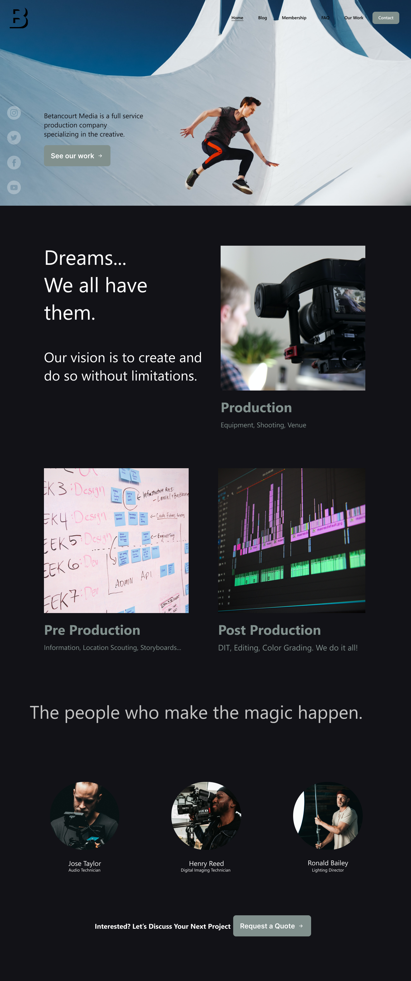
Home Page
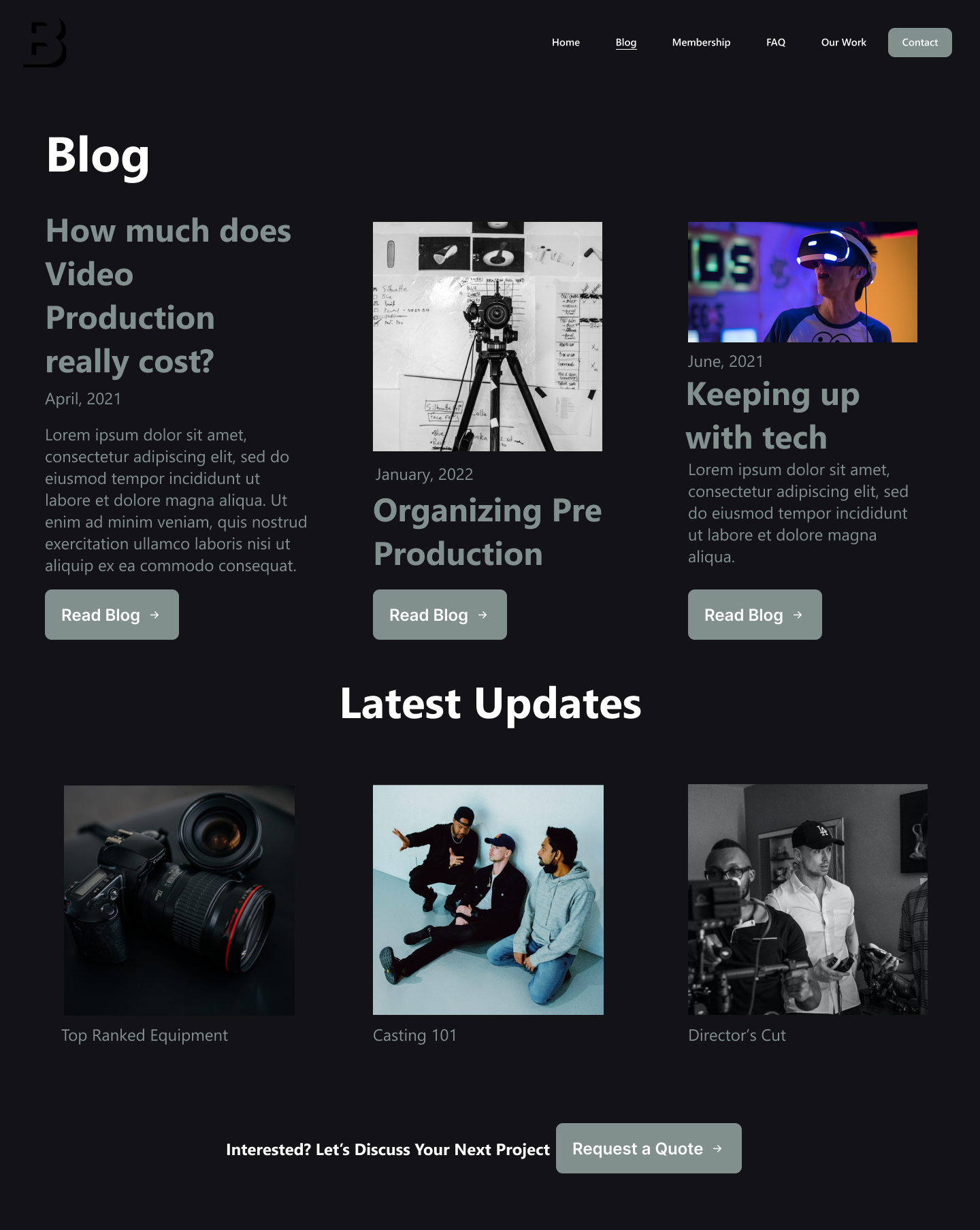
Blog Page
Part Three
Looking back
Overall, the project was a success. There were a few areas, however, where we could have been much more efficient in terms of timing. Our client was very busy and gathering some information was difficult here and there. I believe if we would have collected more content specific information in our initial conversation, the UI portion would have gone much quicker than it did.
Additionally, we didn’t consider the platform he would use early enough. We ultimately suggested Squarespace for the ease or building his site but we tested some features during the wireframing portion and High-Fidelity mock ups and this altered the site map quite a bit. The overall foundation and direction stayed consistent but we definitely would have made less changes had we set on a platform during the research phase.
I was very passionate about the research process though, and being able to complete all of Part One in just three days was very rewarding. Our client was very happy with the design and I’m glad that we were able to exceed the expectations of Betancourt Media.