Availyst
Usability evaluation
Local delivery options, All-in-one
Availyst is a start up that shows local delivery options in one mobile management platform. The intention of the product is to give users the ability to “shop” several third-party delivery platforms when ordering groceries, takeout, convenience and spirits.
Challenge
The beta app needed user testing to identify usability successes and areas of opportunity.
Role
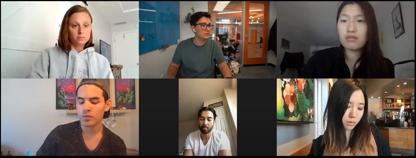
As a team of five, we were tasked with completing several usability tests over a 2-3 week timeframe. We tested individuals within our own networks that use food delivery platforms.
In addition to user testing, we collected findings and presented design suggestions as well as mockups for improvement.
Part One
Project planning & initial observations
First glance
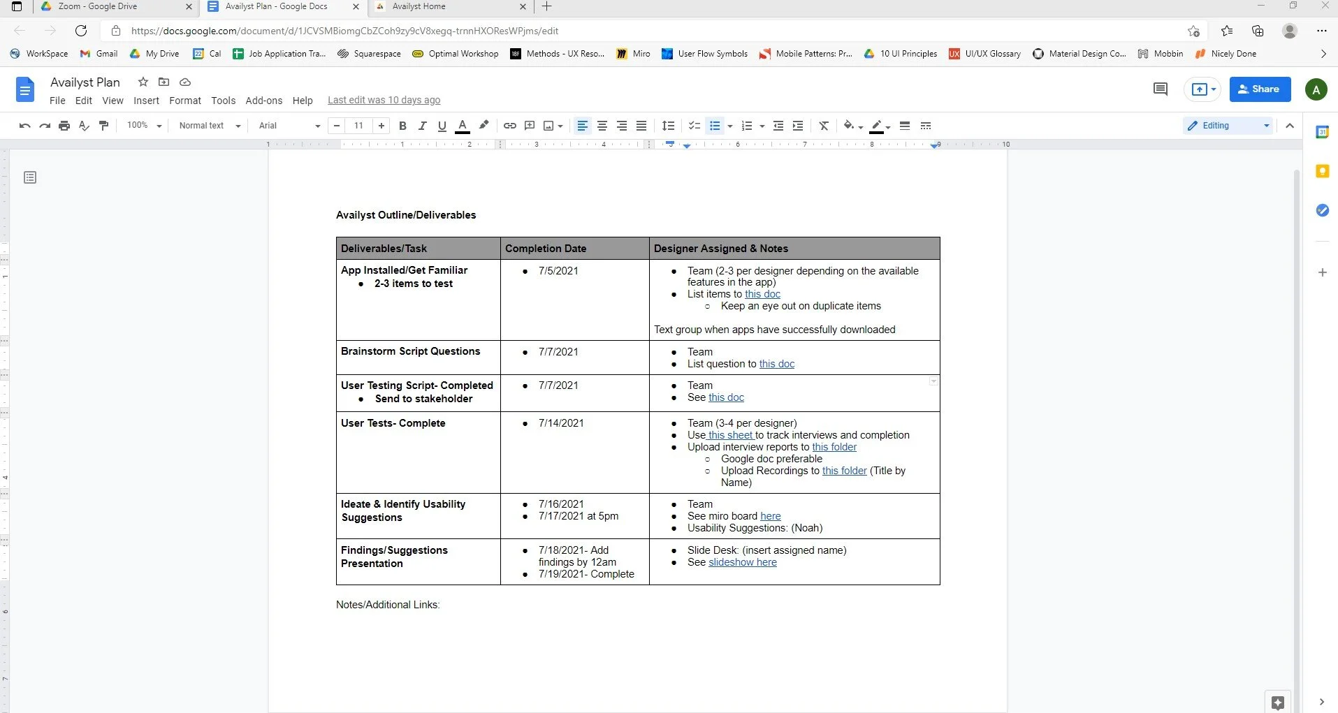
In our initial meeting, we set a timeline for completing all facets of the project. I quickly took responsibility of the structure and organization of our project.
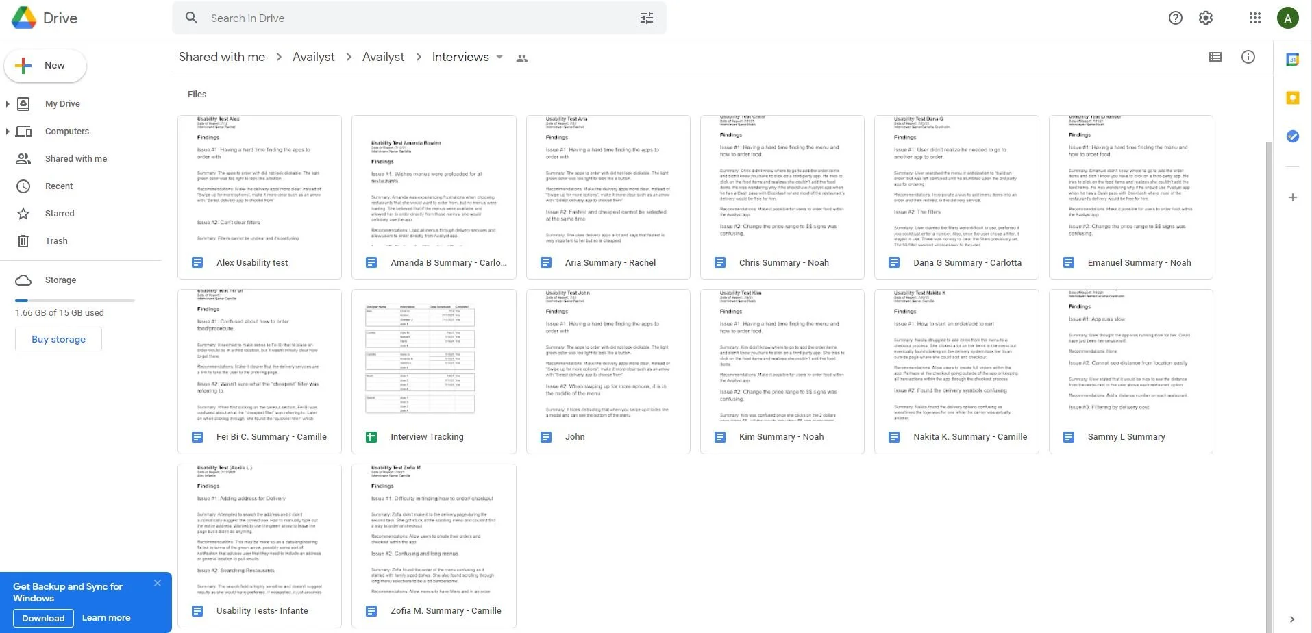
Creating a Google Drive was the easiest way to get the team deliverables and resources in one place.
Who, what, when, where and why?
I divided the project into six phases:
Beta App Install/Initial Observations
Brainstorm Usability Tasks and Questions
Gather Client Approval for Final User Testing Script
Complete Usability Tests (15 total)
Regroup and Identify Issues/Suggestions
Present Findings and Mockups for Improvement
The tools we used for this project were:
Google Docs, Sheets and Slides for testing, interview tracking and the presentation for the client
Miro for Issue/Suggestion Brainstorm
Zoom for virtual User Interviews
Screen Recordings of User devices during tests
Figma for visual mockups to pair with suggestions
Initial observations
The concept of the app is great, and without needing a guide/instructions, the main objective is clear and intriguing. With that said, as a team we noticed a few limitations and areas of opportunity.
Minor technical limitations such as the filtering/searching features
Confusing experience when selecting a delivery option
Menus were not included in each restaurant choice, which was perceived as a lag or error
No way to travel back to the initial “home” page
Difficulty in adding new addresses
Some users may have subscriptions/memberships with delivery vendors, which could ultimately limit the need of the product
Identifying major tasks
The mobile app had several user flows to choose from when it came to user testing. Without focusing on the features we already knew had limitations, we needed to create tasks that would allow users to find them on their own and not led by our initial bias.
This would ultimately determine the priority level of these issues as well as possibly identify other issues we didn’t see at first glance.
Finalizing user tasks
Task 1: Signing Up
The first task was a no-brainer. Signing up for absolutely anything can be a make or break for a digital product. It was highly valuable to gather sign-up feedback so we chose to put this at the top of our list.
Task 2: Identify natural flow
Whenever an individual downloads a mobile app, we want to make sure the objective and intention is clear and concise without depending on a tutorial or signifiers. With the direction of selecting a restaurant and walking us through their next steps if they wanted to build an order, we were able to gather what was intuitive of the navigation and what needed clarification.
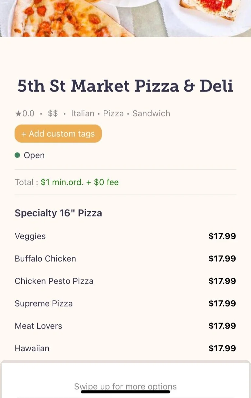
Task 3: Selecting filters
Humans tend to be picky about what they eat. It’s food. It makes sense. They also tend to be picky about how much they would pay for food and its delivery. The mobile app was focused on price so our next task was to determine the feel of filtering. (see visual 1)
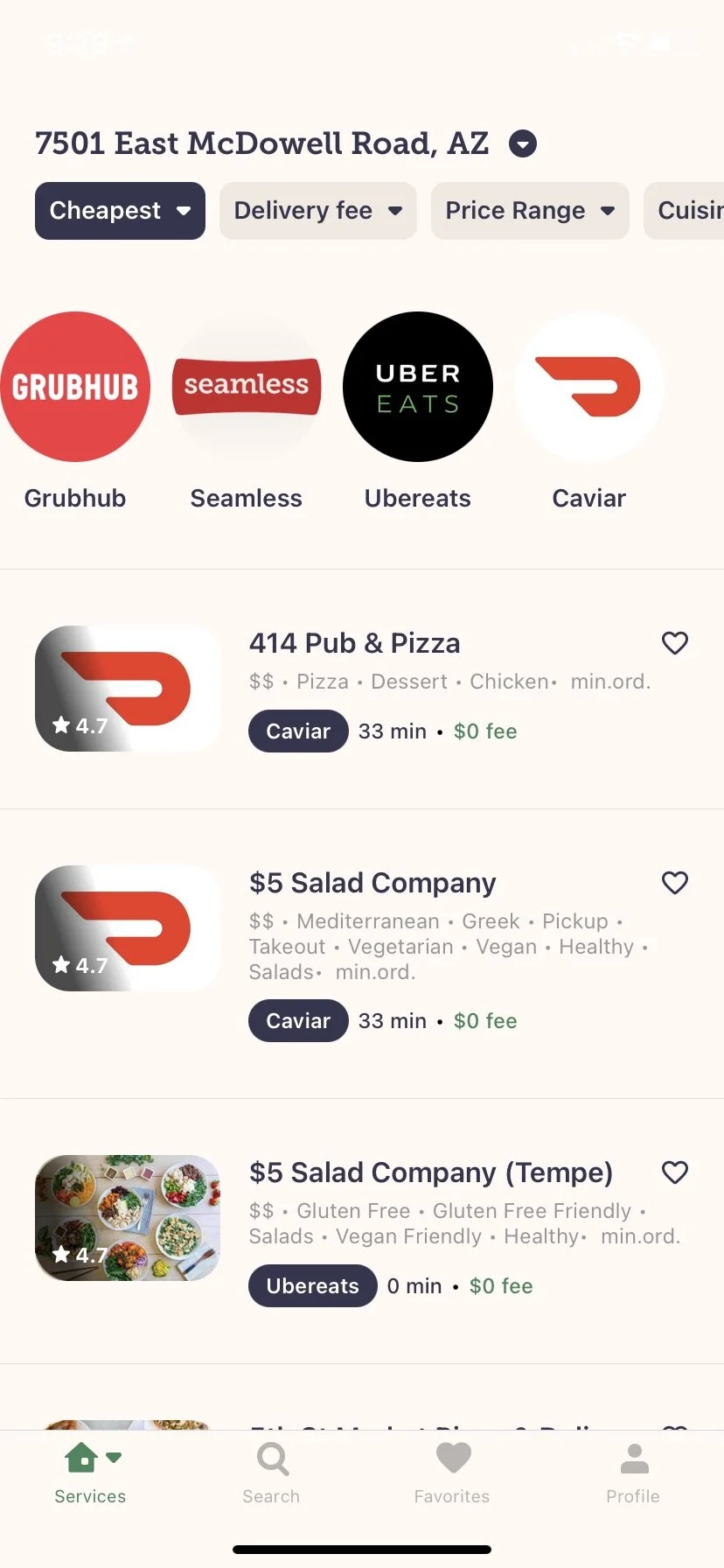
Visual 1: Task Three
Task 4: Selecting a delivery option
Finally, the premise of the app is to choose the cheapest delivery platform, so we needed to test how easy it was to select one and if there was anything at all that required improvement.
Bonus Task: Minor heuristic observations
If time allowed, we also wanted to hear thoughts about the app overall. Colors, icons, image placement, text, etc. These would likely identify normal to low priority issues but nonetheless hold weight to the user experience
Intermission
Our client reviewed our tasks in addition to the rest of our script and granted their approval. They added a couple more questions to help open the floor for supplementary feedback, and with those changes, we were ready to initiate tests.
Part Two
User testing and findings
User testing
We each completed 3 usability tests for a total of 15. Each user was able to record their screens and they gave us permission for Zoom recordings to facilitate our reviews and identify issues.
Usability Findings and Initial Suggestions
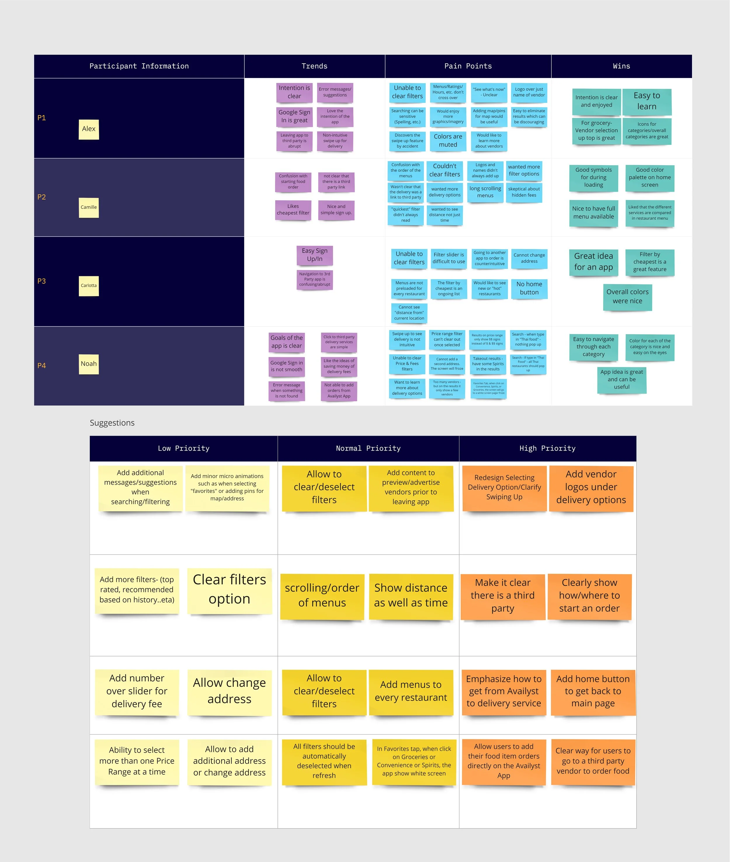
We gathered great feedback overall from our users.
As a team, we met to discuss our findings and overall suggestions.
Using miro, we added notes for each of our observations. These were broken up by three categories: Trends, Pain Points and Wins.
We then each added our suggestions ranging from Low to High Priority.
From there, team member, Noah, compiled a final list of suggestions based on the teams feedback and I added a description of the issues.
Issues and recommendations
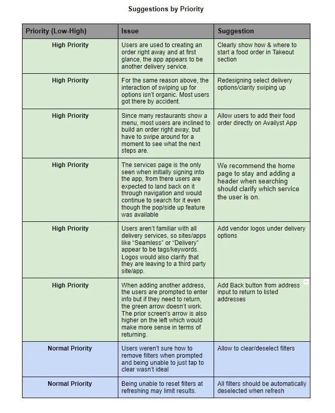
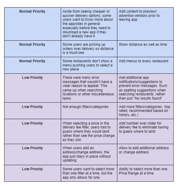
Main issues
After compiling sixteen overall issues, we only wanted to focus on presenting a handful of them to the client. Here are some of the issues found that we would present to the client.
Issues
Visual 1: Issue 1
The app has a feature to “swipe up” for delivery options (see visual 1). The app would then send the user out into the third-party app or website to build their desired order.
Users had the ability to read the menu for some restaurants but they wouldn’t be able to build an order.
Upon initial log in, the app showed a Home Page that listed the available services. After selecting a service, the remaining experience of the app would only provide a “pop up” option when selecting the “Home” tab.
When selecting a delivery option, no logos were presented for the vendor (see visual 2) and some names aren’t familiar to users, such as Delivery and Seamless.
Users weren’t able to deselect filters.
Reasons to address
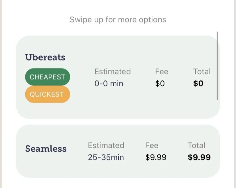
Visual 2: Issue 4
Most user only came across this feature by accident and it wasn’t clear what to do next after selecting a restaurant.
Having to select a delivery option and continue the process in a separate site/app would distance the user from coming back to Availyst.
Most users don’t like to read so even though the services listed in the pop up are just the same as the initial Home screen, the visual difference left many users wondering where to find the initial page again thus slowing down their navigation.
When seeing the options without a logo, the names appeared to be tags/keywords rather than actual company names and this led to confusion.
Users would need to manually set the filter to its default state (assuming they remembered) in order to clear it. Also if the user decided to change service and return later on (ex: going from “takeout” to “groceries” and then back to “takeout”) the previous filters would remain and limit the amount of options for the user unless they noticed the filters were set in place.
Suggestions
Redesigning select delivery options/clarify swiping up.
Allow users to add their food order directly on Availyst App.
Leave the Home Page to select service. The pop/slide up feature isn’t intuitive.
Add vendor logos under delivery options (see visual 3).
Allow “clear/deselect” option for filters or ability to to clear/deselect when leaving the service type and returning.
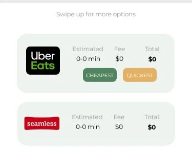
Visual 3: Issue 4
Presenting to the client
Once we had a visual mockup ready for each suggestion, we finalized our Google slideshow to present it to the client.
The slideshow was broken up by reiterating the challenge, sharing the demographics of the users we tested, our initial observations, highlighted the “wins”, areas of opportunity, shared our shared drive for full transparency of our research, suggestions alongside visual mockups and allowed time for any questions/comments.
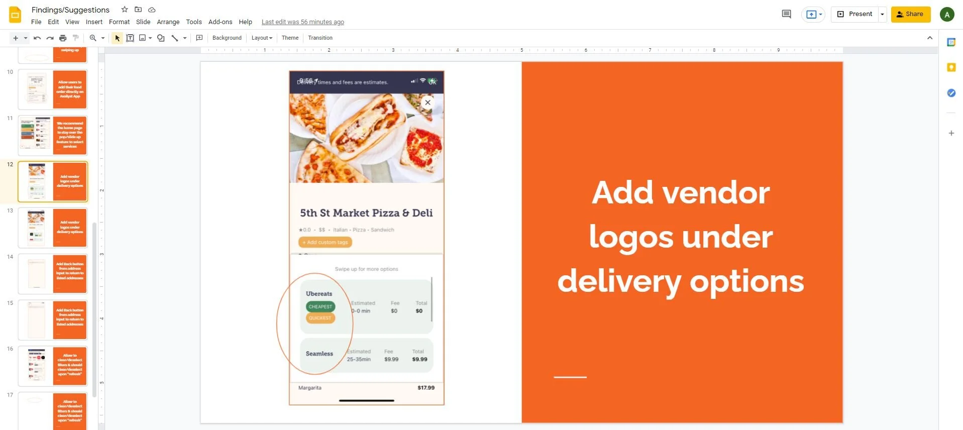
“Before” Slide of Issue 4
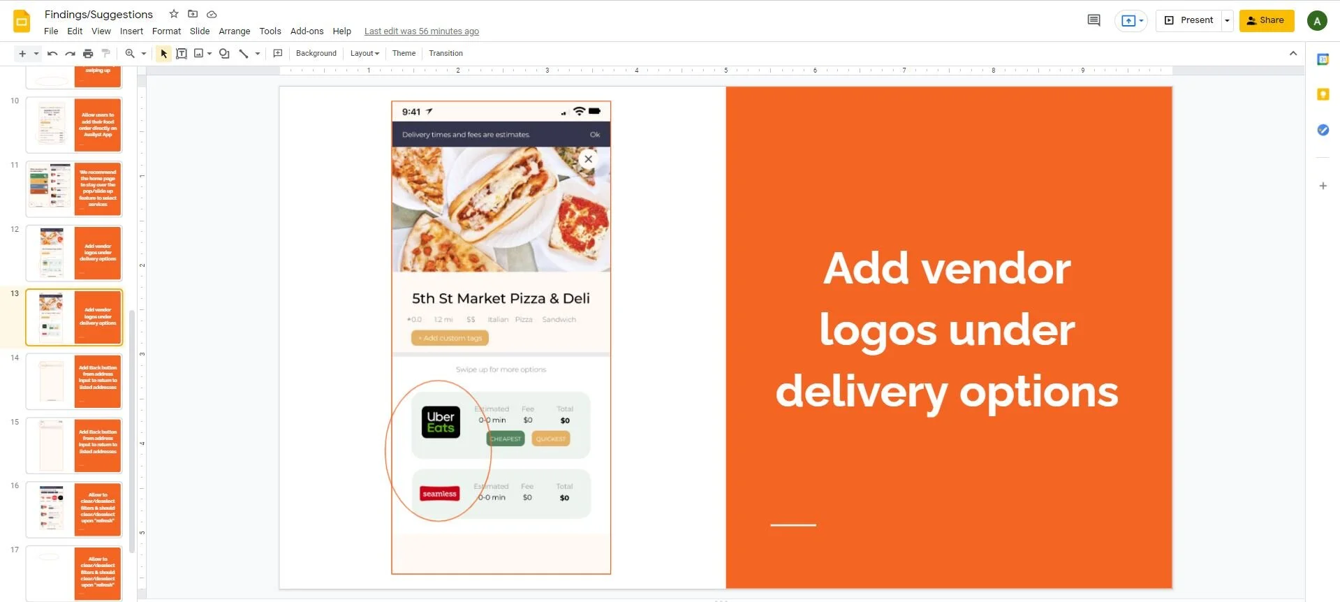
“After” Slide of Issue 4
Part Three
Looking back
Overall, our client was very happy to hear our feedback and advised some items were addressed prior to the presentation as they were technical bugs. The core issues were understood and our client advised they would revisit as soon as possible as they plan on launching within a month.
Collaborating with our team went really well. Organizing and setting a timeline from the start prevented delays and we maintained a high level of consistency across our deliverables.
Availyst is the first delivery management platform. The best feedback we gathered was how exciting the concept and purpose of the product was. Enhancing the user experience is an iterative process and I truly enjoyed the opportunity to contribute to this growing organization.